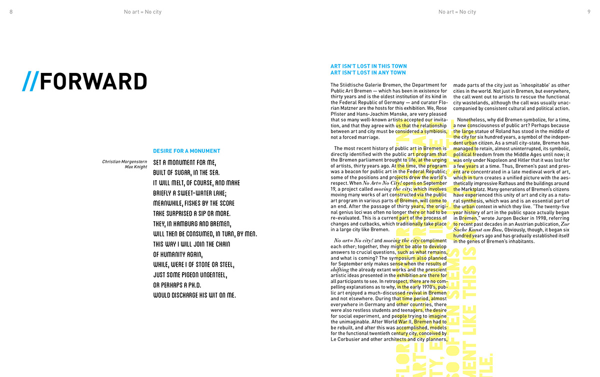
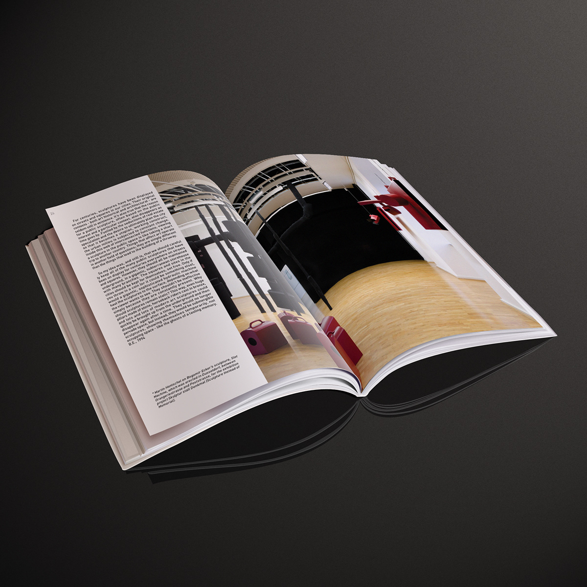
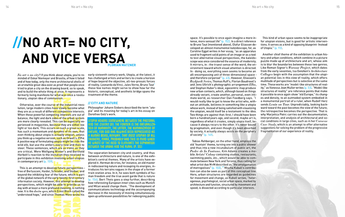
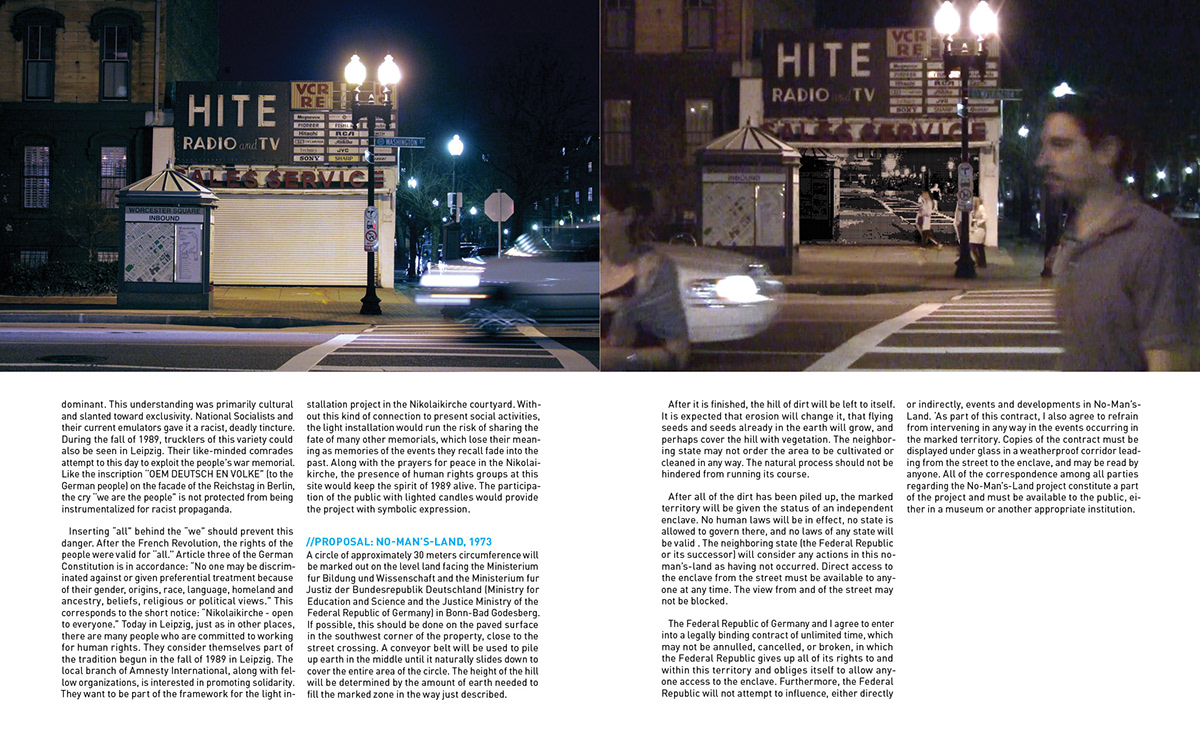
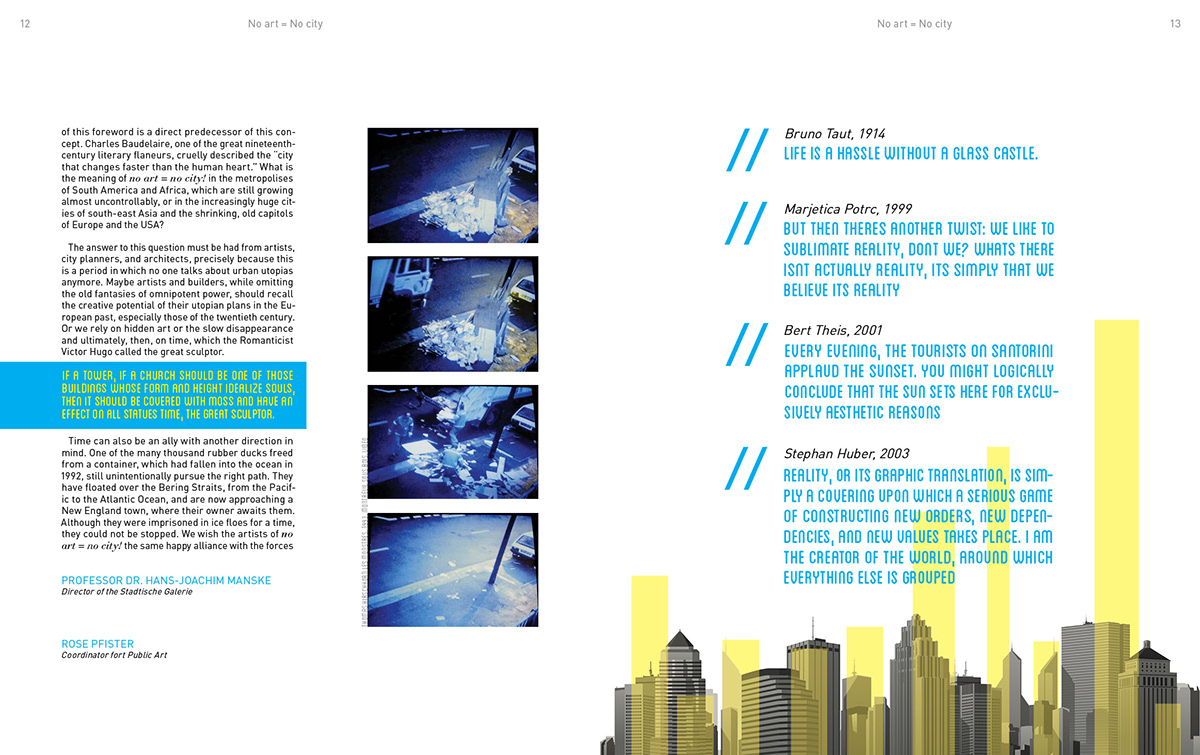
No Art = No City was designed in 2003. Sadly the old and outdated style of its design doesn’t do this fascinating book justice. Considering this, I had the perfect opportunity to redesign the book and give it the proper urban feel it deserves. When I think of art and cities my first reaction is to use a vibrant combination of blues and yellows for they are the essential colors bringing life to a city at night. It was a definite improvement over the muted color style of the original book. My goal was to design on a stocky, yet open design following closely to a grid that reflects the vertical, grid-based structures of skyskrapers. In viewing the following pages I believe I have accomplished this goal and have given new life to a very informative, yet overlooked text.


