Redesigning “Challenges” on Toppr
Challenges are one-on-one tests that students create on Toppr and share to compete with each other. With the objective of making them quicker and more efficient, we recently revamped the feature. Here’s what we did new:
1) Reduced Friction
To create a challenge, users until now would select
Subject > Chapters (multiple) > Duration > Difficulty
As a first step towards simplification, we reduced the option of selecting multiple chapters. This was supported by data which showed its low use-case. Next we dropped down 'difficulty' feature. We evaluated that rejigging these two features alone would have 3-layered benefits:
a. Dramatic reduction in system computations
b. Lesser number of steps, less drop-offs
c. Lesser decisions to make for the user
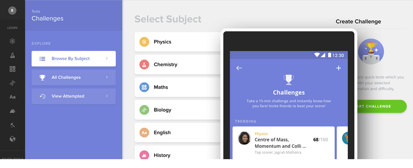
2) New Navigation, Browse by Subject
Users could now handpick any subject instead of going by what is trending or curated. This was done to facilitate individual preferences. In addition to being a general feedback, it was also in line with Toppr’s IA in which subject-wise navigation is pivotal.

Next challenge that we, the product team, faced was where to land the user when she selects a subject:
a. ... to All Challenges page, with filter of that subject applied. This looked highly
preferred and optimised since All Challenges page was already existing.
b. ... to a dedicated page for that Subject. This meant building a new page
altogether.
We realised that subject-wise navigation deserved its dedicated flow. If the user landed on All Challenges after selecting Physics, she would likely feel lost, because the queues of You are in Physics would conspicuously be absent in that screen. So yes, while doing that could have saved us a ton of effort, we decided to create a dedicated page for subject.
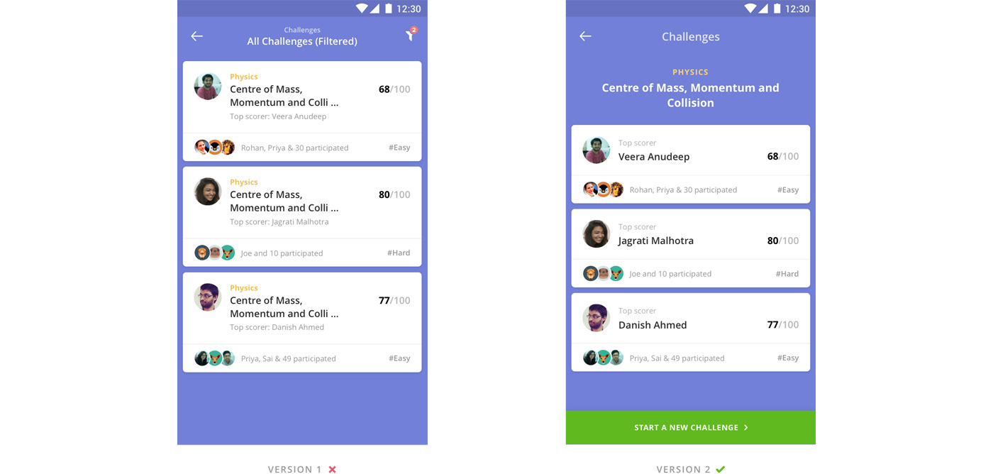
Browse by Chapter: both approaches were possible, but redirecting to All Challenges (with filter active) would have compromised user orientation.
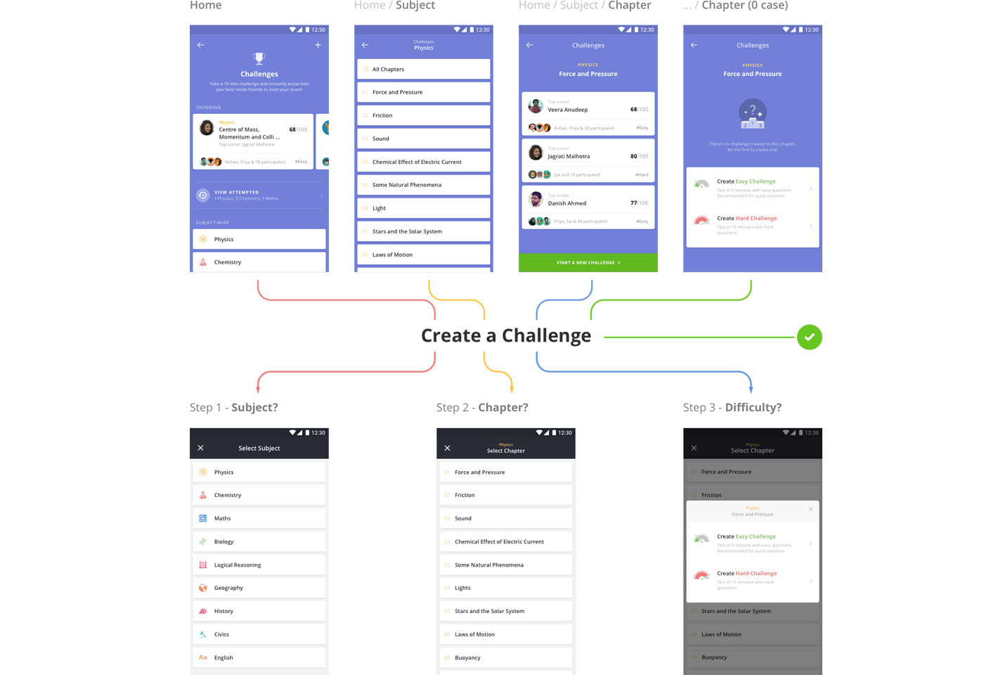
3) Smarter System
The new navigation allows the system to be aware of users’ preferences. It needs to know 3 things to create a challenge: (1) Subject, (2) Chapter and (3) Difficulty.
For example, if a user browsed inside Physics, you would only be asked for Chapter and Difficulty. If you filter by Physics (subject) and Kinematics (chapter), you would be asked for only Difficulty.
When the user runs into an empty state while browsing a chapter (i.e. no challenge exists for that chapter), the third prerequisite, Difficulty, is already embedded in the empty state. This saved an unnecessary extra click.
5) Icon Treatment
From UI point of view, iconography could determine the extent of gamification experience. We also realised that for better word association, an icon in isolation might not solve the purpose however obvious it looked. This turned out specially true for new users. Hence icons for won, leading and lost, for example, were represented by trophy, thumbs up and thumbs down along with the text label next to them.
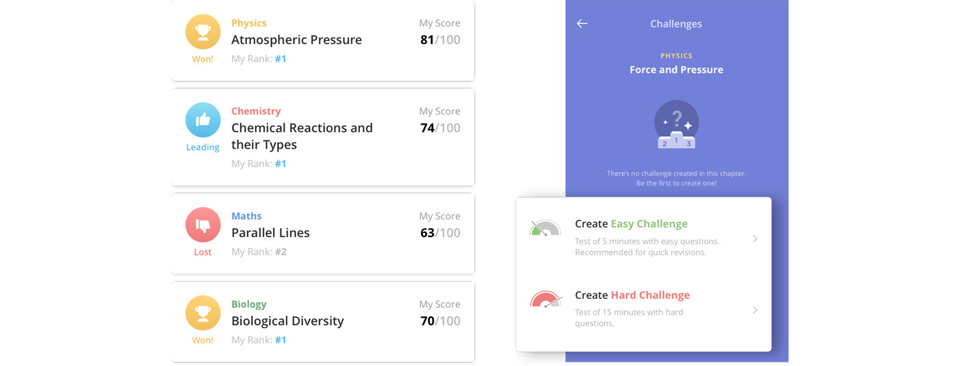
Iconography: the label for thumbs down says ‘lost’ instead of ‘lagging’ or ’behind’, since once someone surpasses you – you immediately lose the challenge.
6) Constants and Variables
What do you do with data that is common (unchanging) across all items? You club it to avoid looking repetitive. Consider the two examples below:
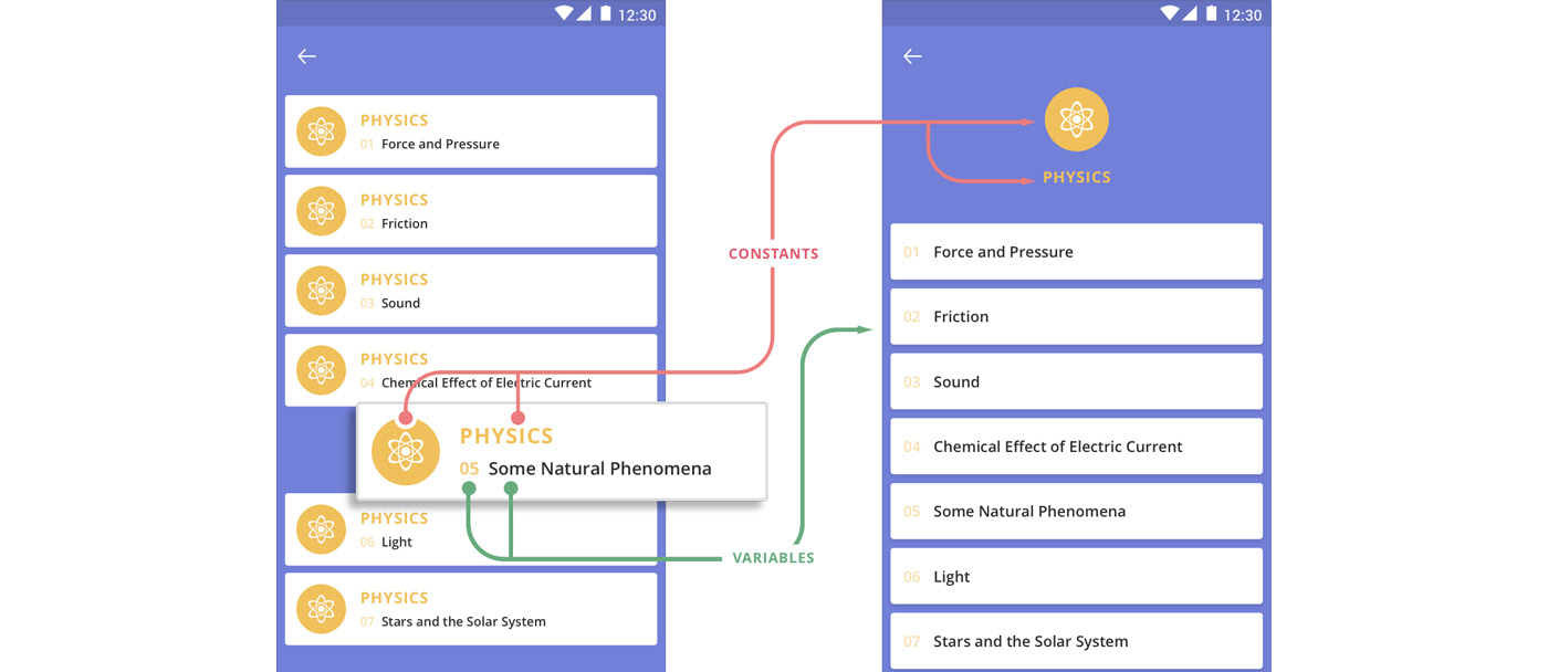
While there can be some exceptions, it makes for a better hierarchy to place such constants as common metadata on top (or another suitable location), and let the variables be part of of each item.
On the home page, each data in a trending card is a variable. But once you navigate into a subject, say Physics, the data immediately becomes a constant. If we continue using the same card here, too, the tag Physics would appear on every single item in the list.
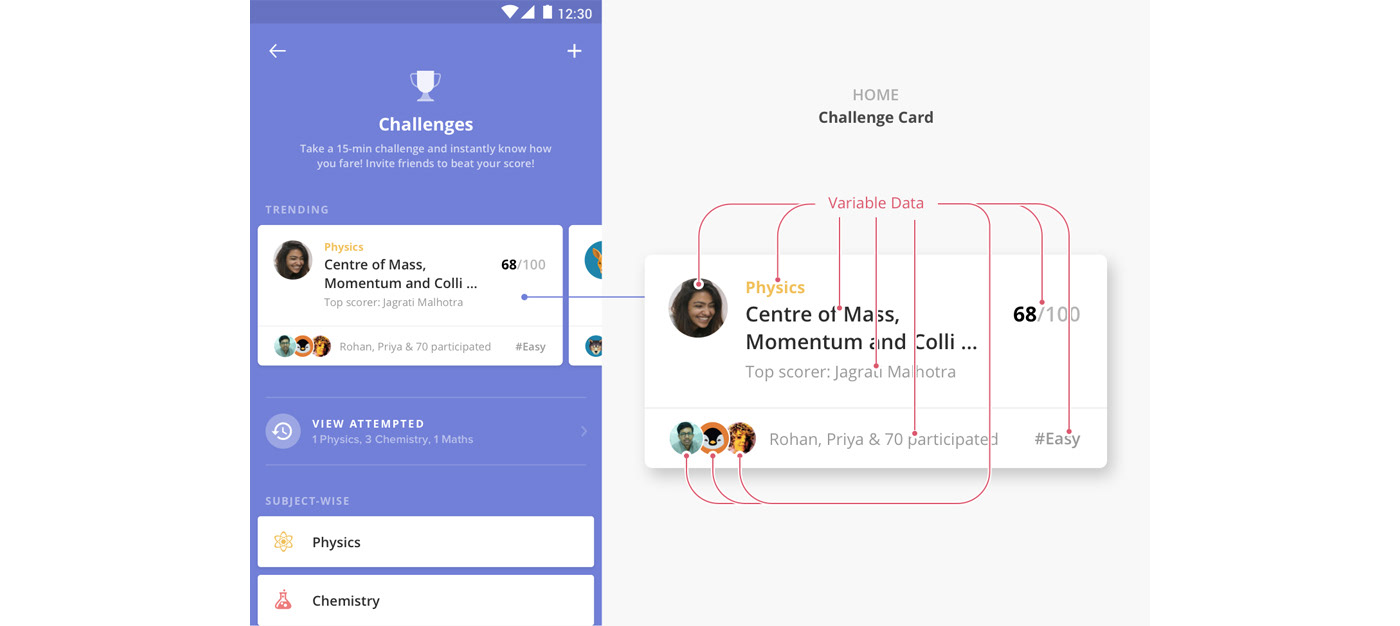
Home Screen: all units in the Challenge card are variable.

Browsing inside a subject takes Physics (subject name) out of the card.
Similarly, drilling down Physics > Centre of Mass (chapter) makes both the subject and chapter constants. Note that on this page, with the chapter gone from the list item, the name of the top scorer becomes the item title to maintain visual consistency.

Browsing inside a Subject and Chapter takes Physics (subject name) and Centre of Mass (chapter name) out of the card.
- - -
Challenges: A Cross-Platform Experience
The new Challenges feature was rolled out across platforms: Android, iOS, iPad and Web. To fully explore the feature first hand, sign up and take a challenge here!
Special thanks to the awesome product and dev teams at Toppr who made this possible
🙌.


