

So of you may have seen an earlier version of this, which didnt exactly turn out well. I decided to re-visit the idea and decided on creating a special edition Chilli Infused gift set, to sort the men from the boys when it came to drinking Bacardi.
This is my first attempt at packaging design, which I think has turned out well. The theme was to try and create something hot, using flames on a dark background. I also applied this to the Bacardi logo, lighting it up from the bottom. I decided to move the bat logo infront of the Bacardi name, obscuring some of it from view. It is still readable as Bacardi have a very noticable type face, Perpetua Tilting Bold.
I inverted the usual black writing into white to stand out on the dark background. This seemes to give an edge to the Bacardi logo, which works well with the flame hues.
On the back of the packaging I wrote a little about the history of Bacardi as they were celebrating their 150th anniversary. Using a larger pt size to make the key words stand out.
I like this idea a lot more than my original, and I hope you do to :)
Thanks for reading!
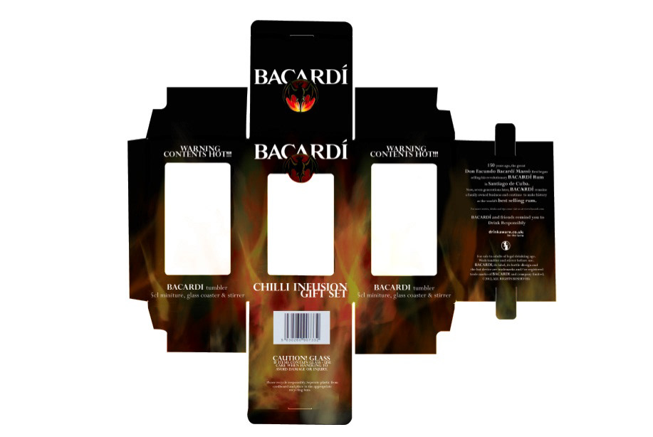
Net of the packaging design.
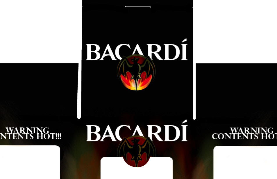
Close up of the top of the box (net).
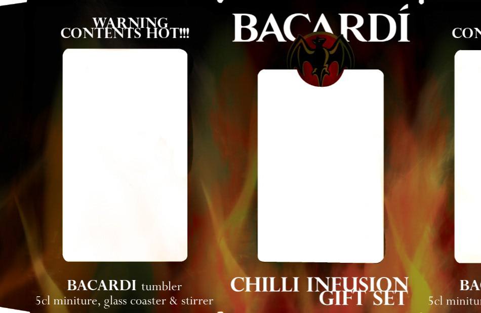
Close up of the front and left side of the box (net).
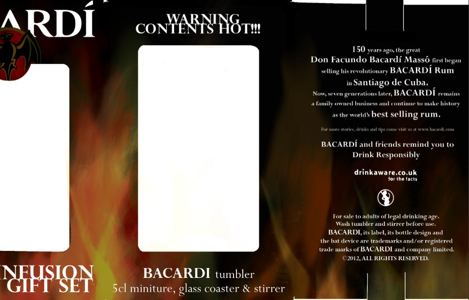
Close up of the right and the back of the box (net).

Close up of the base of the box (net).
Coaster idea for the gift set.
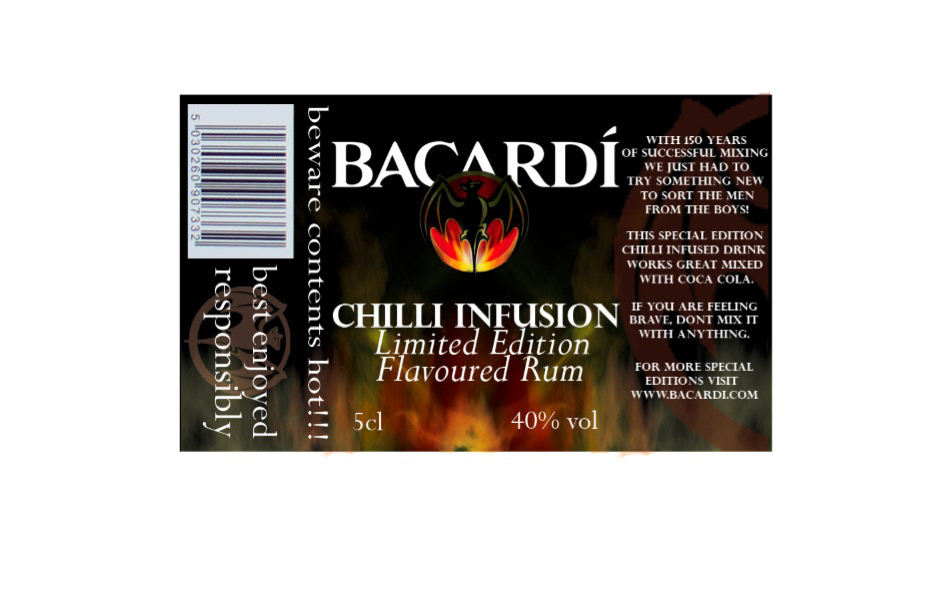
Label for miniature bottle of 'Chilli Infusion Bacardi'

Photograph of prototype box.
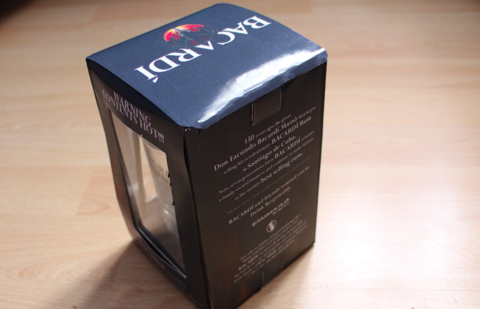
Photograph of prototype box.
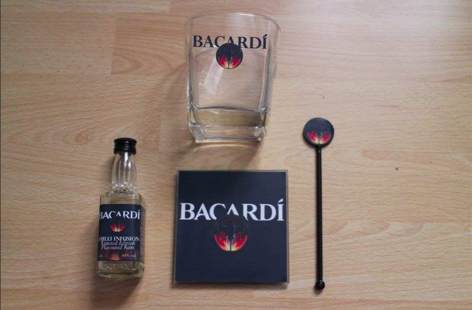
Contents of the 'Chilli Infusion Gift Set'.
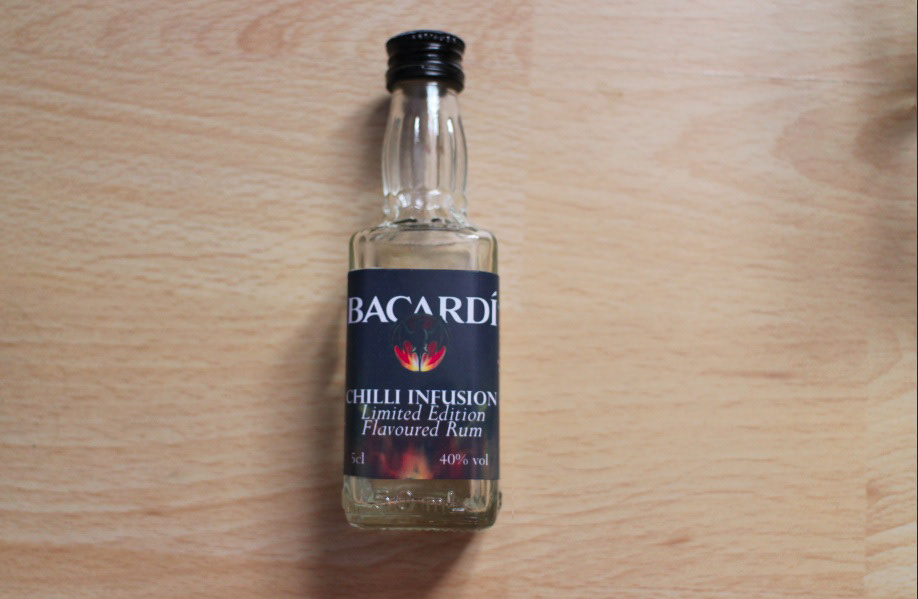
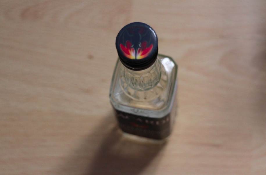
'Chilli Infusion' miniature.
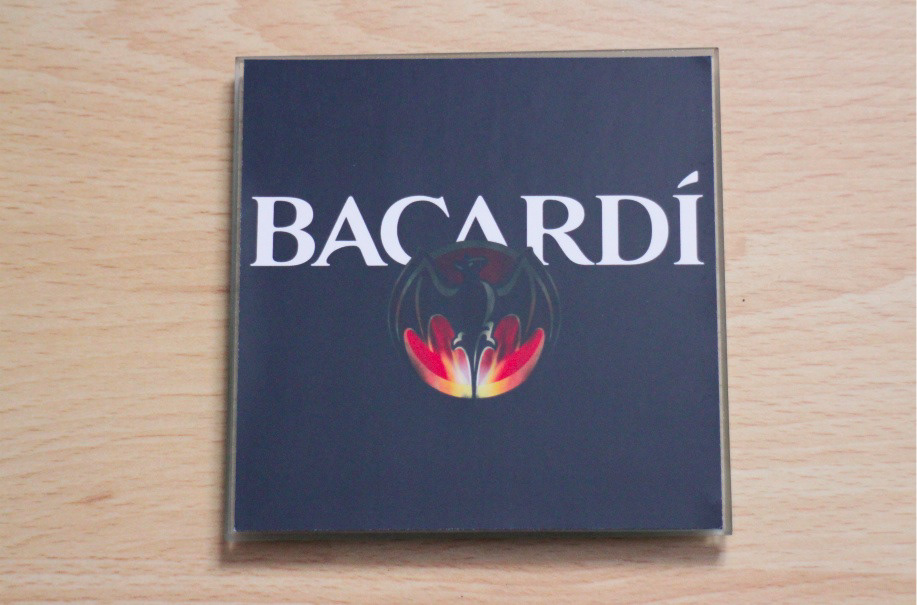
'Chilli Infusion' coaster.
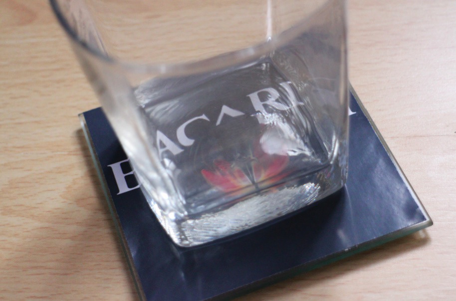
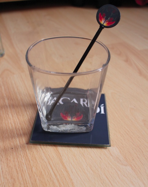
'Chilli Infusion' glass and coaster.

'Chilli Infusion' stirrer.
'Chilli Infusion' set (couldn't get the logo printed on the glass but you get the idea by now)
:)
Thanks for watching!


