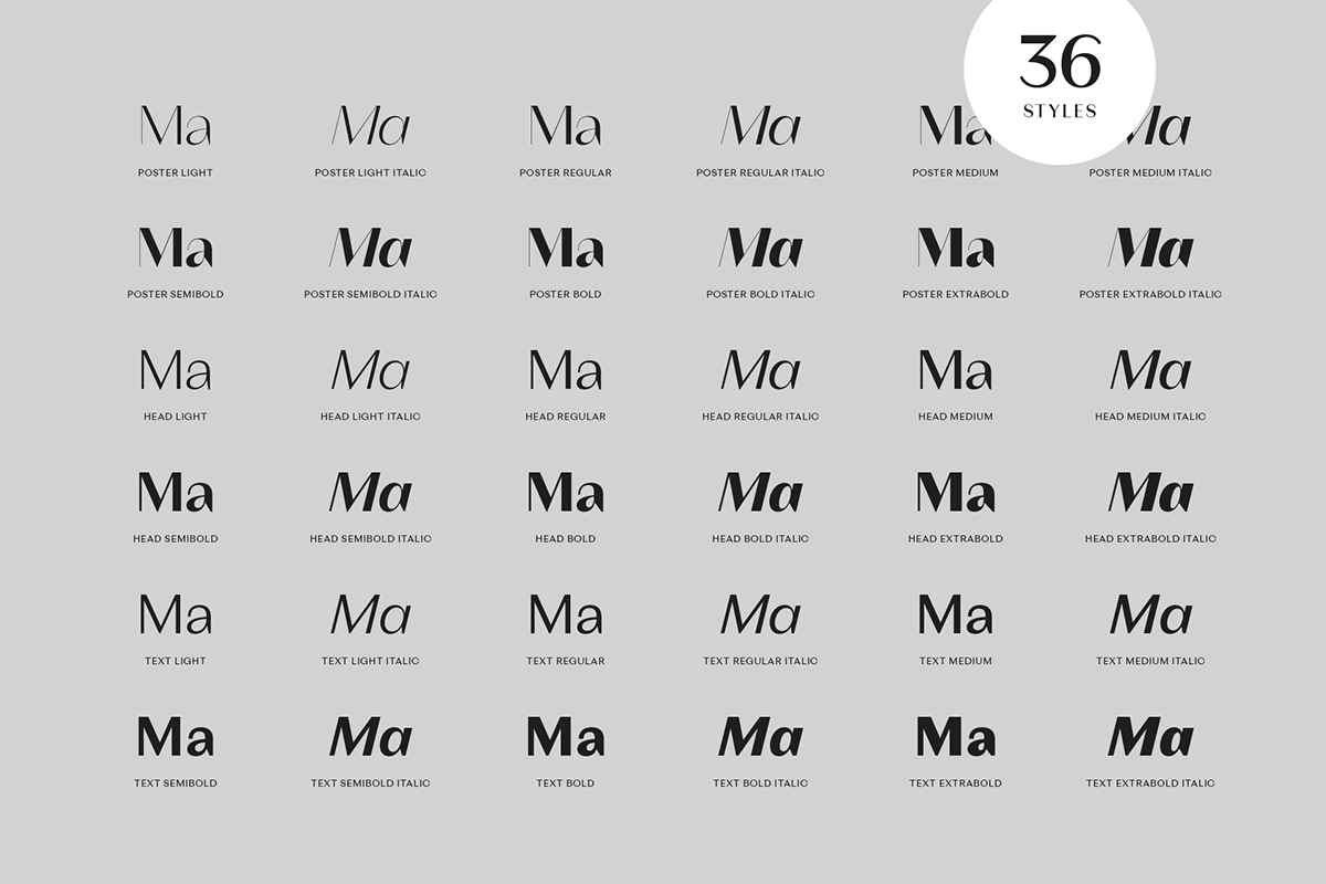
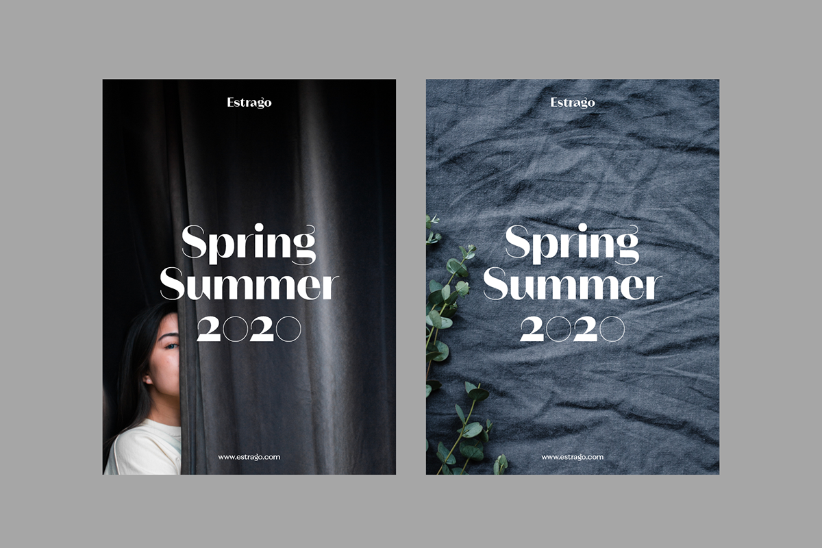
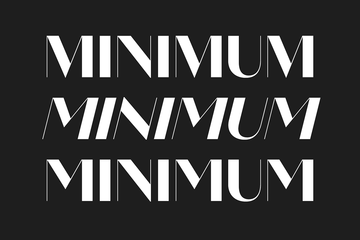
Magnat is a contrasting sans in 3 optical sizes and 36 styles. It loosely draws inspiration from designs from the early twenties century and expands them into an elegant and distinctive contemporary design.


Characteristics
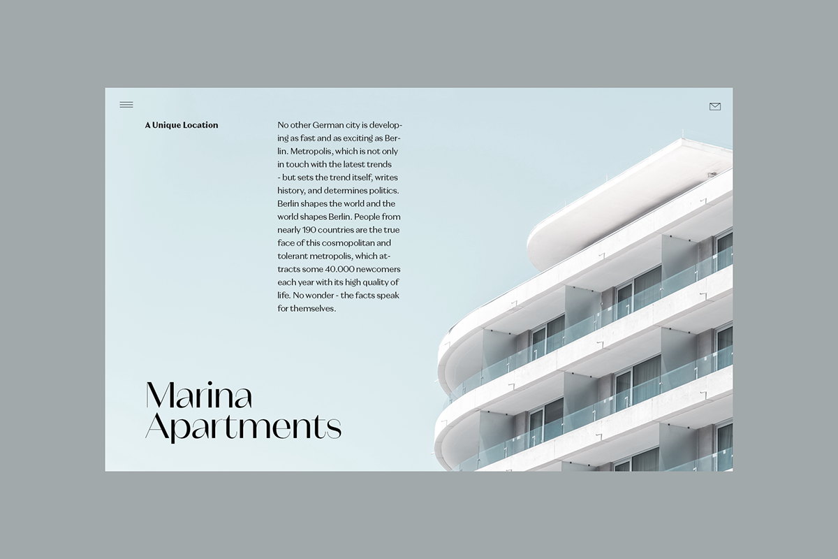
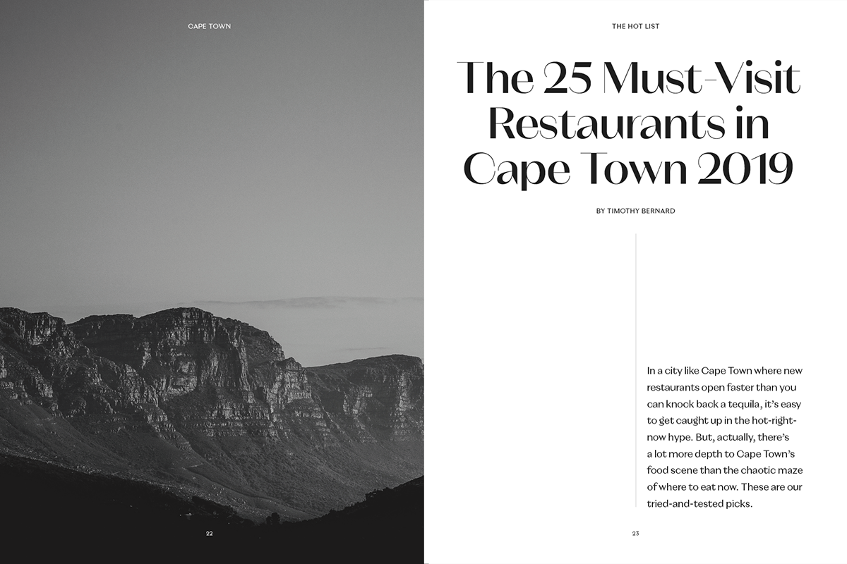
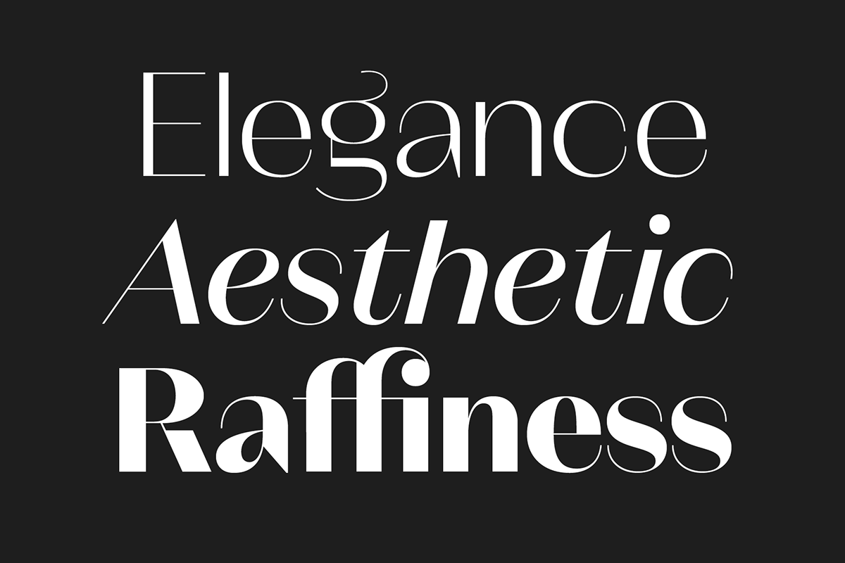
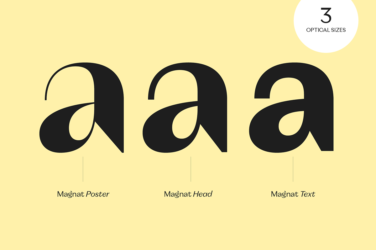
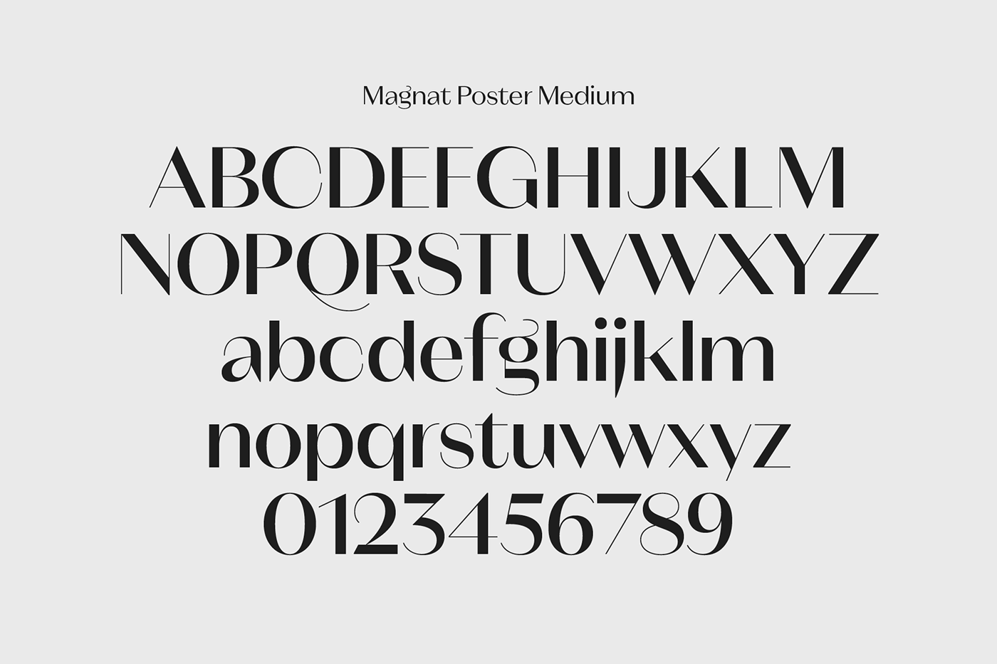
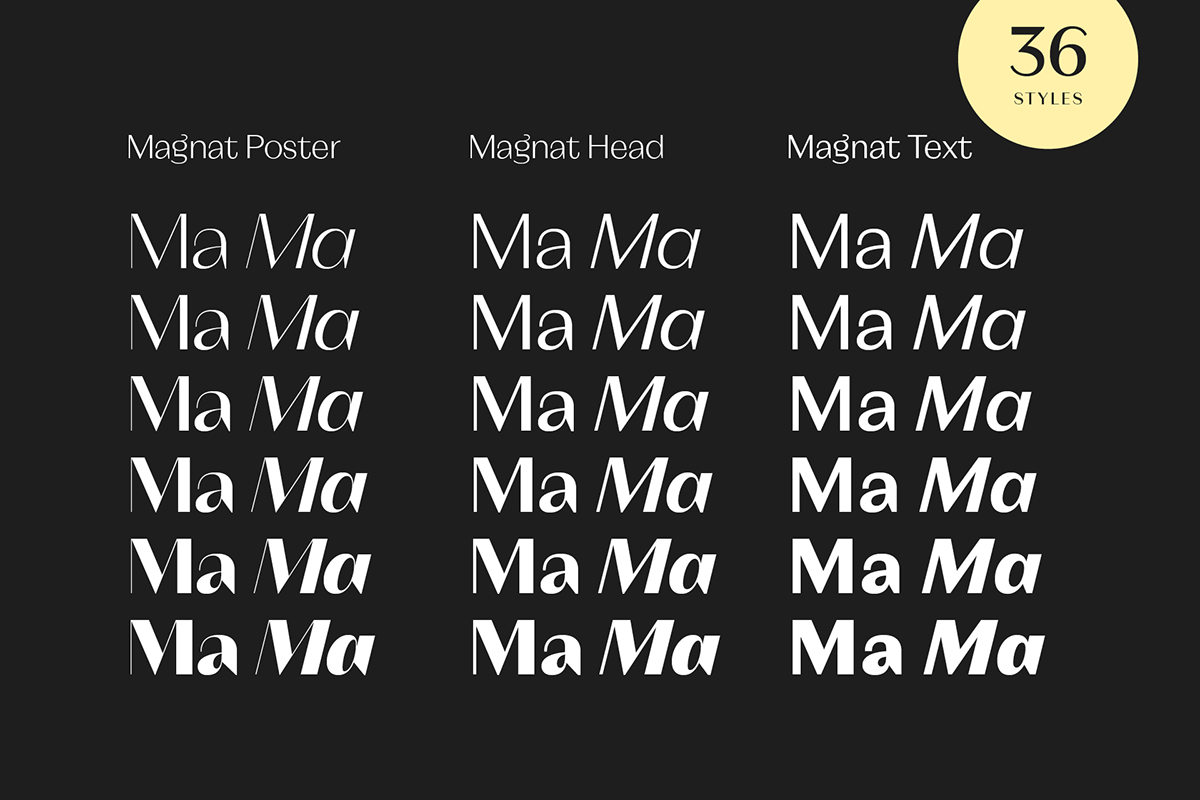
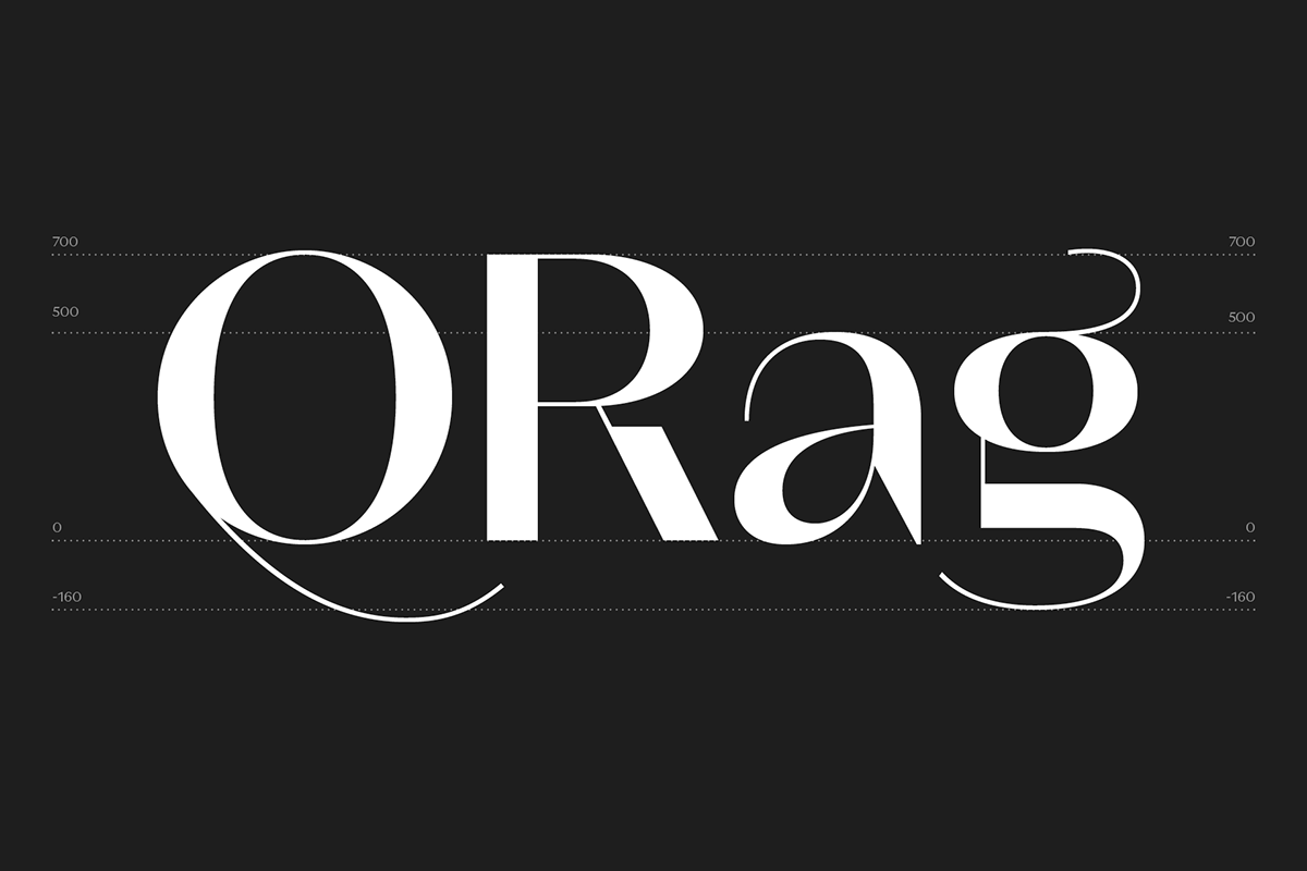
Magnat is available in three optical sizes: Poster, Head and Text. The Poster and Head styles come with a tight helevticaesque spacing, whereas the Text styles are characterized by a low stroke contrast, generous spacing and ascenders above the cap height. Playful elements such as the curvy ear on the lowercase g or the long tail on the uppercase Q break the strictness and add character. Closed apertures on C, G e, a or s in combination with the elegance of the contrasting strokes create an unconventional and distinctive overall appearance.


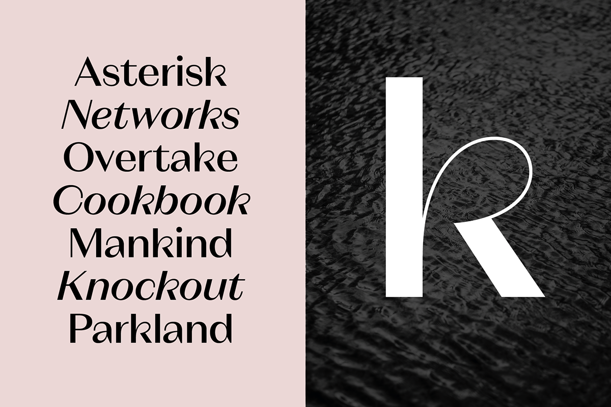
Alternates
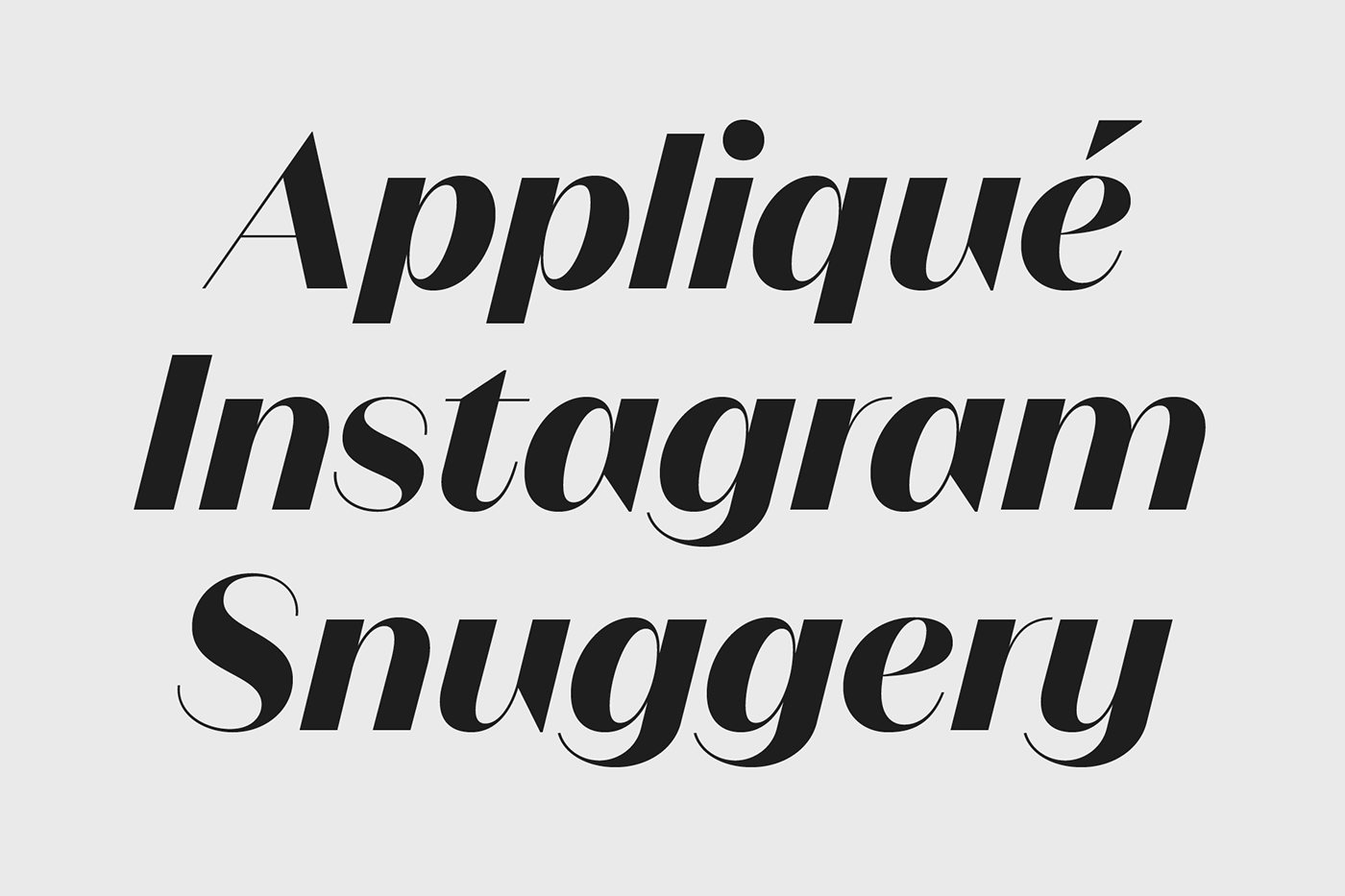
As with many of my designs, Magnat also has numerous alternative characters, such as the single-storey a, the upright-italic k, or a classic shape of the lowercase g. Each of the nine stylistic sets can change the overall appearance and create a unique character according to the project you’re working on.


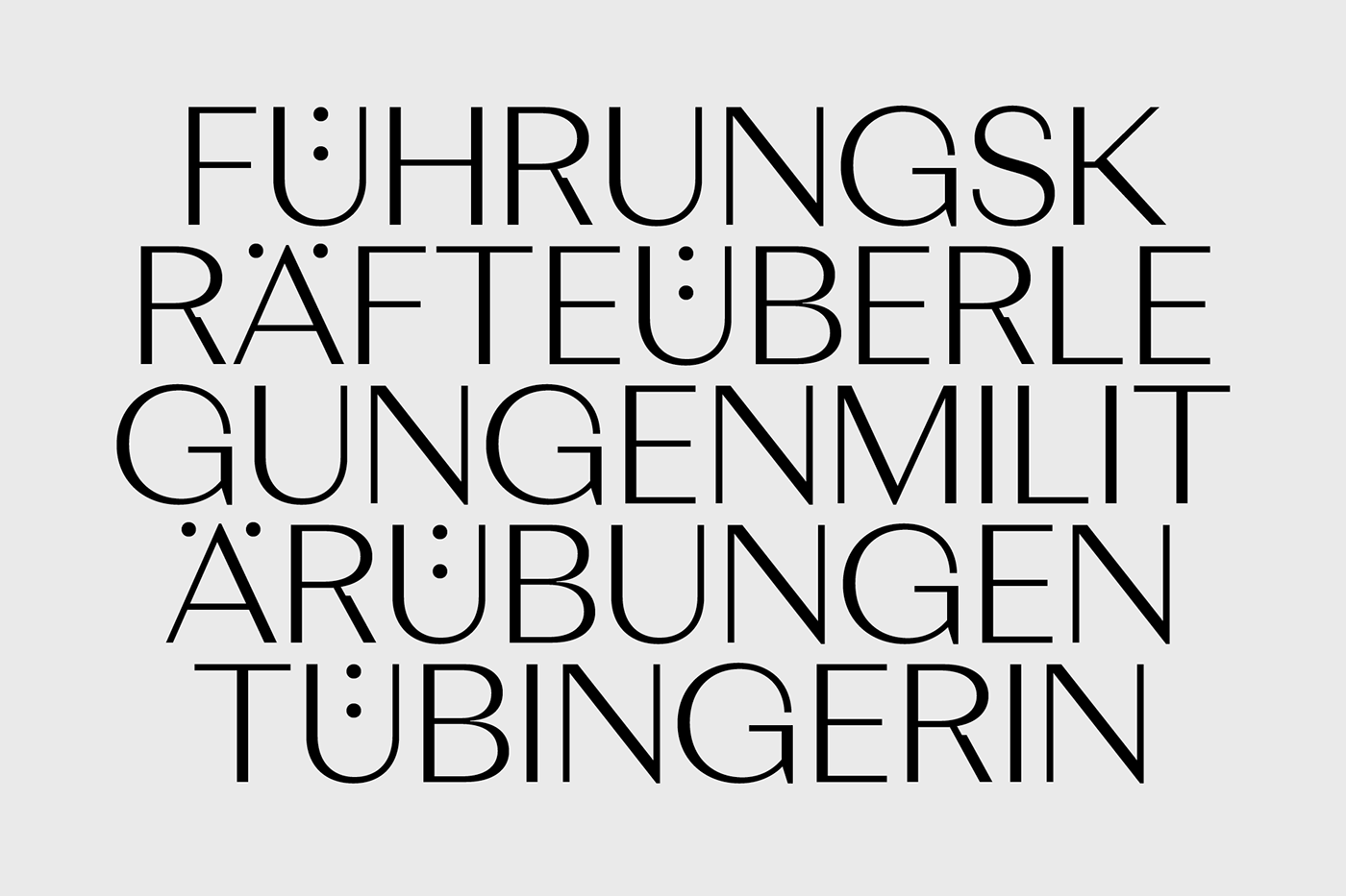


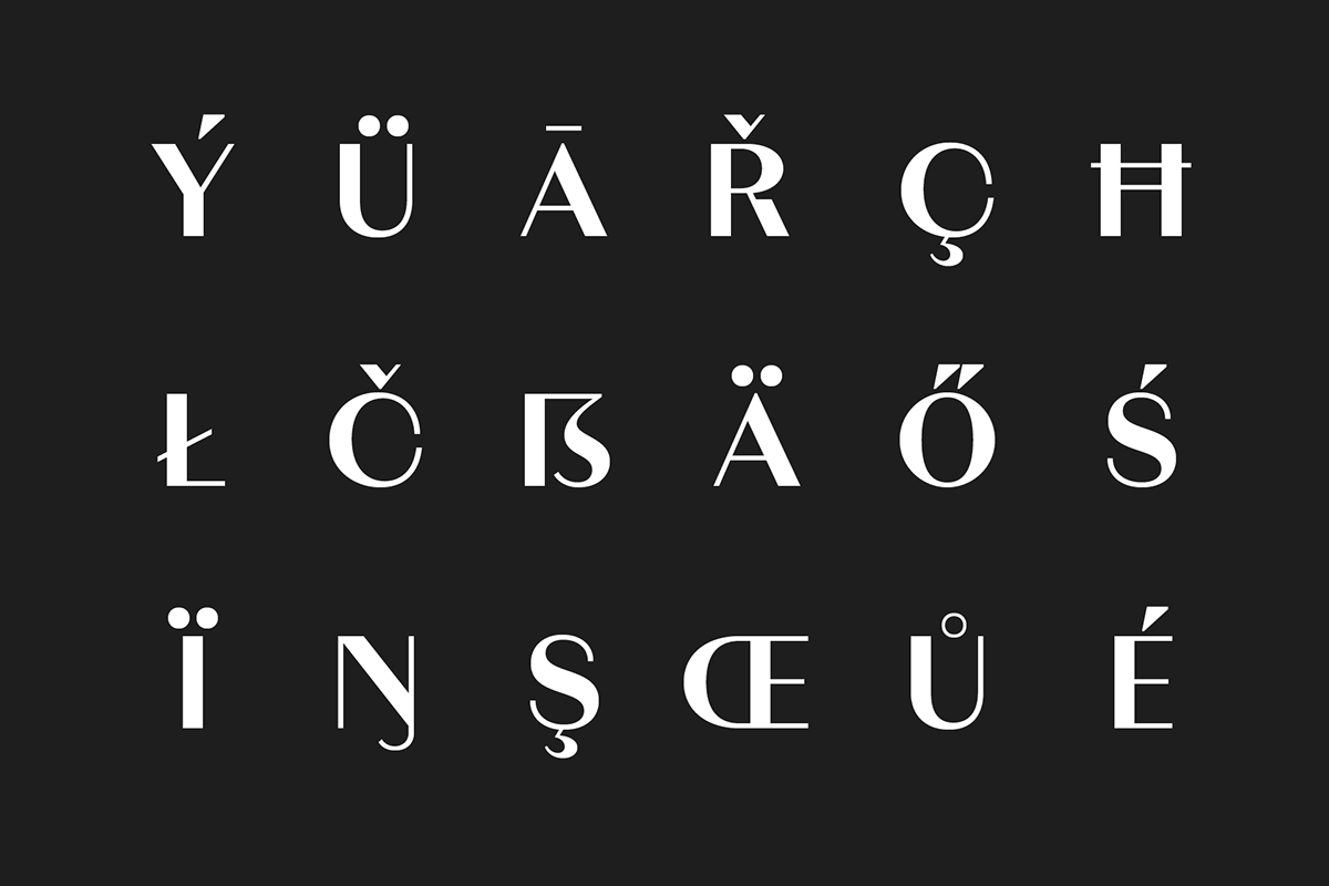
Languages
Bonjour, gracias, dank je wel. It’s all there.
Plus more than 80 other languages.


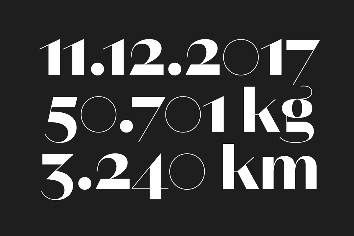
Opentype
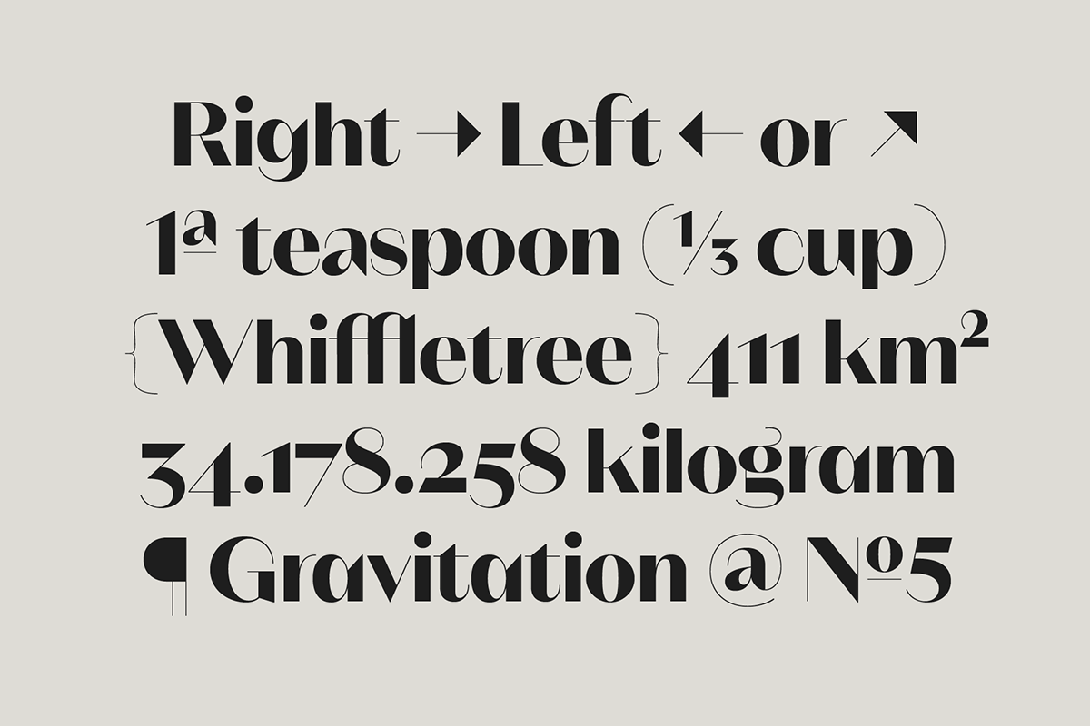
Want to make sure that numbers blend in seamlessly in your text flow, or certain symbols align properly with text set in all caps? Opentype features are your go-to solution! Magnat comes with 12 features making it a perfect choice for professional type setting.


Weights
The Magnat family comes in 18 weights plus matching italics, containing more than 500 glyphs per style. Each of the subfamilies are designed to make your content looks outstanding in every possible size.