


Projekt identyfikacji wizualnej dla Marty Niedźwieckiej – psycholożki i coacherki
Marta Niedźwiecka samą siebie określa jako „terapeutkę od życia”. Jest psycholożką i pierwszą w Polsce certyfikowaną coacherką „życia intymnego” (niestety Behance jest pruderyjny, jeśli chodzi o użycie słowa na „s”).
W swojej praktyce czerpie z wiedzy Wschodu, tłumacząc ją na język Zachodu. Do naukowego i indywidualistycznego zachodniego podejścia wprowadza wschodnią wspólnotowość, mistykę i akceptację cielesnych przyjemności.
Łączy pozorne skrajności – świat umysłu i emocji, racjonalnej wiedzy i intuicyjnych wglądów, działanie i receptywność. Pomaga się porozumieć parom, a jednostkom – nawiązać kontakt z własnym ciałem. Przywraca równowagę między pierwiastkiem męskim i żeńskim.
Ten dualizm, budowanie nowych związków i łączenie światów stały się podstawą identyfikacji.
Zależało nam, by całość była sensualna i pozytywna, ale również wiarygodna i dająca poczucie bezpieczeństwa.
Visual Identity for Marta Niedźwiecka – a psychologist and life coach
Marta Niedźwiecka calls herself „a life therapist”. She is a psychologist and the first certified coach of „intimate life” in Poland (Behance is prudish about the „s” word).
In her practice she draws inspiration from the East, translating its wisdom into the language of the West. She introduces the Eastern community, mysticism and acceptation of physical pleasure into the Western culture of individualism and science.
She connects apparent extremes – the worlds of mind and emotions, the rational knowledge and intuitive insights, acting and receptivity. She helps the couples to communicate and the individuals to reconnect with their bodies. She brings back the balance between feminine and masculine elements.
The main concept of the identity is build upon this duality and connecting the opposites.
At the same time we wanted it to be sensual and positive and to evoke a sense of security and reliability.

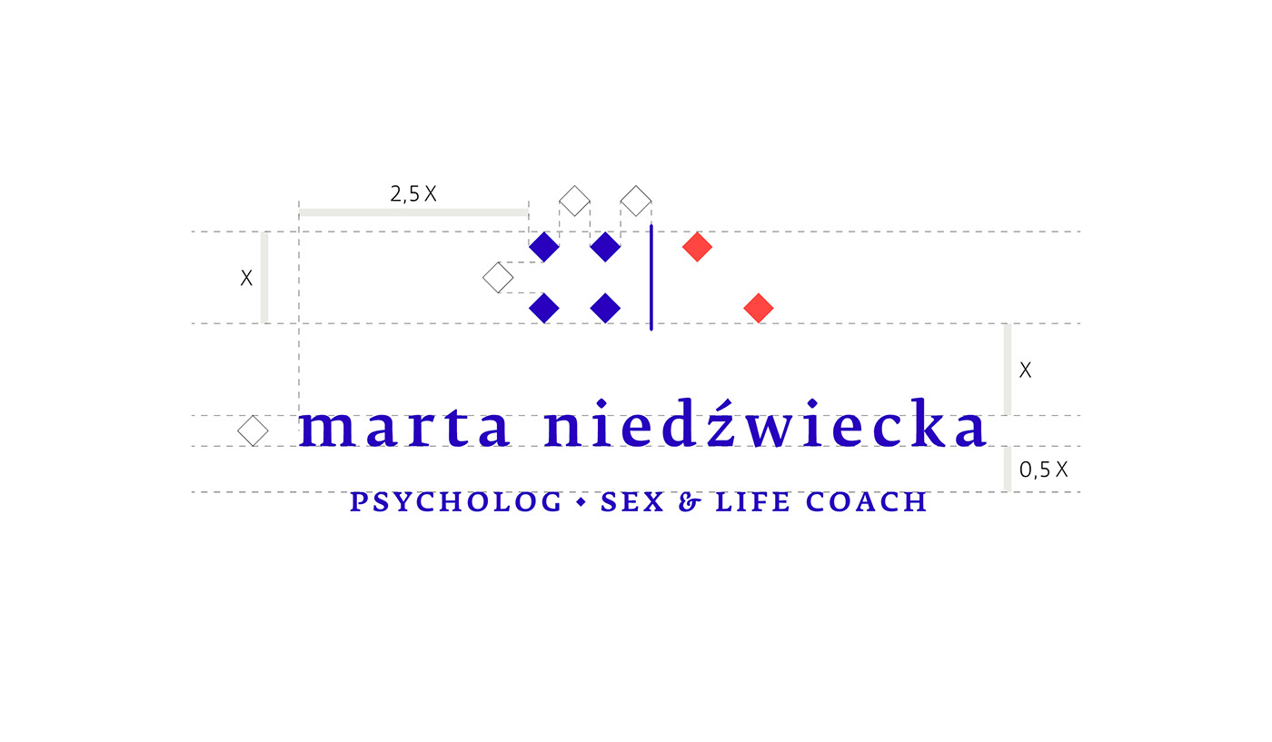
Logo nawiązuje do pochodzącego z Chin domino – gry opierającej się na zestawianiu odpowiadających sobie elementów. Forma sygnetu została wyprowadzona z inicjałów Marty Niedźwieckiej.
///
The inspiration for the logo came from dominoes – a game with a Chinese origin, where you have to combine matching elements. The form of the sign is derived from Marta Niedźwiecka’s initials.

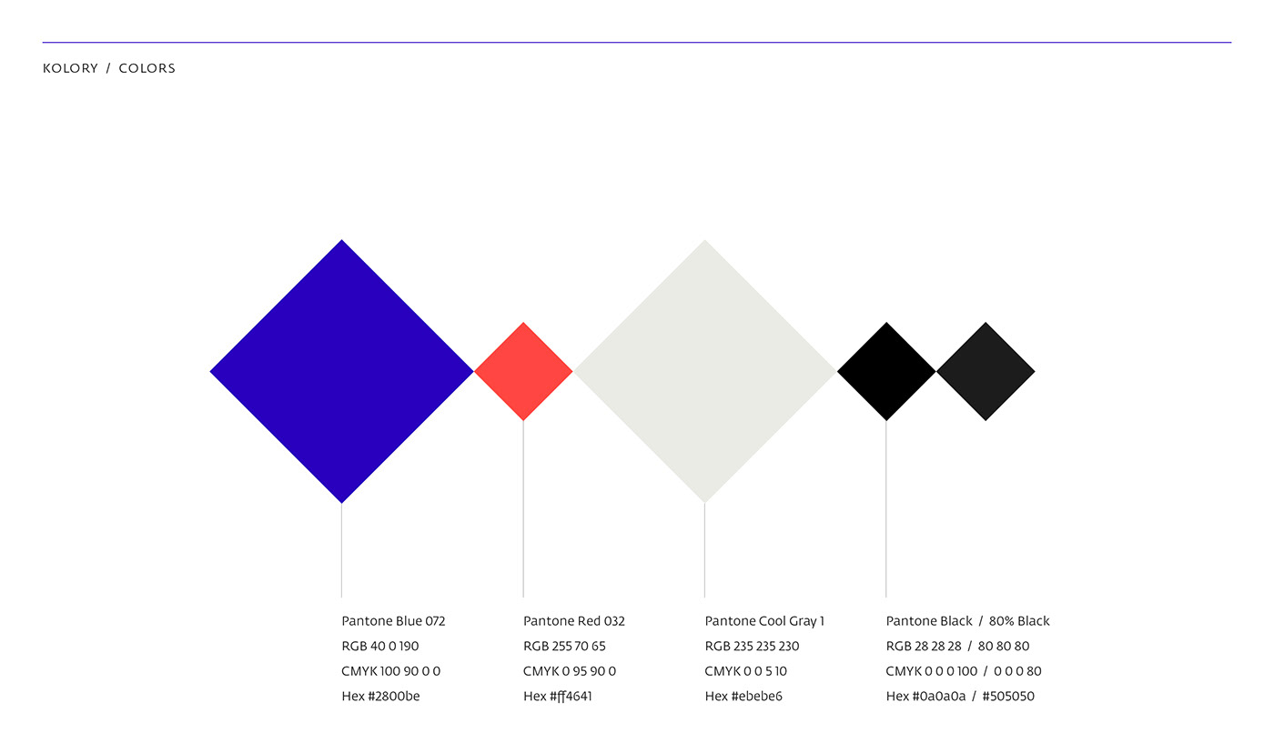
Przewodnie kolory to kontrastujące ze sobą granat i czerwień.
Podstawowym krojem pisma (np. do akcydensów) jest Fedra Serif Petera Bil’aka. Klientka chciała mieć możliwość skorzystania również z bezpłatnego kroju, dlatego kroje uzupełniające to Merriweather Serif i Sans Ebena Sorkina.
///
Primary colours are contrasting blue and red.
Primary typeface is Fedra Serif by Peter Bil’ak. The client needed also free, secondary typefaces. These are Merriweather Serif and Merriweather Sans by Eben Sorkin.

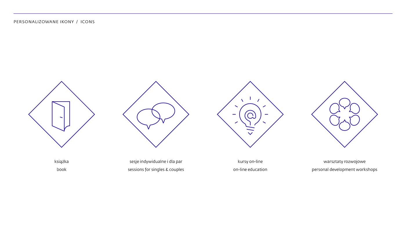
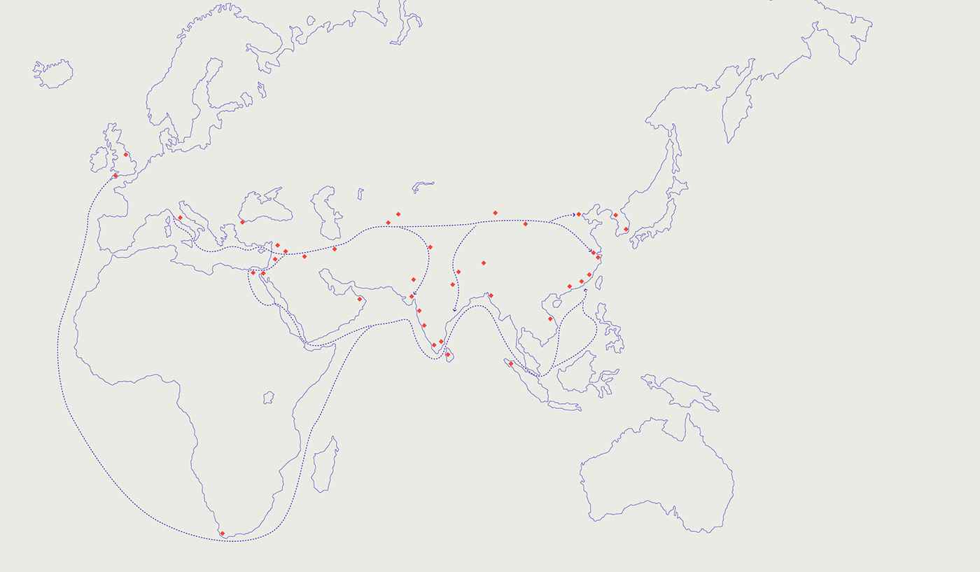
Na potrzeby identyfikacji powstał zestaw personalizowanych ikon, seria ornamentów inspirowanych tradycyjnymi zdobieniami chińskiej porcelany (delikatnej, a zarazem trwałej), a także mapa pokazująca dawne szlaki handlowe łączące Wschód z Zachodem.
///
I designed a set of icons and patterns inspired by the traditional Chinese porcelain ornaments. I also created a map presenting ancient trade routes that connected the East and the West.


Strona internetowa powstała we współpracy z Piotrem Niklasem. Autorką sesji zdjęciowej jest Weronika Ławniczak. Link do strony: niedzwiecka.net
///
Website cooperation: Piotr Niklas. Photo Session: Weronika Ławniczak. Check the website here: niedzwiecka.net


