
Nous les Vignerons de Buzet
Brand strategy - Brand architecture - Visual identity - Packaging - Sustainable design

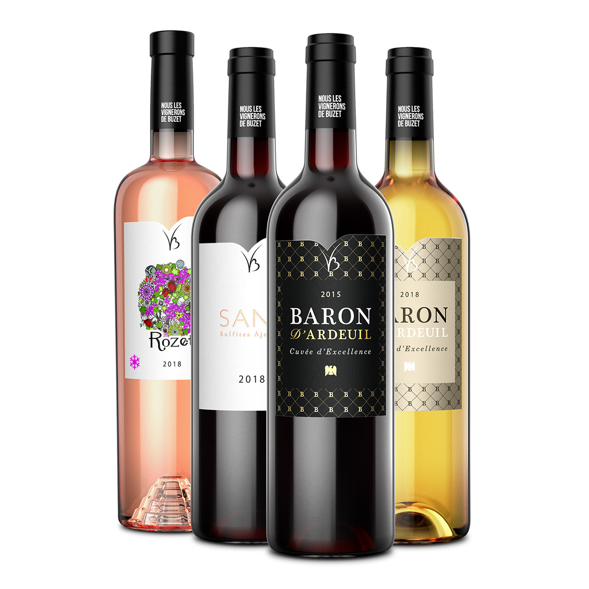
We created the new visual identity system applied to all the wines bottles (labels and capsule) and secondary packs from Les Vignerons de Buzet, in order to foster and establish a consistent brand architecture, while transmiting the brand values and its committed positioning.
The company will now have a unique capsule for all its bottles and a unique format of ecodesigned labels (choice of paper, colours, inks, printing and labeling techniques). The evolved brand name - which includes now the word "Nous" ("We" in French) - appears on the capsule like a starting or ending sentence of a manifesto, and the new VB symbol will be placed on the upper part of all the products labels.
Visual Identity for the HoReCa network
Packaging range is now consistent: while keeping the unique identity of each product, consumers can now easily identify that the different wines come from the same commited vineyard.


Visual Identity for the supermarkets and hypermarkets network


