
40 Years: The Music of Superman
Part II: Layout and Design
Client: La-La Land Records, 2018
In Part I, I discussed the restoration and reconstruction work that went into preparing the various photos and title treatments for La-La Land Records's trio of soundtrack albums for Superman: The Movie, Superman II and III and Superman IV: The Quest for Peace. In this second installment, I'd like to briefly explore my layout design process, beginning with the cover artwork.


Shown here are some the earliest, unfinished cover roughs. The "space" concept (above) was borne out of the producer's interest in seeing something that captured the magic of the final shot shared by all four films in the series, when Superman smiles at the audience before flying off screen. In order to extend the concept organically across the series, I added smaller images of the moon/earth/sun to the tops of each for variation. If approved, the plan was to digitally composite the final art, using a mix of photos from the studios and applicable stock photography. The giant net of nuclear warheads from Superman IV would have needed to be a complete digital illustration.

The unfinished "streak" concept (above) was my homage to the original 1978 poster campaign by the great Bob Peak. Like the other unused concepts, these are just roughs that would have either been composited digitally on my end, or given to a traditional hand drawn artist to illustrate. Given the tight release schedule of having all three releases approved and manufactured during the 80th anniversary celebration, it was decided to go with cover designs using only pre-approved marketing materials -- ideally the theatrical poster art


Bob Peak's "streak" painting was first used on the 1978 poster (below middle), and used again on some of the first CD album releases of the soundtrack: a 1998 re-recording from Varese Sarabande and a 2000 Rhino Records reissue (far right). For both CD covers, something about Peak’s artwork always looked strange to me... It wasn’t till I began researching and collecting materials for this project that I realized the original printed posters were much different in color than those later CDs.

That 1978 poster campaign showed a higher contrast to Peak's art, with brighter, more blown out clouds, and the overall color temperature is cool. The blues are more saturated and almost entirely cyan—with very little violet in the inks. The reds are cherry, and the yellows more pure and striking.
Look closely at the two CD covers, particularly the re-recording’s, and you can see an overall warmer temperature: the reds in the streak are nearly orange, the yellows darker and muted, and blue gets very close to purple. Having never seen Peak’s original painting, I could only guess which of the two looks was accurate. (And the hi-res scan sent by Warner Bros. did little to clarify the issue, since temperature-wise, it fell almost perfectly between the two extremes.) Since my inclination is always to hew (no, not that “hue”) to what audiences in 1978 would have seen, I decided to adjust/correct the scan for a brighter, cooler color temperature.


With the key art retouched and color corrected, I needed to address the formatting problem. Peak's artwork was designed for a vertical poster, so simply cropping it to fit a square CD cover meant losing most of the blue from the top of the streak. However, since the painted clouds are rather loose and gestural, I was able to warp the overall shape of the art, leaving the center diagonal streak untouched, but stretching the clouds around it to comfortably fill a wider format.

above: Once the artwork was retouched and color corrected, it was warped at the edges to seamlessly expand the proportions.

above: Final case and cover art.

The second album, a combined release of Ken Thorne's scores for Superman II and Superman III, was next on the schedule. A split screen-style treatment featuring both individual posters (above) was initially tried, but the producers preferred a singular image so I started thinking about the 1978 billboard (below).

The chest reveal visual was photographed before the costume was finalized (note the different "S" shield) and with a male model wearing the tights, not Reeve. The home video cover for Superman II: The Richard Donner Cut, which also used the image, partly addressed this inconsistency by darkening the image so the male model was less visible. My plan was to more aggressively retouch the image to bring the overall impression more in line with Reeve in the film.

I enlisted the help of superfan and film historian Jim Bowers of CapedWonder.com, who provided me with photos of the "S" shield from actual costumes worn by Reeve, and then followed my thumbnail sketches as reference to position and photograph a replica Clark Kent prop tie.


Finally, although the cover would be cropped tightly, the model's face was replaced with the that of Christopher Reeve. I was never 100% happy with the above cover though. Reeve's hands were a bit more slender than the male model's, who had rather large hands with pronounced knuckles. I probably would have replaced them with Reeve's own from another photo, but it proved unnecessary since the final cover design chosen used the original billboard shot with only minor cleanup and retouching (below).

Individual poster art for the second and third films was also prepared, which would be needed for the front and back covers of the interior booklet, flip-book style. Superman III's poster art was in very good shape, but the teaser poster for Superman II featuring the three Phantom Zone villains was not found in the Warner Bros. archive. In order to use the image on the booklet cover, we had to rely on a photograph of a vintage, folded one-sheet. The one-sheet had yellowed, was worn badly on the folds, and had a substantial amount of text at the top of the art, obscuring the clouds swirling around the planet--all of which needed to be retouched out.


above GIF: Less work was needed on the poster artwork for Superman IV. Mainly, the suit color was adjusted to match the color-corrected photos.
Opening spreads are essentially the overture of a soundtrack CD's liner notes. I generally start sketching page layout ideas early, concentrating on those first two pages. The sketches that come out of that stage would be unreadable squiggles to anyone else...it's really just an exercise to focus my thoughts via pencil-on-paper. From that mess of ideas, I plucked the better ones and then began to work them up in InDesign (see below), using the headlines/text from the liner notes writer to try out different typefaces, colors, spatial relationships, etc.

My final layout design, which carried through all three releases, was very similar to parts of what's shown above. I was initially drawn to the darker backgrounds, which felt appropriate considering that original 1978 soundtrack album, with its Star Wars-inspired all black cover. However, there's a hefty amount of text in these essays, and a CD booklet is a small piece when printed... with the font being under 10pts, I felt it best to use the black backgrounds sparingly, and instead brought in a more neutral grey that complemented the layout and photos well.

A key component of the layout are the small red, blue and yellow diagonal lines, which were meant to echo the 1978 poster's streak of color and also bring the three booklets consistency and a sense of upward motion. Those same three primary colors were also used as accents to give a little oomph to several black and white photos used in the booklets, and to create a visual division to separate the short sections that closed out each booklet with discussions of technical notes and information on the composers.


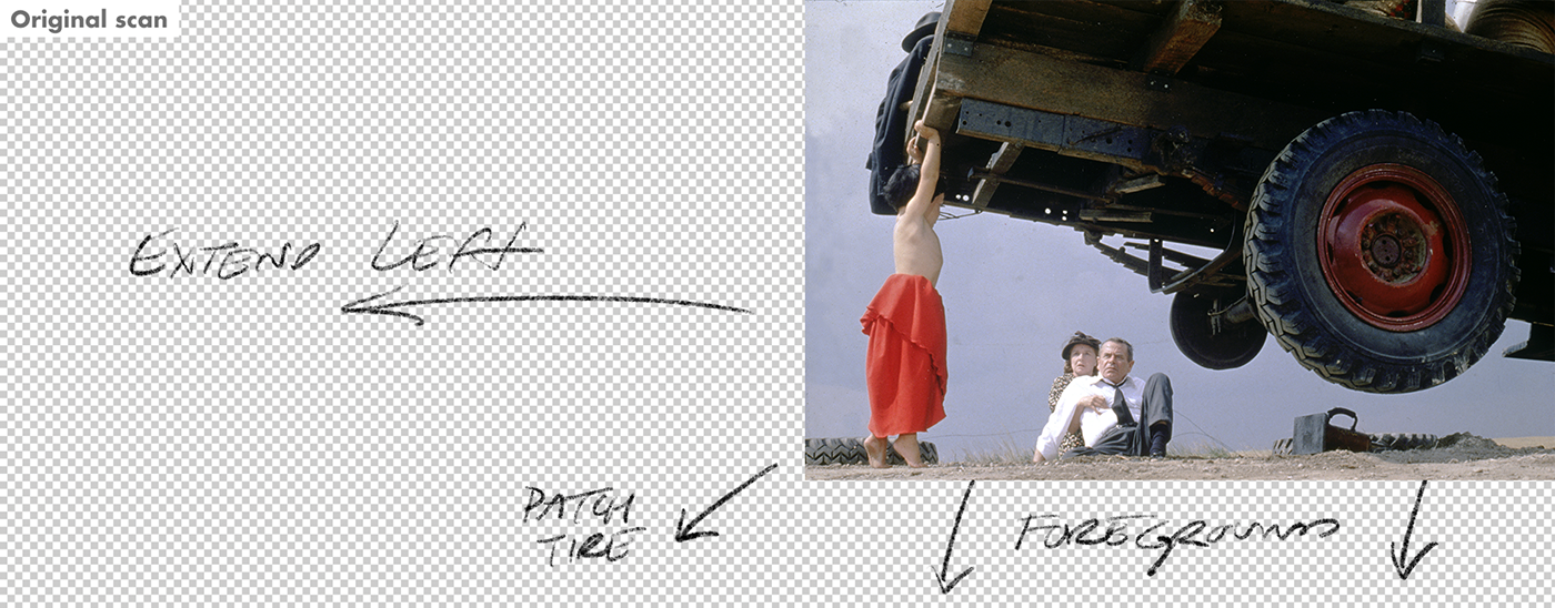
Specific layout ideas prompted me to go back and retouch a few remaining images. The above shot of baby Kal-El lifting the Kent’s pickup truck, needed to be extended in order to open up enough space to run the full track listing within the booklet across a double-page spread.

Likewise the clouds in the sky were added, partly to enhance the verisimilitude, but also to provide a lighter backdrop to more easily read the tracks and times (below).


This vertical still of a de-powered Clark finding the last green crystal needed some work before it could be used horizontally on the inside tray card. In addition to the obvious color issues that left the crystal looking white, a green glow was added to his face, the background swapped for something more like the scene in the film, and finally Mr. Reeve's shoulder was extended in order to keep his face away from the center spoke.


Originally the inside tray for all three albums would be themed around the United States flag, which appeared prominently in stills and marketing of all four films. However, certain images, including this one from Superman IV (see below), couldn’t be cleared for use and the overall flag idea was abandoned. Prior to learning this news, the vertical image was retouched and expanded horizontally to prepare it for use on the inside tray card.


With a total of eight discs spread across three albums, the design of the CD labels needed to be mapped out early. I had hoped to avoid using Superman himself more than once, as in the recent blu-ray collection (shown above). So many Supermans -- to me at least -- makes it difficult to tell at glance which film/score is being represented. I also felt strongly that a broader range of characters would better represent the series as a whole.
Plans shifted when workable (and, more importantly, WB-approved) photos of both Lois Lane and Lana Lang could not be acquired. (Sadly, Margot Kidder passed away during the production of these albums, so it was doubly frustrating to be unable to feature her character more prominently in the set.)

Finally, it was important that all three case backs be unified by a consistent design theme featuring various objects/figures in space over a planet. The art for each tray back had to be digitally composited, using both approved stills and stock photography.While the track listings for Superman IV and Superman: The Movie would be able to run on the back of the case, there would not be enough room to feature the extensive track listings and source music cues for the Superman II / Superman III set. The consistent design theme makes this less noticeable when the cases are viewed together, as in the image below.