LISSA: a collaborative data visualisation
for higher ed
(this work was realised in 2016-2017)

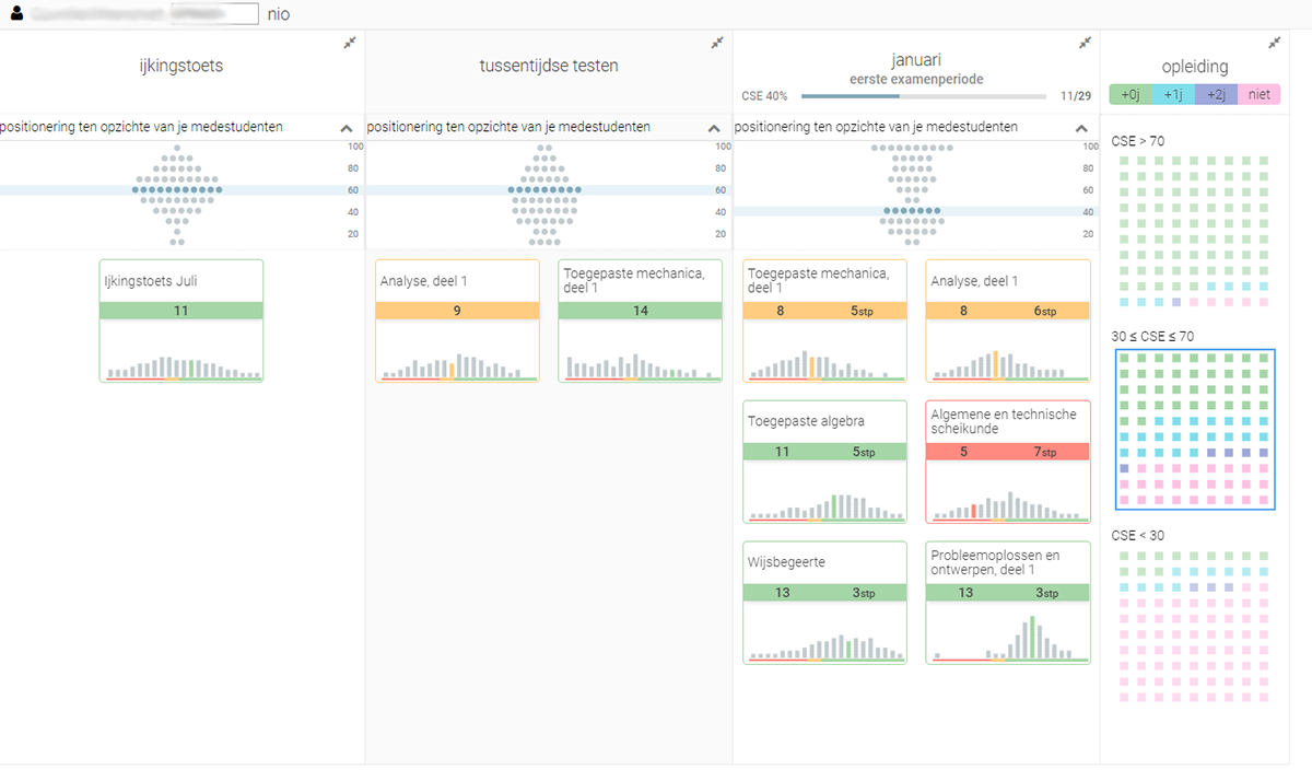
Final LISSA prototype for the post-June exams period . From left to right: positioning test results for July and September (ijkingstoets) (A), mid-term tests (tussentijdse toetsen), January and June exams. Above each period: histograms of peer performance for that period and an indicator of the student’s position in relation to grades of peers in the different test periods (B). Each course result (C) is accompanied with a histogram of peer performance for that specific course. The total percentage of credits achieved in January and June is visualized in (D). Failed courses can be planned for re sits (E, F). Length of bachelor in years is predicted through historical data (G).
Based on months of extensive research including brainstorm sessions with study advisers, interviews, but also observation of advising sessions with students (and sometimes parents), and an iterative design approach which allowed study advisers to provide input along the way, we ended up with LISSA, or “Learning dashboard for Insights and Support during Study Advice”.
LISSA supports the conversation between study advisers and students, and is currently being deployed across a range of degrees at KU Leuven. It helps students with planning of exams, visualises predictions based on historical data in order to motivate students (or demotivate to do more than they can handle). The dashboard is based on data readily available at KU Leuven, and most higher education institutions.
The research showed the importance of transparency but also the importance of the role of the adviser. This was the first example where we learned about the potential of collaborative visualisations, providing insights to multiple parties but relying on an expert to help with proper interpretation, story telling, and avoid destructive behaviour in students.
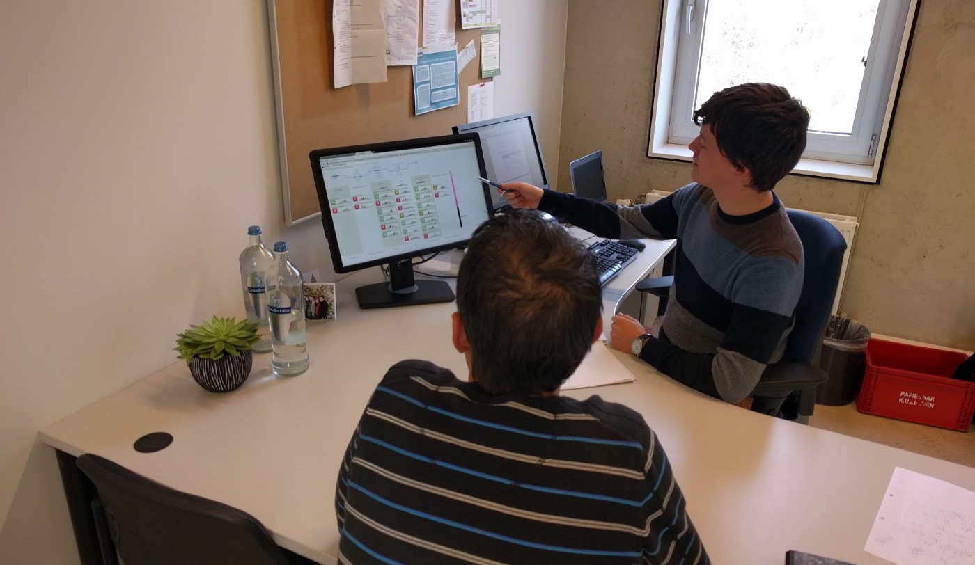
Eventually, as I finished the PhD and started working on other projects, the dashboard development was continued so it could be rolled out across more campuses. As I built proof of concepts, 2 PhD students were tasked into making it production ready. While they did a great job at a cleaner looking and performant dashboard, I'm not 100% happy with the result. For one, the visual flow/story through the entire academic year got lost in translation. Still, I'm proud to see this dashboard help first year students get better insights into their progress and help plan their future.
The current state of LISSA. The modules and the data is still there, but the flow is gone. The stacked bar charts were replaced by a prettier, yet visually less impactful solution.
A more detailed explanation can be found in this Medium post, or the journal paper published in IEEE Transactions on Learning Technologies
Bonus: early prototypes are very basic, but good enough to get the ball rolling during e.g. a brainstorm session.
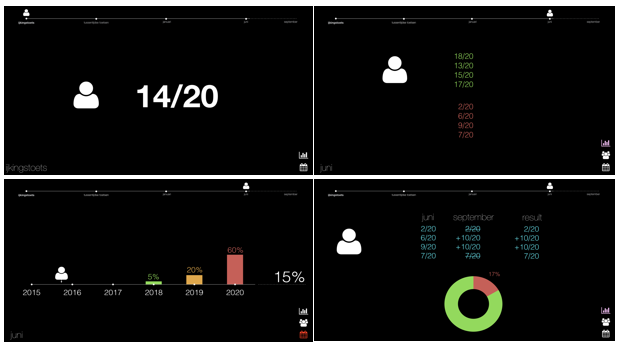
Rapid prototyping is just that: rapid! Throw some ideas on paper (or here: Keynote), and get people talking. Once you have a proper overall idea, you can start designing more detailed prototypes.
Later, I head (in this case) to Sketch. While looking quite similar to the final result, about 8 more iterations happened between this and the final version.
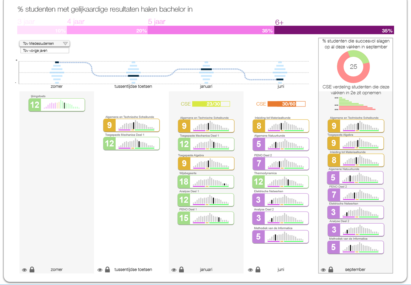
Often a proper digital, clean sketch is enough to evaluate with participants. Making it interactive is a plus, but not always necessary. Adding interaction slows down the iterative prototyping process, and makes it harder to deviate from the original design. It's better to spend a few hours on a sketch and have to throw it out, than days on an interactive prototype. There's a good chance no one will dare to alter it too much, which is very bad for the UX approach.

