PoPI: Glyph Designs for Collaborative Filtering on Interactive Tabletops
(this work was realised in 2014-2015)
Filtering data on a visualisation can be a challenge when multiple people work on a shared visualisation, for instance on an interactive tabletop. Visualisations can present data that satisfy the union of all user filters, or data lenses can provide individual views on parts of the data. To support per-user filters simultaneously across a shared visualisation, I explored different glyph approaches that complement data points with per-user filter status information.
This video gives a quick overview of the problem and the solution
Imagine 5 users attempting to explore a large set of data points. Each user wants to filter the visualisation, but have different approaches or goals. Collaborative filtering across these data points is not straight forward. Certainly not if we want our users to move freely around the tabletop. Through the use of Kinect which tracks the user positions, we can use this location data as an added visual indicator that adapts to the user position.
I created a prototype with Kinect and a large interactive tabletop to show the feasibility of such a setup. But the important part of this research was the user experience: how should we visualise data points with this added positional data so that users clearly understand what data points belong to their filter actions?
I explored multiple glyph representations and performed user evaluations (timed tasks, interviews, questionnaires) with 4 data visualisation experts and 14 researchers and students.
Below a couple of examples of glyph designs
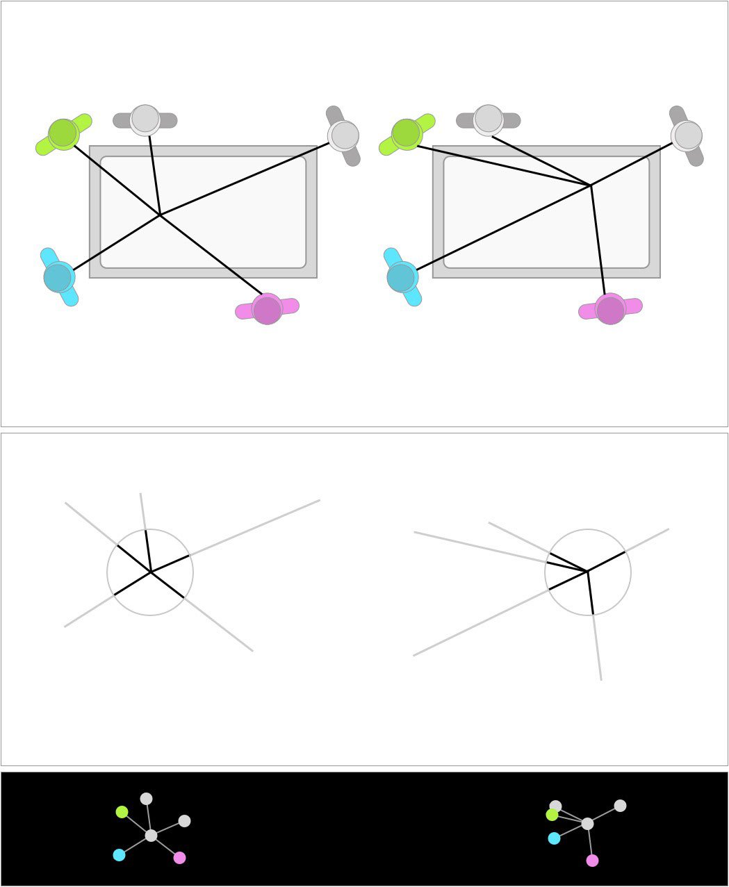
Directional glyphs, which each filter attribute pointing to the participant around the table. The issue with this glyph is that the shape of each data point changes depending on the location of the data point.
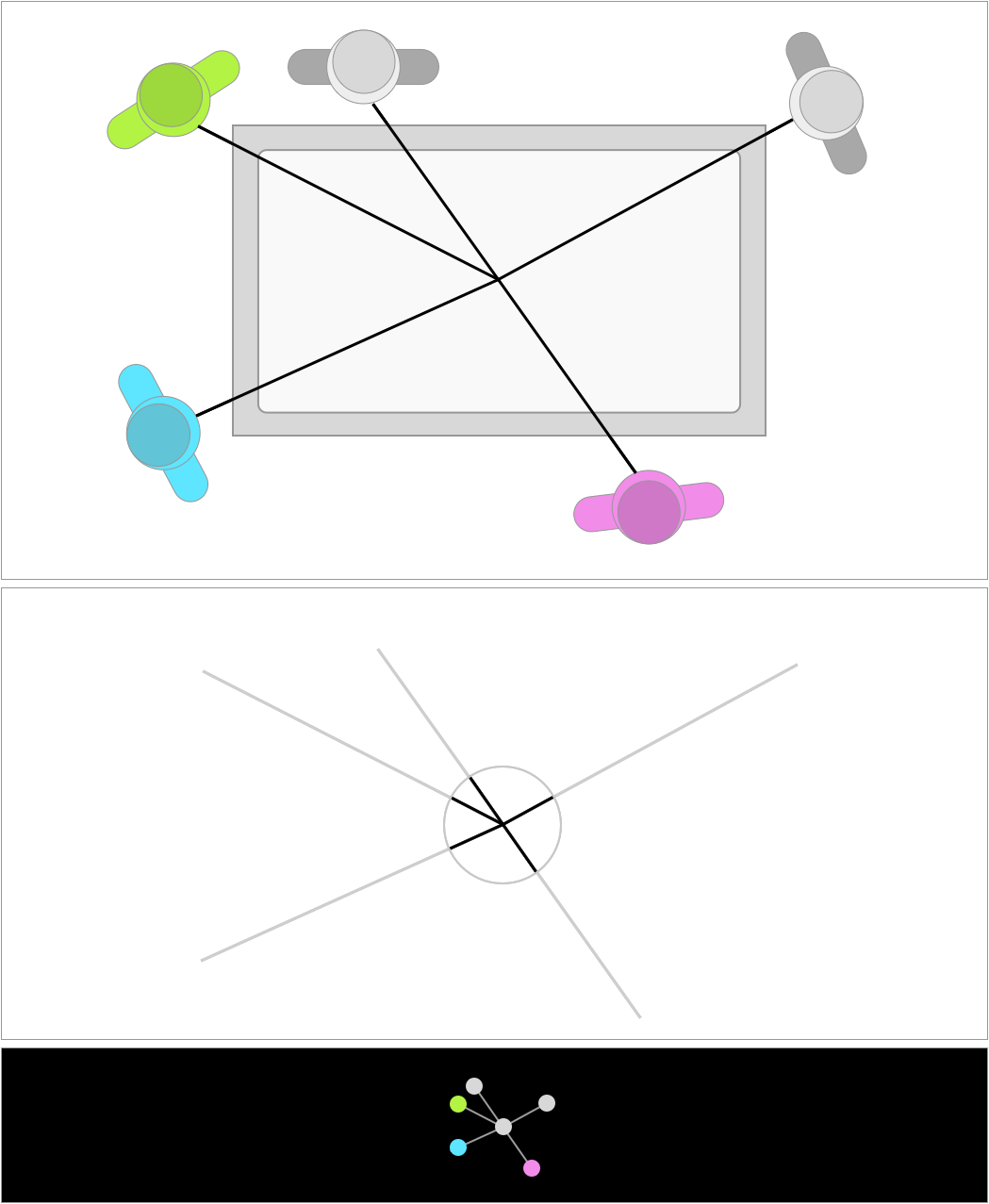
This glyph uses the position of each participant relative to the center of the table. The advantage here is that each data point, no matter its location, has an identical representation.

In the end, the natural mapping approach worked best. Other version omitted the location of participants who did not filter the data point, but this also was experienced as confusing: even though we remove information that would seem redundant, participants standing close to each other had a hard time differentiating between each other without the position of every single participant.
For a more thorough look at the research, check out the paper published at the Eurographics Conference on Visualization 2015, or get in touch.

