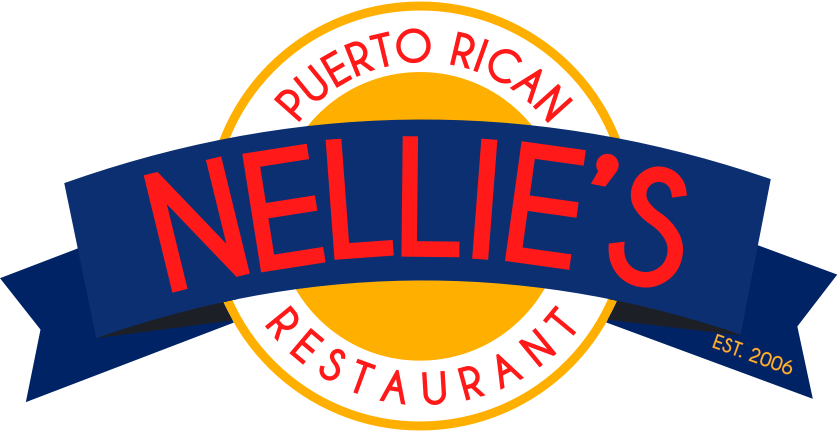
Nellie's Identity Refresh
Logo and color refresh for a more lively, exciting, and accessible identity.
There are two reasons for this refresh.
First, the colors always seemed off for this brand. The restaurant itself is a fun, lively, and familial dining experience. The previous color tones just did not do it justice.
Secondly, we are working on making brands more accessible meaning more enjoyable and legible for all including individuals who have color-blindness.
Our identity refresh checks both of these challenges off the list.
Logo Identity Pre20


