W&P Rebrand
Art Direction, Branding, Logo Design, Packaging,
W&P Design Co-founders Josh Williams and Eric Prum launched their first product—the Mason Shaker—in 2012, and since then, they’ve been dreaming up, designing and manufacturing fresh ways to (literally and figuratively) shake up your everyday encounters with food and drink. Seven years later they’ve launched 6 sub brands, developed over 250 products for the kitchen, bar, bookshelf and beyond, and shifted from selling to small boutique stores to partnering with large national retailers. Their logo, website, and brand needed to reflect the new face of a fast growing company.


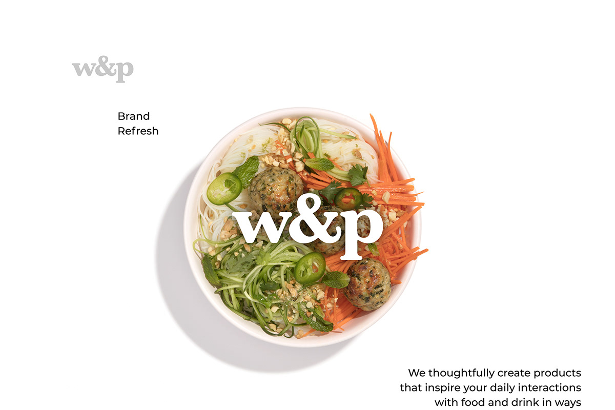
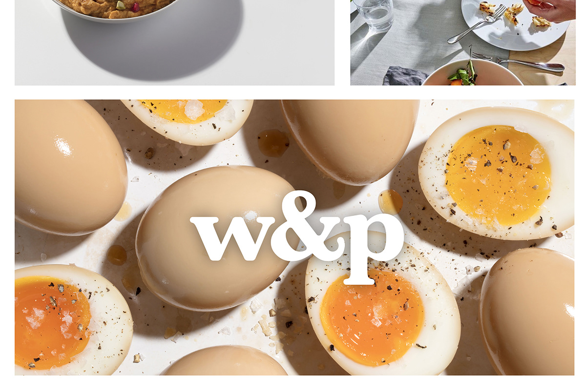
The old logo was based on Raleway, the new is based on a modified Baskerville Bold. Notable in the rebrand is putting the ampersand in the center, symbolic of putting the "and" in the forefront. W&P sees the "and" as doing more, incorporating more, and bringing new ideas together. I chose lowercase for a more casual and approachable feel rather than a stiff all caps read.


