This is the design for a Human Resources Consulting firm of a very good friend of mine specialized in executive headhunting at Kazakhstan.
We want to highlight two things: it's got both a human touch on one side and a corporate consulting firm on the other. It's about people and we want to transmit that message mainly. Then the rest. Relationships with companies as well as with candidates are very personal and that is what we want them to feel with the whole image.
Image: We want to transmit both an informal and colorful image, as well as a it is a solid and professional consulting firm. With the image we choose to represent our companies we transmit constantly a message, not only with words, but with colors also. It's about attitude.
Fonts: I've chosen Amerika Sans because it also can become corporate (when in Caps) or informal.
Anagram: We wanted to use the colors of the rainbow. Another concept we want to transmit is that with your services, both companies and candidates will make a 180º turn in their lives, there will be a before Iris Consulting and an after Iris Consulting. It'll become a milestone, like the change of B/W to Color. It also represents a spiral stairs made of colorful steps that takes them to the highest point always. The company will make them grow, shoot up, and help them feel better and better. Iris Human consulting is the stairs to improve their carreers and their lives.
The first design was modified so it becomes more curvy, not so straight, and turned it so it is like an 'S' as in the first letter of my friends' last name and the first letter of her partner's name. The stair is still represented as well as a bar chart that show how the graphics of the company will turn up with the Talent provided by Iris Consulting.
Colors: I've chosen the raibow colors for the anagram, of course, and the beautiful cherry color (C: 0 M: 100 Y: 50 K: 0) for the name, since it's not too used and it shows that the business is run by women, with the feminine touch to do things.

Sources of Inspiration

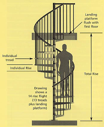

A design of a Nautilus Shell with the colors of the raimbow I made at the beggining of January.
First Design

I wanted to make it in a way that steps could be seen better, so I came up with the Second and Final Design.


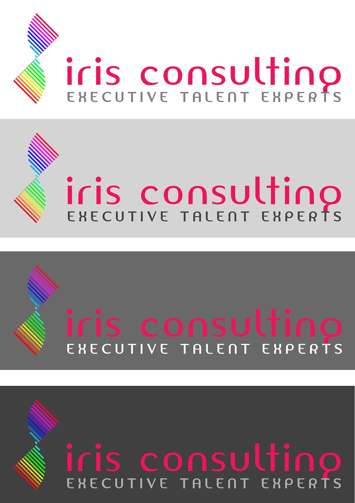
Different background colours to see wich one highlighted more the logo. Extremes were the chosen, since white is the universal background and the dark grey (#404040) makes a great contrast with cherry color.



I still have to create more material, but for my friend it was enough to love it.
Hope you love it too.
