


Lympo.lt (not to confuse ir with Lympo app, that rewards users with Lym tokens for taking fitness challenges) is a platform, where everyday people can find a coach in Lithuania.
When I was assigned to the project, my main tasks were to streamline the connection between the coach and a potential client. It was one of the biggest projects I’ve had a chance to take part in and it was quite a learning experience. I’ve had a chance to worke with almost every aspect of the project: prototyping, copywriting, conducting user tests and interviews, UI design, branding, design system, social media marketing...

The problem…
Previous version of the website had “one page for every problem” approach. The landing page was serving as a coach listing and filtering place, place for basic product information and a place for potential advertising. So we started from here…
And one major elephant in the room was, that the whole project was designed with desktop users in mind, despite the fact, that approximately 60-70% of users were using mobile phones.
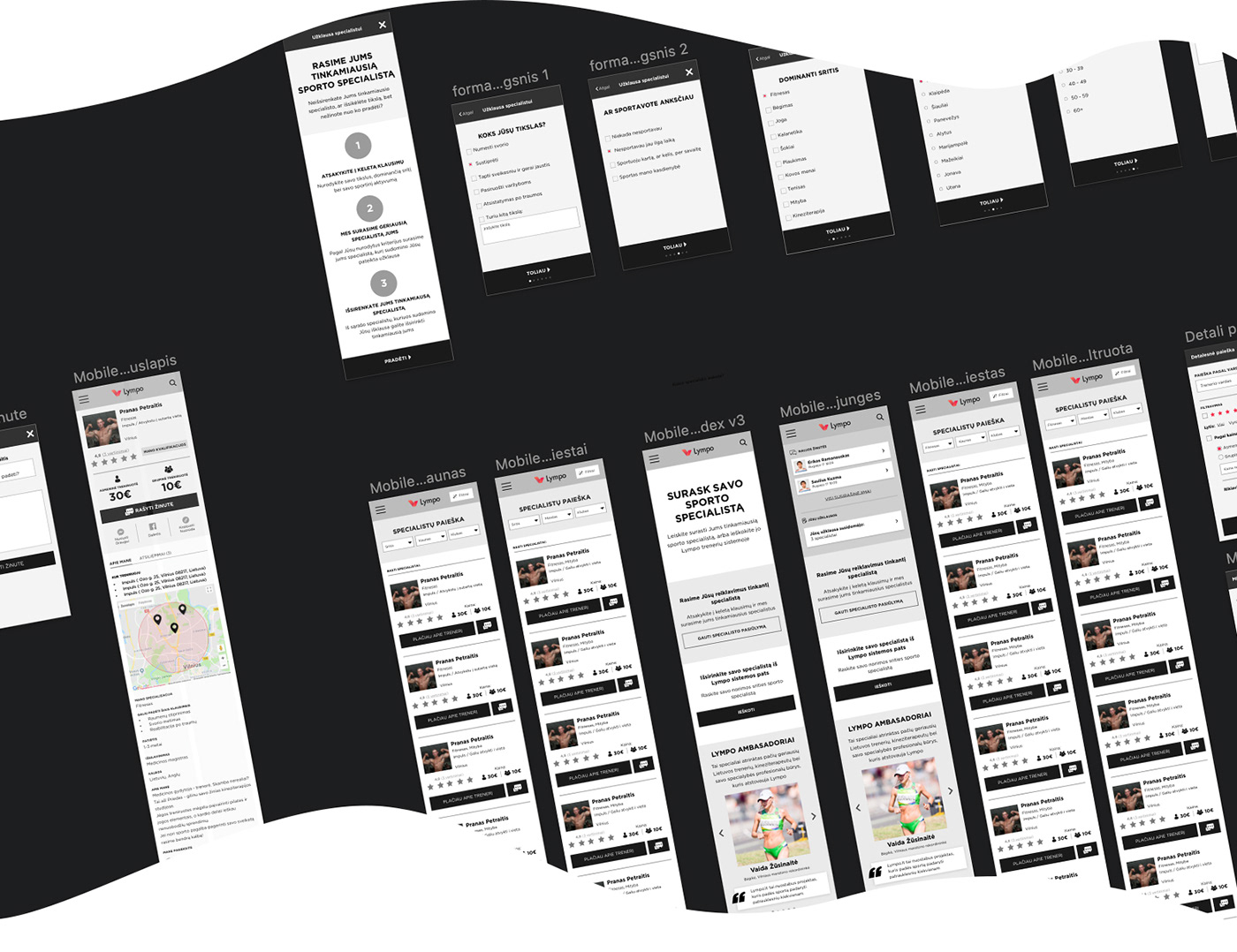
An obvious idea…
After numerous prototypes and testing we ended up in a pretty good place, where we solved the most crucial most painful problems. Even though user paths seemed pretty fluent, we felt that something was missing....
So we sat down and started looking at the information that we gathered from all the testing and user interviews. And we found that different users had different needs from potential coaches (obviously!) Then we thought… what if users would post their needs, problems and expectations, then the coach, who felt he could help, reply the inquiry. That way users could not only browse through numerous coach pages and write each one of them, but could pick from those who replied to a specific inquiry.
The feature was quite successful. The traffic wen up, coaches got more engaged, replying to user inquiries, and users narrowed down their searches this way.
A few takeaways:
Content is the king
It's too easy to overlook the importance of a good copy. It doesn't matter how good and promising the product or the feature is, it's pretty worthless if your user can't understand you. One of the most painful points to our project was our text. It took quite a few revisions until users could understand everything we wanted to tell them.
Don't punish your users if they don't act as you want them to
We spent hours thinking and planning how to make our users engage with coaches more within our platform. We’ve tried all the silliest things… Even limiting social media interactions! (Can you believe that?) But in the end we found that we are no match for users habits and we decided to implement even more ways to communicate: email, phone number, facebook, instagram… And to our surprise, that increased communication rate.


