Heim (meaning Home) is a concept i created for the cafeteria in our school in a contest.
My design is based on Norwegian cuisine, and is inspired by the modern family,
that is not afraid to cook based on traditions from different parts of the world. Heim focuses
on nutricious meals with a home made touch. Many of the students in the school
where the cafeteria operates, are living away from home for the very first time. With a stylized concept
inspired by the Norwegian home through the ages, the intent of the profile appearance is to
provide a recognizable and safe atmosphere.
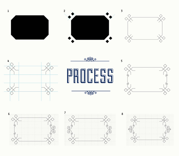
I wanted to design a modern version of something that is essentially traditional.
Examples of this include the rose pattern, embroidery, ornament from jars,
patterns from the cup towels etc. The idea was to retrieve relevant items
that could help build up a strong brand.
The colors are obtained from the Norwegian cuisine in the 50's (dark blue),
the fresh and healthy food (lime green), and the warmth and safety in the
tree structure (brown).