
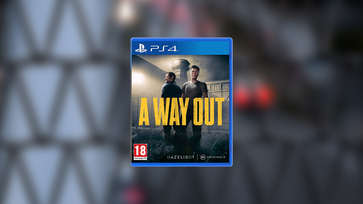
The Logotype
After having successfully designed the brand for Hazelight Studios, writer and director Josef Fares contacted us again to create the brand identity for his upcoming game for Electronic Arts. A Way Out follows the paths of two prisoners co-operating to escape, and Hazelight wanted a movie-like logotype and brand identity to accompany the game.

The Brand
Apart from the logotype (which was printed and scanned multiple times to create the grimey look in a more genuine way) we also created an intro animation, and a brand identity including typography and colors that was later applied to both the in-game menu's and HUD's as well as all marketing and web-related content, by EA's internal marketing teams.


Conclusion
We love designing brands for games and A Way Out was a perfect match for us. Thanks to our previous relationship, Hazelight trusted us to freely interpret the game and create a brand identity that we believed in. Our approach with a simple but strong typographic wordmark and striking yellow color hit a home run with the team, and easily translated to the game UI and marketing for an instantly recognisable look across multiple contexts.
"It's done! How did you know yellow is my favourite color!"
— Josef Fares, Writer / Director at Hazelight
