Redesign of Gramex's Website
Business goal: to standardize all the organization’s digital resources, to show their members a more recognizable corporate image in line with the new branding guide.
• The redesign of the website marks milestone 3 out of 4 in reaching this goal.
UX goal: to redesign of the website to make it responsive and more modern looking, and of the infrastructure that supports it and that will support "My Gramex" (Mit Gramex, the members' portal).

About the project
• Client: Gramex.
• Live website: gramex.dk.
• Project date: Mar - Oct 2018.
• My role: I worked on this project as a UX Designer with the following main areas of responsibility:
• UX research
• Analysis and sensemaking
• Facilitation of co-ideation workshops
• Creation of user flows with Lucidchart
• UI Design in Figma (wireframes and high fidelity mockups)
• Usability testing with internal users
• Coding a prototype in HTML5, CSS, and Javascript
• Creation of technical and design documentation
The website
The website is one of Gramex’s main channels to communicate their offerings to the target users, and needs to reach the following goals:
• Provide comprehensive information on:
• ISRC codes
• Membership details and registration process
• Overview of royalty collection
• Access to the member's portal
• Fund application guidelines
• General organization information tailored for their target users
Design methodology and my activities

Project summary
In this project, I undertook the task to redesign the website, which is one of their main channels of communication. The new design is responsive, with a more modern look, and is easier to maintain and update.
The challenge
The website was built with a custom-made WordPress theme, which had components without any kind of documentation or technical support. For this reason, updating WordPress or making any changes to the website was very challenging.
Furthermore, Marketing and Communication (MarCom, from here on) also had issues related to updating the blog and the homepage with new blog posts and other content, respectively.
Lastly, it needed to be responsive to better cater to the visitors who access it via their mobile phones or tablets, which were steadily growing.
Background Info
Gramex is a non-profit organization that collects royalties on behalf of Danish musicians and record labels who have their music played in public spaces, commercials, radio, etc.
Gramex was a company in a UX Design maturity stage called Inception, which meant that design was not part of their processes. I was the first person they hired who introduced design practices to the organization.
Target groups
Gramex has 3 target groups they give service to:
(1) Record labels
(2) Performers (singers and musicians)
(3) People and businesses who use the music (for example: at a cafe, in commercials, etc.)
The journey to the solution
To craft the solution, I used the set of steps as described in the section “Your Role”. A selection of the activities will be explained as follows.
Pre-Project
Preliminary analysis
Upon receiving the project, I made a preliminary analysis to familiarize myself with the website. In this analysis, I made:
• An inventory of assets that form the website
• A list of features that are specific for Gramex with respect to the website
• A list of components that handle cookies (in preparation for GDPR)
Based on my initial analysis, I divided the assets and features into "need to have" and "nice to have".
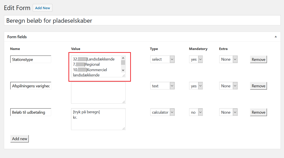
Example of features that are specific for Gramex: the field "Value" needs to be updated with a certain frequency so that the members can get accurate results in their calculation..
Through his analysis I learned that the website was more complex than anyone imagined, because of many points, 3 of which are as follows:
• The website grew, content-wise, without a strategy behind it, thus making it difficult to have an overview of the website
• Technically speaking and looking at the code, there was no in-house knowledge of how a WordPress site and blog post were created
• The forms were part of a custom-made component and there was no way to know where their code was used elsewhere, so changing one field in said forms did most times create problems in accessing the website
Once that part was completed, I held a kick-off meeting with representatives from the MarCom and IT Departments where I asked questions to understand the problems the website had, the goals to accomplish, what they knew about the users, and how the project would be considered a success.

Empathize
Interviews with internal users
I carried out contextual interviews with MarCom and Customer Service, in order to see how they performed their usual tasks related to the website, and learn how they used the website and what their pain points were.
One of the tasks I asked them to do was to design the ideal homepage for them, and gave them a printout of the home page to write their thoughts. MarCom had many ideas, which are illustrated in the following graphic.

n addition, MarCom expressed that one of their pain points is that there are not many different text styles, such as for the image captions and the byline of the articles. They would have to resort to using italicized body text as captions or bylines, but they were dissatisfied with the visual results.
Lastly, MarCom gave several attributes that describe how the website should be perceived (see “Look & feel” on the Final Brief).
Although the need to involve external users from as early as possible in the design process was expressed and requested on several occasions, it was not possible to do so. I suggested sending an anonymous survey containing 5 questions, which I had prepared, via e-mail or published on the website and social media, but the request was not approved.
Since reaching out to the members was not possible, I interviewed representatives from the Customer Service department and asked the most common reasons for contact they had back to 1 year, and they mentioned that they were looking for information about:
• ISRC codes
• Payments and stipends
• The use of music in public spaces
• How to become a member
• Register to the newsletter
• Login to the members' portal,
among others (see "Tasks and scenarios" on the Final Brief).
In addition, I held the same exercise as with MarCom about identifying issues with the homepage and asking for improvement ideas. Customer Service said they could not find anything to improve and said the homepage was fine as it was. However, they expressed that their main issues with the website were:
(1) Finding some of the information promptly upon receiving calls from the members, which they solved by bookmarking the pages when they were found, and
(2) Some forms that had inner data in one of the fields were cumbersome to update (see an example on the Pre-Project Phase).
Desk research
To continue understanding the behavior of the members with respect to the website, I looked for information in social media, looking for any questions or negative comments they may have written; additionally, I searched within the help desk tickets back to 6 months, and I went to the Analytics tool to collect information about:
• The devices used to access the website
• The most visited pages
• The ways the visitors used to find website and the page they were looking for,
among other data.

Website analysis
An analysis of the website, concerning the information architecture and visual style, was made to further investigate issues and how to solve them for the new website. Some of the findings were:
• The website used too many colors beyond the brand colors
• The way the website is designed did not take advantage of the screen width
• There was little space between lines and paragraphs, and the body text is rather small, which makes the website difficult to read
• There was no standard visual style for the links. Sometimes they were underlined, other times they looked like body text. On a desktop or laptop computer the mouse pointer would indicate the existence of a link, but on a mobile device it would be difficult to find the links unless the visitor read everything.

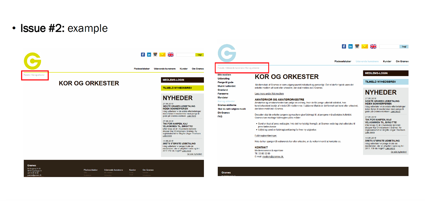
In this sample page we can observe how small the body text is and the inconsistency in the visual style of the links
Additionally, the value proposition of Gramex is not well communicated. One had to click on information about the organization to learn what it was.
The custom-made template did not include a way to create a sitemap, so it was necessary to add a plugin to do that and give a complete overview of the website. By doing this, the following issues were discovered:
(1) There were empty pages.
(2) Some of the empty pages seemed to have a page with the same title, but under another category.
(3) Pages from different categories had the same content.
(4) Pages without any classification of any kind do not show in the sub-menus because of the way the WordPress theme was made. They can only be accessed via a direct link.
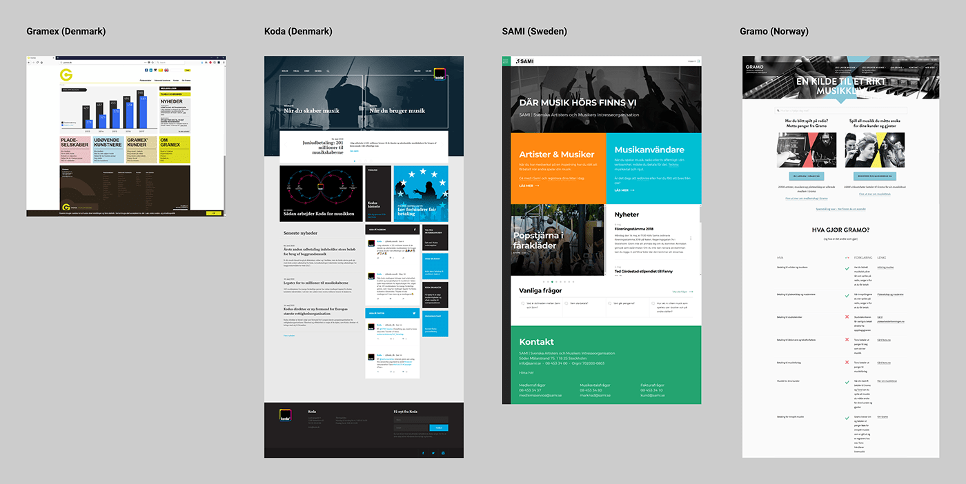
Benchmark with similar organizations
Given the nature of the work that Gramex does, they do not have any direct competitors in Denmark. The benchmark that I carried out included their Danish sister organization, Koda (which collects royalties for composers and under a different scheme), as well as organizations that do the same work in Sweden (Sami) and Norway (Gramo). The analysis consisted in visiting their websites and going through the process of finding information as a new visitor.
Some of the findings are:
• The sister organizations have their own interpretation of “Nordic minimalist style”, with color palettes with few brand colors
• They use a language that is closer to the one their target groups use
• The imagery used, whenever possible, represented said target groups
• The structure and information architecture on the website enable visitors to easily find what they are looking for, although sometimes they might have to click one too many times to do so
• Gramo, Norway’s royalty collection organization, had a very long homepage, where they seemed to cram all the relevant information into it. This made the website very long to read, especially in the mobile version
Define
In this stage, I used affinity maps to analyze the information that I collected in the previous phase and derive key findings. The following are some samples of what was found.
Key findings
From the benchmark
A list of suggestions that Gramex could incorporate (called “Do”) and to avoid (called “Don’t”) on their new design was made. Some of these are:
• Do make the website more personal by addressing your target group directly and using simple language
• Do use images that relate to the content or the target group
• Don’t have a big footer that repeats the menu options
From the interviews with internal users
• The IT Department experienced issues giving maintenance to the website and making changes to the code or the visual style because it was mainly built with a component that did not have any technical support or documentation. Furthermore, no one knew how to code for WordPress.
• MarCom's pain points lay in little readability due to little space between lines and paragraphs, an old visual style that did not give them enough freedom to choose a suitable picture size, and a lack of a text style for the captions, publication date, and byline.
• The Customer Service Department had difficulties finding the information promptly upon receiving phone calls and updating the forms that have values in them.
From the user research about the external users
While it was not possible to contact the external users, there was still good information that could be collected via the Analytics tool. For example, some of the most visited pages, as was told by Customer Service, were related to the ISRC codes:
• ISRC
• Ansøg om ISRC-koder
• ISRC-kodens opbygning
The number of visits using a mobile device was on the rise. At this point, it was assumed that most people still visited the website from a desktop computer because the page was only optimized for larger screens.
From the website analysis
The main issues with the website were related to:
• An outdated visual style that crammed everything into one container, thus not making efficient use of the screen real estate
• Not being responsive
• A somewhat unfamiliar language to the members
• Content that grew without a strategy
• A WordPress template that did not allow to building a sitemap, so it was not possible to see the big picture (content-wise)
• Little readability due to small body text and little space between lines and paragraphs
• The links cannot be visually differentiated from the body text
From the user research findings we derived the following insight:
The users want to keep their part of the website updated easily, but they're unable to do so, because their lack of know-how concerning the customized WordPress template makes them afraid of breaking something important on the website and rendering it inoperative, given the importance as a main communication channel.
The result of the definition phase was a brief that got updated, and that led the process of creating the solution.

Ideate
The ideation focused on how to present the information (text, pictures, icons, etc.) to the external users while meeting the requirements of the internal users.
Co-creation workshop
Readability and the lack of styles for specific texts (image captions, bylines, etc.) was an important issue, and to solve it I held a workshop with MarCom in which they were given the opportunity to decide what the different text styles they needed should look like.
I created a test environment with a test blog post that had one element of each kind so that MarCom could change the size, color, font weight, upper or lower case, and space before and after utilizing the Inspect Element tool on the browser.
When this task was completed, I added the chosen text styles to a style tile that I created previously with ideas for the visual style of the website, based on the trends used in similar websites at the time, thus giving them a first taste and allowing them to make changes before making high fidelity mockups. They especially liked the iconography and the image treatments that I introduced. They thought that the interpretation of the look and feel was good and liked where the new design was going.

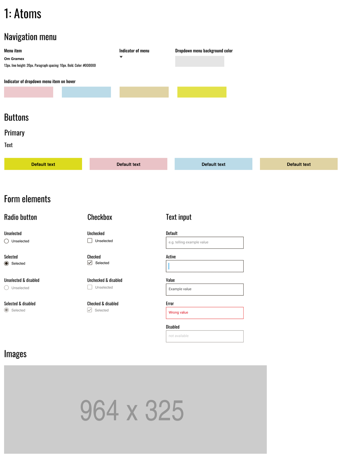
Creation of a pattern library
Now that the visual style was approved, I created a pattern library using Figma and Atomic Design. For Gramex’s context and UX design maturity, it did not make sense that I created a library in the strict sense of the word. Instead, I created a combination of a style guide and library into Figma, where the components are listed and can easily be incorporated to designs of websites in the same program.
Their library contains:
• The assets, which were a combination of their current graphic assets, and the new components made for the new design as per the co-creation workshop
• The graphic assets ready for download and use in any HTML, WordPress, design, and non-coding document
• All the device sizes the website should be designed for, as per data from the Analytics tool
Prototype & Test
User flows
To illustrate the different ways that a member or prospective member can take to access the pages, I made user flows. One of the use cases was the process of requesting an ISRC code since this was one of the main reasons why Gramex’s members reached out to Gramex, and it was among the pages with the most traffic.
Although the journey does not take many steps, the user can access the ISRC page in 3 different ways from the home page. Additionally, they could have the option of accessing the ISRC page directly should they receive a link via e-mail or direct traffic.

UI design
I made a first proposal of how the design of the website could look like. Taking the desktop version as a starting point, I created a wireframe to lay out the different content elements. I made a high-fidelity mockup of it as well, intending to test it with the internal users before proceeding to create the tablet and mobile phone versions.


Test of the first UI design proposal
The test was made with the approvers from MarCom and Customer Service via a technique called cognitive walkthrough, in which I explained the design and they verbalized their thoughts. They were satisfied with the design and expressed that the website looked attractive and had better readability. They liked how it was easy to get an overall picture of what to do on the website and how the ISRC page was more prominent than on the original design.
The changes that were requested were:
• To move the carousel to the top of the page, above the fold
• To change the menu item “English” to an icon with the British flag and to place it together with the social media icons
• To change the icon set for “login” to the text “Login” and to place it together with the other 4 navigation menu items
Second iteration of UI design
I undertook those changes, which also meant changing the sitemap that was created in the Ideate Phase. Then proceeded to a second iteration of the design, which was approved. With the approval in place, I proceeded to create wireframes and mockups of the following pages, all in desktop, tablet, and mobile versions:
• Homepage
• Inner “homepage” (a homepage for the main sections, such as "Jeg udgiver musik", etc.)
• A special inner “home page” for the section Kunder
• A default layout for the inner pages that contain only text
• A default layout for the inner pages that contain text and a picture
• A layout for displaying all the blog posts
• A layout for a single blog post


I proceeded to create 2 prototypes: first a clickable prototype in Figma, and one in HTML, CSS, and JavaScript, showing how the responsive design looks and feels in the browser, outside of the limitations that Figma as a design tool has.
Prototype for mobile (see the other prototype versions on the links below)
Hand-off
The IT manager received the following:
(1) All the design files in Figma
(2) The coded prototype
(3) Design and technical documentation
In addition, they were briefed on what is what, as well as the following advice:
• To run a test with some members before coding the website in WordPress. I recommended the Think-aloud technique and explained how to do that
• To monitor the website once it is launched for a period of 6 months, to see how the internal and external users react to it
• To set more specific metrics to measure the success of the website. I explained with examples how to set them and why they are important
• To keep the pattern library and the sitemap files updated as needed
Results
This new design pursues communicating Gramex’s offerings more effectively and attractively to each of their target groups. Similarly, it intends to provide higher employee satisfaction by facilitating the tasks related to updating the platform and creating or updating content.
Update Jun 2019: Gramex implemented the designs, making modifications where they saw fit. The feedback I received focuses mainly on how happy the new developer team is with the extensive documentation I wrote.

From the left: (1) Original, non-responsive website; (2) New design in Figma, desktop version; (3) The new design implemented
Update Sept 2023: Gramex updated the designs, keeping the original concept I created for them with some minor tweaks.

From the left: (1) Design implemented in 2019; (2) Design updated anno 2023.


