Why Google Should Re-Think It's Gmail Logo
June 27, 2018, Google introduced the Google Marketing Platform. Why was it significant? For two major reasons: (1) Gives marketers new and improved tools that "make it easy to get better results from their marketing". (2) It foreshadows what I believe is Google's unification of it's visual identities.
On September 1st 2015, The Verge, wrote about the launch of Google's new logo identity, which saw the tech giant unveil a new visual system based on the most intuitive and ubiquitous of shapes — circles (dots). Three years later, Google releases three new brands and identities that expanded on the same visual system.
Amidst all this, Google released a brand new Gmail and Chrome UI, that both again, extended the circular system. However, the Gmail logo. remained the same. I think this was a missed opportunity to further unify its product logos. This case study aims to address this.

Google's New Brand Logos Audit Against Gmail Logo
The small audit above, shows how unfitting the current Gmail logo is with the new suite of logos, and not to mention the new Gmail UI.


The first step (exploration #1) was to simply use circular or rounded rectangles to bring the icon/logo, closer to the new family of logos. In addition, I made the shadows much simpler.

The second step (exploration #2) was to update the orange. The current Gmail orange is slightly dull and out of sync as Google is moving towards brighter and more vibrant hues.

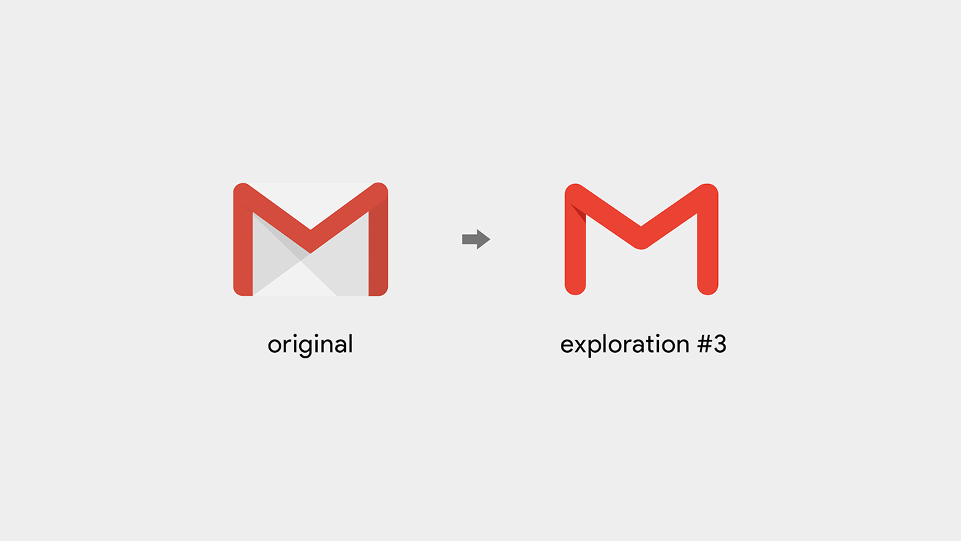
Finally, I realised that the logo worked best by being made free of the envelope structure. Gmail has been in market for 14 years. The primary visual element of recognition is the M. By removing the envelope structure, we are not losing much of the logo's recognition, whilst yet gaining flexibility and simplicity — making the logo even that much more memorable.

As you can see above, the evolution creates a much better logo without sacrificing brand equity. The slight shadow on the top left helps give depth and dimension whilst also lending to the logo’s subtle distinction.


Thanks for reading, please remember to appreciate and share if you like it.


