

Introduction
In 2006, TRI director Meredith Brodsky commissioned a new agency advertising brochure. The existing brochure was a bit amateurish, was not co-branded with Western Oregon University, was not full color and did not adequately reflect the professionalism and capacity of TRI at the time. The TRI Tech Committee, of which I am a founding member, was charged with determining the content and narrative of the brochure while I was tasked with creating the design. I chose Adobe Photoshop as the graphic design tool for creating the brochure.
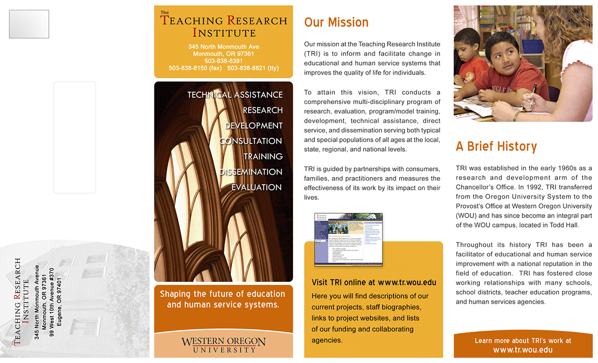
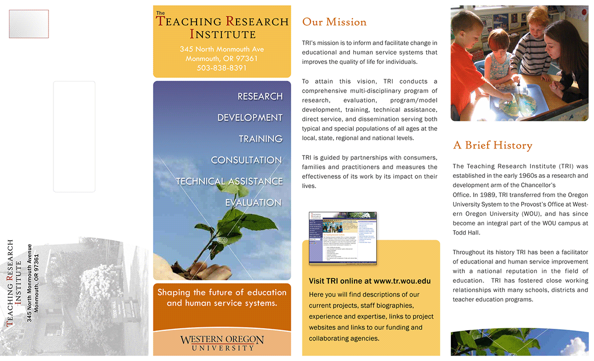
[Side 1 of the brochure showing the mailing panel, front panel and 2 inside panels.]
The Design
It became apparent early on that the brochure would need to accommodate a large amount of content. We wanted to include information about TRI's history, mission, funders, services and work focus areas. In addition, there needed to be space for contact information, photos and a place to highlight the new TRI website. I decided upon a 4-fold, 8 1/2" X 11" full-color layout.
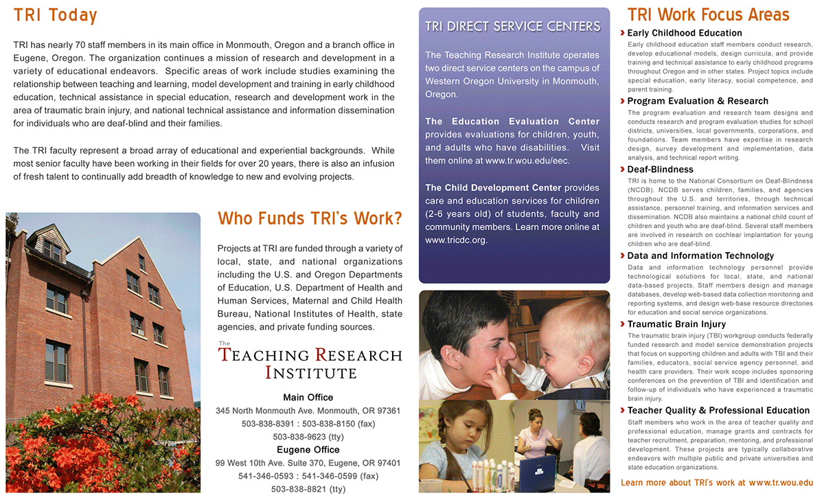
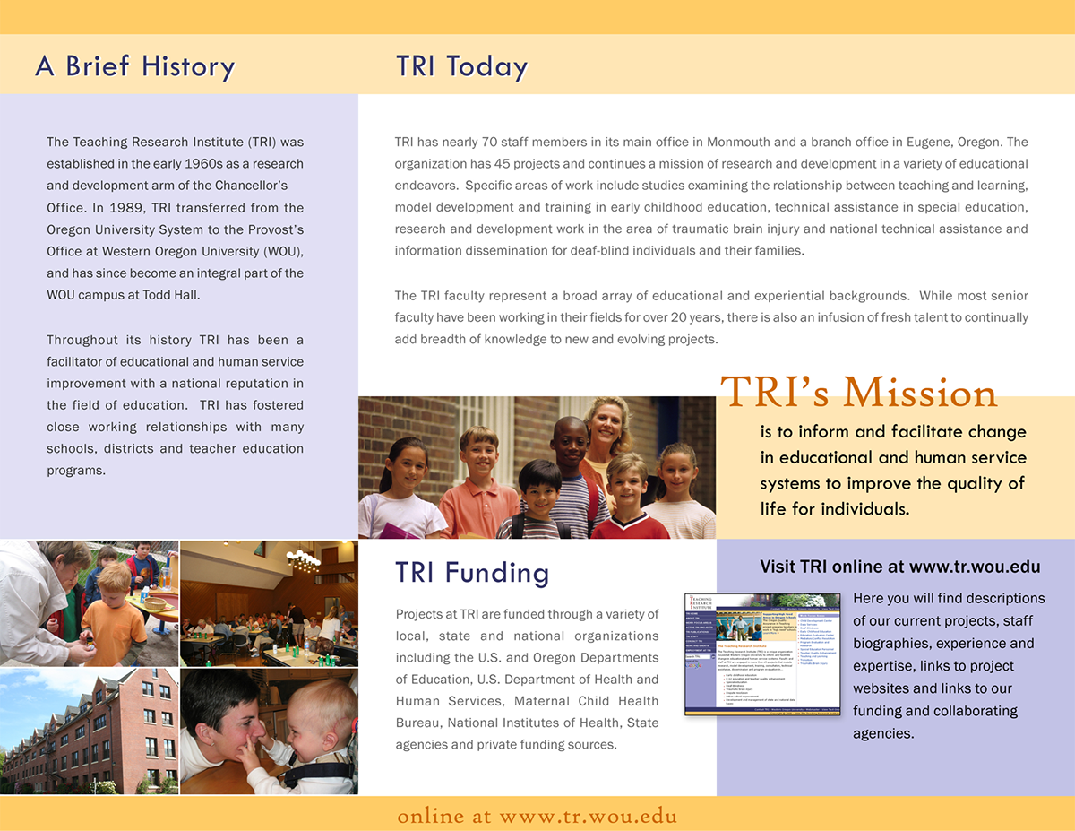
[4 inside panels on the opposite side of the brochure.]
The colors were based upon the color scheme of the newly redesigned TRI website at the time and the photos were selected from TRI and WOU photo archives. About 8 front panel photos were tested in the design before we finally decided upon an evening photo of the windows in Campbell Hall.
After the design was completed and approved by the TRI director and leadership team, I sent the design files to the WOU Print Shop to have the final product printed.
Alternate Versions
Several trial designs were developed before we settled on the final design. The design below presented a slightly different approach. It is a 3-fold design with different font selections, fewer prominent photos and more muted colors. The cover panel also lacks the visual impact of the final version.
[Alternate version 1, side 1.]
[Alternate version 1, side 2.]
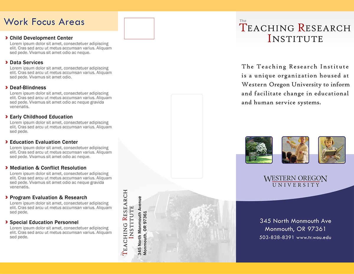
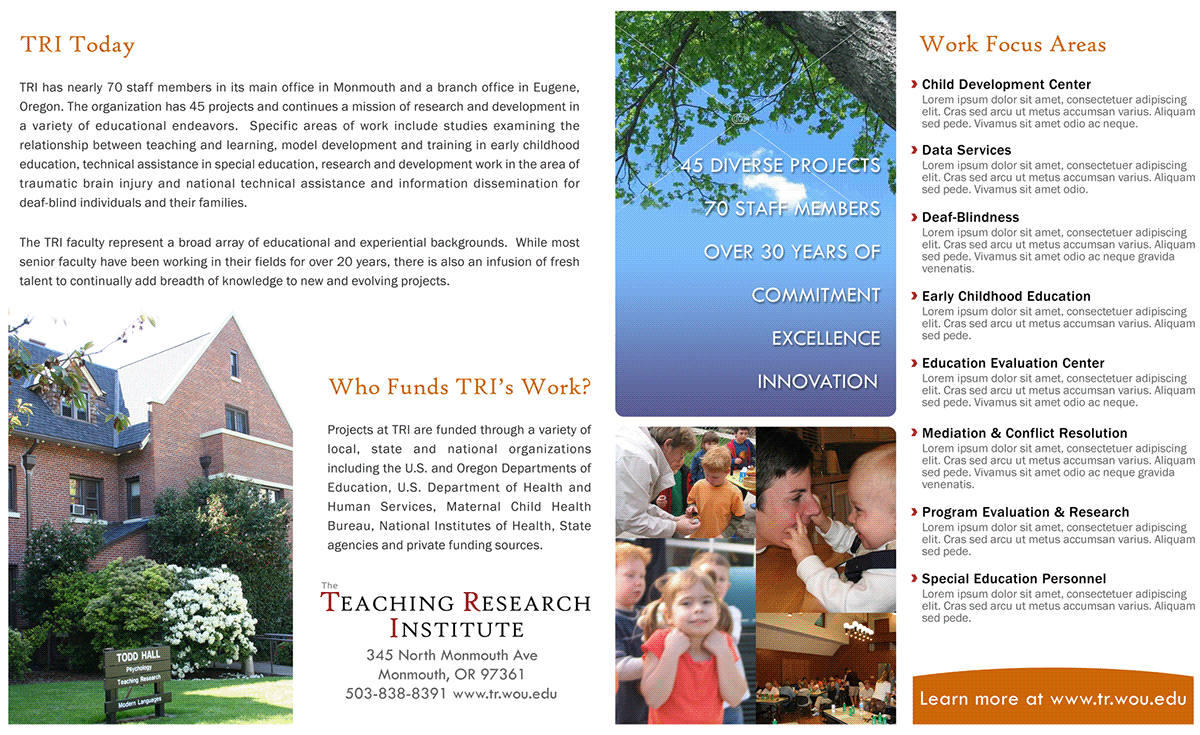
In the following design, we are getting closer to the final product but with a botanical theme signifying growth or flourishing. Most people felt that the trees and plants made this theme too prominent and did not really convey the essence of the agency. A different heading font was used but the layout and color scheme are the same as the final brochure.
[Alternate version 2, side 1.]
[Alternate version 2, side 2.]


