
Contemporary Letterpress (Project)
Editorial project printed in letterpress and hand-bound in the form of leporello, "accordion-book", explaining the contemporary production techniques of movable types and cliché through infographics (synsemias to be exact, definition elaborated by my supervisor Prof. Luciano Perondi).
The project was supervised by Prof. Luciano Perondi for conception, research and Information Design and by Prof. Giovanni Turria for book design and letterpress printing part.
For the description of the themes and the research conducted for the thesis, see the project Contemporary Letterpress (Research) in the appropriate Behance page.


"Synsemia means the deliberate and conscious disposition of elements of writing in the space in order to communicate in a reasonably unambiguous way and in a regular manner, through the space articulation and the other visual variables. These regularities can be valid only for a specific text (but coherent, rigorous and interpreted without the aid of the author), or defined by specific patterns and consolidated habits of use."
To find out more: https://synsemia.org/about/

For the realization of the sinsemias, I chose not to use any type of computer graphics software, such as InDesign or Illustrator, but to use only my hands, a pencil, a rubber and a sheet of paper: manual writing, in fact, in addition to being simpler and more fluid, it facilitates non-linear writing, linking together all the various graphic elements and finding the right balance between text and images.


The manual and sinsemic writing required the search for a lettering that could fit well for the topic. In the end, after various tests of lettering based on inscriptions, signs or fonts, the solution came in a completely random way during a simple walk: Equilibratura (Balancing, a usual term for tire specialists) was born.

In order, from the bottom left, clockwise: lines of linotype, wood type milled with CNC machine, movable type printed in 3D, wood type composed of layers of plywood laser cut and glued together, linocut, photopolymers plates.

Photopolymer plates produced in the School of Graphic Arts laboratories of the Academy of Fine Arts in Urbino.
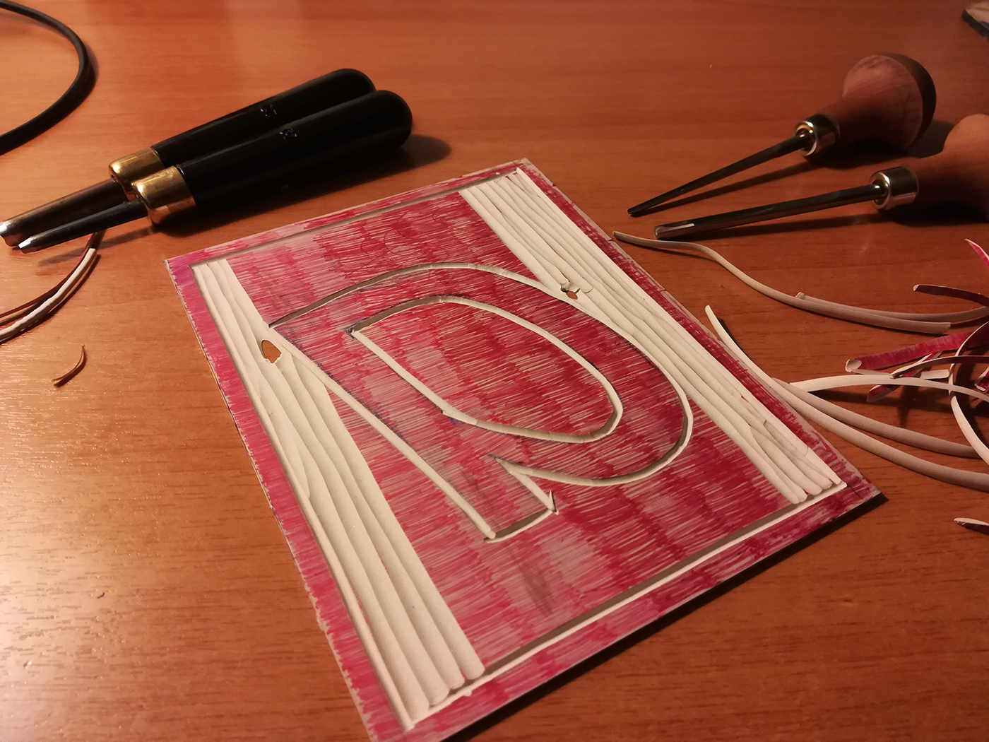
Linocut.
The glyphs all belong to the Titillium font, an opensource font produced by the students of the Visual Design course of the Academy of Fine Arts of Urbino (https://fonts.google.com/specimen/Titillium+Web)

The linotype of the Museum of Printing of Lodi (Italy).


3D-printing at FabLab Catania (Italy).

Letterpress postcards produced as merchandising for the 2018 School of Graphic Arts openday.


At work on the FAG Standard proof press.


The printing of the book took place at the laboratory of the 'Italic' association in Fano (Italy), thanks to the help of Mattia Caruso, Matteo Spinelli and Riccardo Buccella.


The edition was printed in a limited edition on Saroglia proof press.


