


Pyure
Branding System | Package Design | Advertising | Storyboards | Invitation | Booth Banner
GMO-free, Calorie-free, All-Natural and Organic Sweetness from Nature.
Pyure Brands is the fastest-growing independent organic sweetener company in the United States. Earning its third induction into the Inc. 5000, Pyure has consistently seen double digit growth since entering the low-to-no-calorie sweeteners category. They're committed to providing customers with the highest quality, best tasting natural alternatives to sugar and artificial sweeteners.

Various Design Projects
I had the opportunity to design a number of projects for Pyure, including branding and packaging, ad campaigns (with digital banners for Amazon and Google), storyboards for a case study video, a large fabric booth banner, mood boards, and tradeshow invitation. Here are a few samples. Please see below each image for a detailed description.

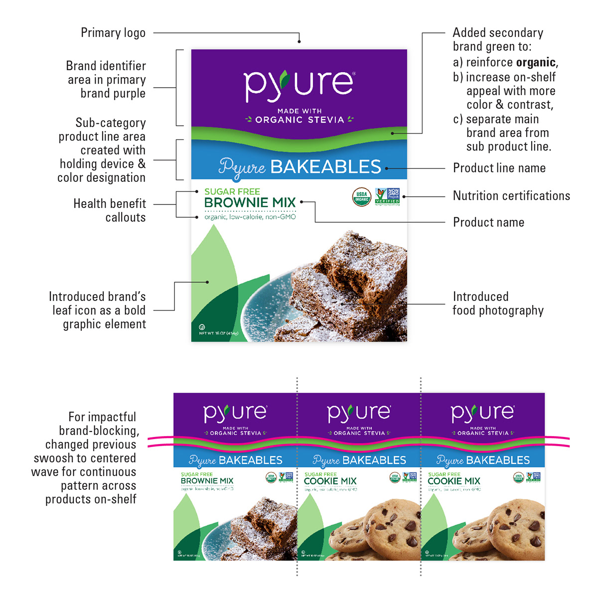
Pyure Bakeables Branding & Packaging
Following the success of 12 sweetener products in-market, Pyure was ready to create its first full food product line, beginning with a sugar-free brownie mix. I was tasked with creating a new branding system for this upcoming baked goods line that clearly differentiated it as a family of products, ensuring flexibility to expand, while also working cohesively with the full Pyure suite of products on-shelf.
I did this by leveraging some of Pyure's current brand equity elements, as well as introducing food photography and category distinction by color, name, and treatment. I turned their purple swoosh into a continuous wave to span across products on shelf for maximum impact. I enlisted Pyure's secondary bright green as another category element. And I used their leaf icon in a fresh new way—as a bold, dramatic background graphic.


Continuous wave created to span across products for an impactful brand-blocking on-shelf.

Cookie mix packaging design to display system adaptability for future product line expansion.

Initial exploratory sketches.
Brand style sheet.
Presentation and results
The Pyure folks understandably had an attachment to their current packaging, but also expressed major concerns about lack of product differentiation and evidence of confusion amongst consumers with their products on-shelf. So in order to ease them into changes for the new line, I presented to them with a stepped-out transitional approach—options ranging from most similar to current packaging to most substantial changes. We discussed the pros and cons of each, and I explained the sweet spot where I felt they needed to be for Pyure Bakeables.

Options within the stepped-out presentation of design solutions.
The client expressed great appreciation for my process and varying solutions, pointing out specific details they felt were thoughtful and on-target. In particular, they agreed with my suggestion, and gravitated towards the above highlighted design, which I then expanded upon for the mockups.
Following the presentation, the client expressed being inspired to have me rebrand the rest of the products in their portfolio. This would entail creating new treatments to categorize the full suite into separate groups, each with its own distinct branding solution for clearer consumer and retailer communication.
Scroll down towards the bottom of this project for a revisit of the Pyure Bakeables packaging with new imagery and new names for the product line.
. . .

Pyure Commercial Tradeshow Booth Banner
Pyure has been successful in both the retail and the commercial ingredient spaces. I designed an 11.3' x 7.5' fabric display banner for Pyure's booth at commercial food & beverage tradeshows. The goal was to draw attention to Pyure's booth to increase brand exposure, and to communicate the nutritional benefits of their products.
This was a great opportunity for Pyure to broadcast their sweeteners as healthy, no-sugar, no-calorie ingredients for use in commercial products, such as yogurts, juices, carbonated beverages, nutraceutical and pharmaceuticals, and other food & beverage CPGs.

. . .

Digital invitation.
Pyure Booth Invitation for Expo East 2018
On the retail side, I was excited to design the invitation to Pyure’s booth at the Expo East tradeshow. I felt it was important to feature enticing waffle photography to tie in with their maple syrup and honey sample packets handed out at the event. In addition to the take-home samples, we invited consumer and retail attendees to visit the booth and experience Pyure Breakfast Bar, serving up protein pancakes and waffles. Shown here are the digital and print (front & back) invitations.
Scroll down to see the sample packets package design.

Print invitation front and back.
. . .

Pyure – Sweet Victories chocolate packaging
Smart Indulgence.
Following Pyure Bakeables, I was again tasked with creating the look for an upcoming product line, Sweet Victories, a decadent chocolate snack series that celebrates smart indulgence. The initial offering was Dark Chocolate Almonds with sea salt, Dark Chocolate Pretzels, and Chocolate Hazelnut Spread Snack Packs with pretzel sticks.
As with Pyure Bakeables, it was important to strike a balance between belonging to the full portfolio of products, while also setting apart the new product line as its own family. Leveraging their brand equity elements, I continued to use my centered purple wave, as well as the leaf icon as a recognizable background graphic. I created a dark brown band to house the category name and clearly identify the series. Since flavor appeal was a big factor, it was important to continue the new usage of enticing food photography.


Version 1: white background.
Two Versions
First I created the white background version that was a close cousin of the existing products, and a bit safer. Since we aimed to move a few degrees away from current Pyure products and appeal to a different snack market, I also created a second, more extreme version that featured a rich, chocolatey brown background to drive home the decadence and even more distinctly set apart the Sweet Victories line. Our goal was to speak to a larger market of both existing Pyure consumers and consumers who may not like the taste of stevia.


Version 2: brown background.
Walmart 2018 Snack Product Conference
To secure interest from key retail partners prior to product development, the Pyure team presented the designs at Walmart’s 2018 snack product conference. It was a great opportunity to inform and entice Walmart and other influential retailer attendees with Pyure’s upcoming releases.
. . .

Pyure Digital & Mobile Banner Ads
To promote Pyure's all-purpose sweetener and display some of its many uses, we created a digital campaign for desktop and mobile devices, featuring a series of banner ads in multiple sizes.
Images and messaging were based on researched consumer goals, such as sugar awareness and reduction, baking, fitness, coffee pairing, and general health and wellness. The banners were displayed on various sites and platforms, such as Amazon, Google, Well+Good lifestyle and wellness publication, and Cluep mobile ad platform.
Shown are some of the banner ad themes in various sizes, the "Set The Oven to 350" theme series, as well as banners in context on mobile, desktop web and email placements.


Mobile and desktop web placements.


Email placement.
. . .

Pyure Maple and Honey Sample Packets
I designed the packaging for 4500 maple syrup and honey sample pouches for both general consumer inquiries, as well as distribution at the Expo East tradeshow.
Natural Products Expo East brings together the health, wellness and eco-conscious community to highlight products and missions driving global change. Our goal was to promote Pyure, increase awareness of their organic, sugar-free maple and honey products, and target retailers who may be interested in stocking them on-shelf.
Shown are the front panel, outside cover, and inside packaging with and without sample pouches.


Initial rough sketches for maple and honey sample packaging.
. . .

Pyure revisit – Sweet Confections, Sweet Bakeables packaging
After my success with the Pyure Bakeables and Sweet Victories product lines, the folks at Pyure were more comfortable with my expansion of their brand identity. They were fully onboard with my introduction of food photography, the new product line categorization bar, and altering their swoosh into a continuous wave across SKUs for stronger brand-blocking on store shelves.
Next I was tasked with revisiting the sugar-free food product line (formerly named Pyure Bakeables). This was an opportunity to push the branding a little further, creating even more distinction, but still remaining true to the Pyure look and feel. In addition to the design changes, they also requested more copy choices for the category name.

Reference Sweet Victories packaging
Shown at top is an option that pushes the boundaries with full-background photography across a large portion of the packaging, as well as bolder type for the product names. Above is an option that features the product name even more prominently as a major focal point. Below are options with variations in layout, type treatment, and category name, as well as introducing a new swoosh color to replace the green.


. . .

Pyure Hazelnut Spread Packaging
Pyure created a healthy hazelnut chocolate spread as an alternative to high-sugar brands like Nutella. 100% sugar free, 100% organic, non-GMO certified, and 100% delicious. To gauge interest, they decided to test it out at an industry tradeshow. Pyure wanted to learn who may be interested in using the product from a consumer side, and who may be interested in stocking it.
I designed the packaging, using ownable, recognizable Pyure brand equity elements, and introduced enticing food usage photography. Similar to Pyure Bakeables, I once again turned their purple swoosh into a continuous wave to span across products for an impactful brand-blocking on-shelf.
The goal was to promote Pyure, introduce this brand-new product, and target retailers who may be interested in stocking it in their stores. The sampling was a big success, and there were no jars left to hand out after the event. Pyure is nearing their first production run, and I'm excited to get my chocolate fix!


Initial rough sketches for hazelnut spread packaging.

. . .

Pyure Case Studio Video Storyboard
Our Man In Havana (OMIH) created a Pyure case study video to demonstrate to other clients what a partnership with OMIH could do for them. Shown above is the storyboard I laid out—including title cards and type treatment designs—to direct production of the video.
The presentation told the story of Pyure, explained our goals, challenges, competition, strategy and solutions, and finally, highlighted results for the brand and associated retailers. OMIH not only helped the target audience lead a healthier life, but also helped Pyure far exceed their sales goals and deliver astounding ROI with a highly effective campaign.

. . .


