


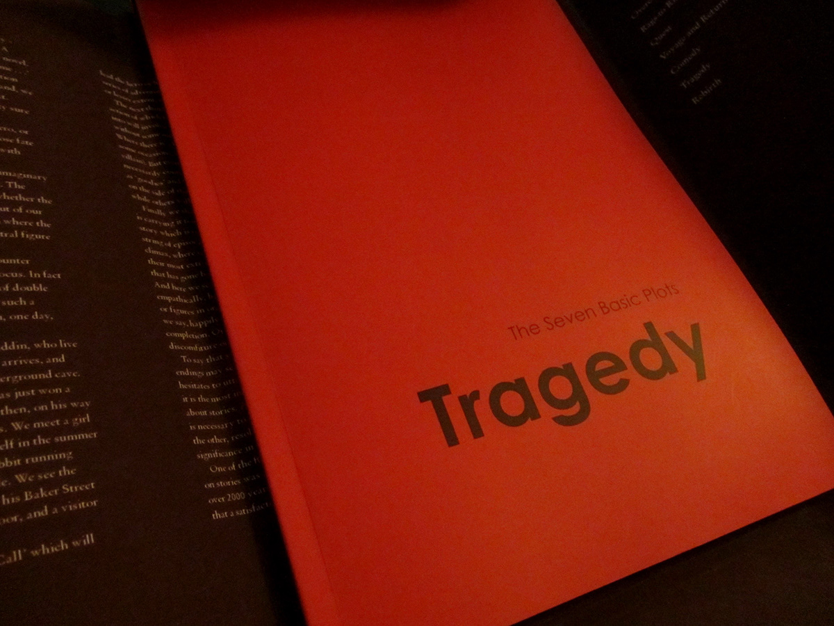
Case for Tragedy book, front cover.

Case for Tragedy book, back cover.

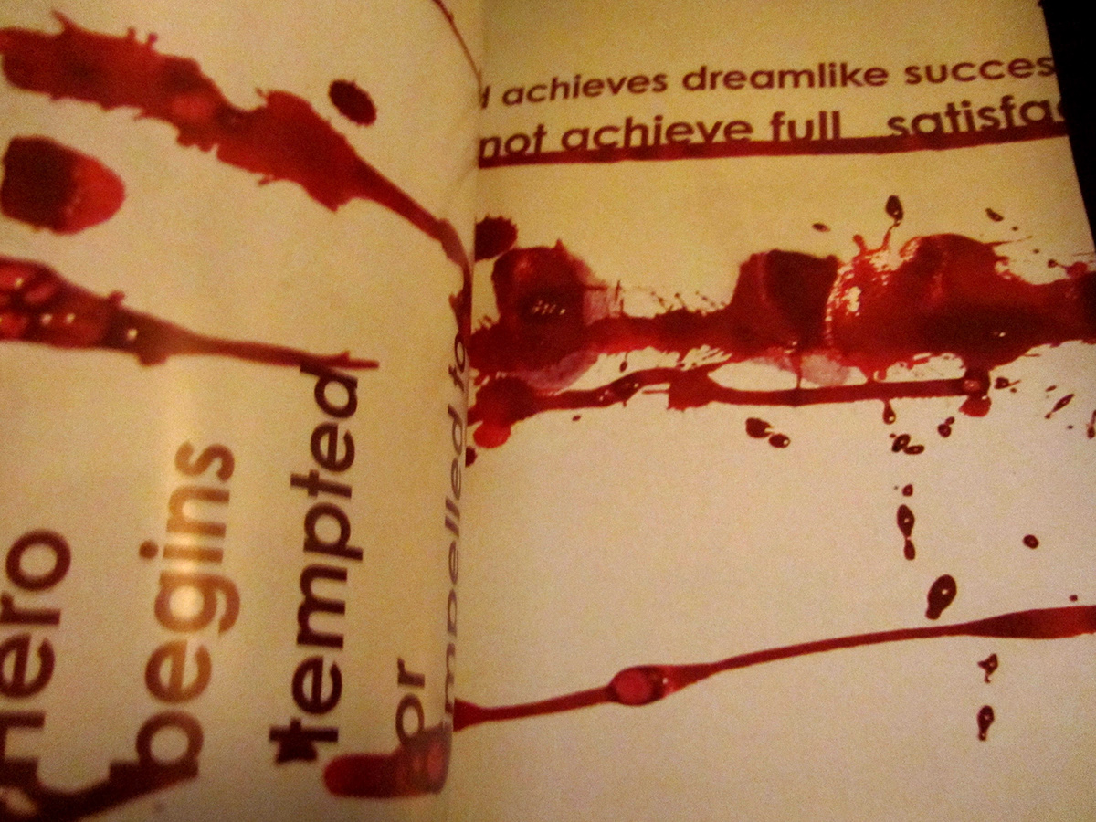
I wanted to communicate the chaos in Tragedy so I produced imagery with ink on paper that imitated blood dripping. I experimented with chaotic typographic layouts along these drip lines, using different typefaces until I found one that I felt fitted in best with the design style. As these pages are a very big part of the design I wanted them to have a different impact from the rest of the book, not just in layout and content but also in print. I felt the best way to do this was to use an alternative stock. I chose to use a glossy stock for these pages from the phasing in part to the ëStage 1í page of the following section which marked the end of the choas and the begining of the ëstagesí. Also, I chose a glossy stock in particular for this to give a more magazine-like appearance; to bring out the more media orientated side.

For the body copy I decided to used mostly the examples given in the book. I used the direct type and set it accordingly, separating the examples in footnotes alongside the stage descriptions and main body copy based on way these parts are written and phrases in the original book. I then set the type in columns that mimiced the sense of falling that is in the dripping and in the idea of a tragedy. I took the main quotes from the examples out of the body text and set them as footnotes alongside the columns, much like splashes off the dripping stream.


In the creation of my final piece I took a trip to view the process of print and binding first hand.


