
Crescent Spur has been operating for over 20 years. The above mark has been with them for half of that time, and (surprisingly) hardly shows its age. Initially crafted to represent the rotors of the helicopter blades, and carving through fresh powder, it now adorns all aspects of the Crescent Spur identity and operation.

The Crescent Spur website endeavors to convey the magic that keeps bringing guests back year after year. The homepage features key information about the operation, current blog content, and a wide variety of visuals that help put the site visitor as close to the experience as possible.
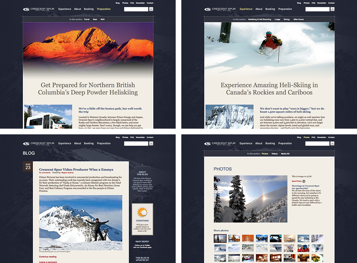
Pictured (from top left, clockwise): information on preparing for a trip; the Photo Gallery showcases some awfully sweet moments; the Experience section tries to convey what makes the place so special; Crescent Spur owners and staff tell their stories and connect with heli-ski lovers, on the Blog.


Crescent Spur’s collateral utilizes a clean, crisp navy tone on a bed of pristine white. While generally quite simply applied, some settings rely on draftsman-like lines that help divide and space information. These same lines are present in their website, brochures, email newsletters, and other materials.


Pictured above: Crescent Spur’s letterhead, envelope, and other materials are all printed on understated matte paper stocks; promotional and information booklets feature an emboss of the organization’s mark, lending a tactile characteristic to these materials.

Small hand-sized booklets like the one above summarize key information about the operation. All of these materials are heavily supported by remarkable imagery contributed by professional photographers, guests, and staff alike.

A kind of character comes out in every piece of Crescent Spur collateral: from epic and crafted, to personal and fun. The newsletter on the left plays off an old image of the operation’s owners in their early days; the one to the right uses the same core treatments, but is customized for the Way Beyond Skiing video campaign.
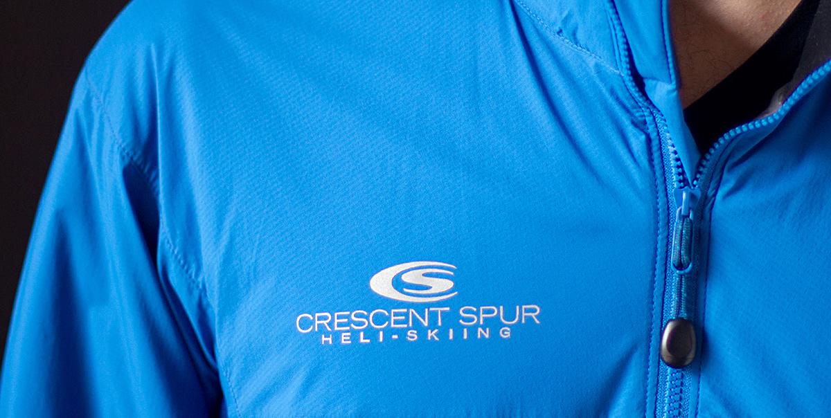

Many of Crescent Spur’s guests like to take a little piece of the lodge with them. Some do it with technical jackets like the one above. The helicopter is certainly part of the family at Crescent Spur—and doesn’t it look fine with that lovely mark and Crescent Spur blue it sports?

Although they do little traditional advertising, from time to time, ads like the one above talk about the reasons folks love Crescent Spur so much. Meanwhile, postcards and rack cards, like the ones to the right, help visitors get a taste for the dream.
View full case study here.


