Applegreen are a true Irish success story. From humble beginnings in 1992, with their first service station in Ballyfermot, West Dublin, to now having over 177 service stations and employing over 2,500 people, across Ireland, the UK and America.
Over the last 25 years, their brand reputation and success has been earned through low fuel prices and 100% traceable, quality assured fuel.
So what's the deal?
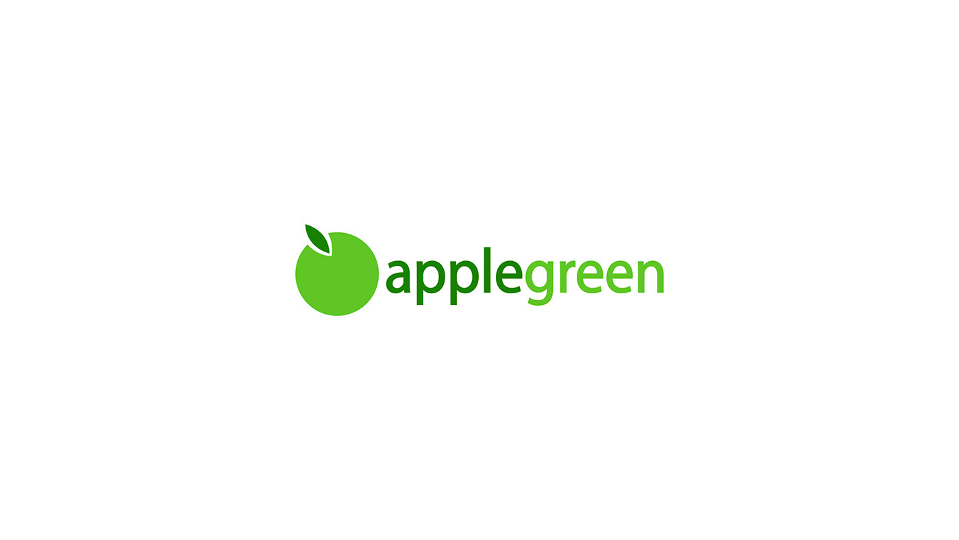
The mark you see below, is the current Applegreen logo — it's not flattering at all. Let's review why?
1. The logo icon, though pretty simple and straight forward, to me doesn't lend to the brand's reputation. It's very easily forgotten. It's not distinct enough and certainly not flexible in isolation.
2. The logo-type, using Myriad Pro, feels too corporate and somewhat unrelatable.
In a nutshell, it's not inspiring nor does it invoke the same excitement that the brand itself is yielding through it's growth.

The first stage of the redesign was to explore separating the logo-type from the icon. As mentioned before, I think the singularity and distinction of the icon would give the brand that timelessness.
Certainly we are headed in the right direction — the icon should stand-alone. Next is the icon itself. Though the mark looks better separated, the icon looks like a clip-art object. We need something memorable and distinct, but minimal.

Starting from the stem, we want it to be as geometric as possible. So I make it wider here and slightly smaller. We can afford to do that because the enlarged width. Much better already.
The next stage was the apple’s body. What made it un-inspiring was the fact that it was just a circle. It needed to be distinct, so I gave is stroke and create a ring. Psychologically this gives a sense of continuity, positioning Applegreen as an evergrowing and inovative brand.

Myriad Pro, is not working here. It’s too corporate, alienating the audience. It is a consumer brand after all, so I use AvantGarde instead. Its geometric, contemporary and friendly. I tweak the letters ‘L’ and ‘E’, a bit to help with symmetry.

There we are. It functions and looks much better in my opinion — even as a monochromatic mark.
Colour was also another issue. The current colours are slightly dated and not as vibrant. So I tweak the hues a bit here for a fresher looking palette.

To wrap it up, the current tagline is, "low fuel prices, always." Apple green certainly offers more than just low prices, their reputation is built on quality and value. So let's communicate that instead, my proposed tagline is; "quality fuel, always value." In this, Applegreen is not just promising, value for money, but more importantly quality fuel that will last longer, which in retrospect is value to the consumer.


