Client: Karla & Aldo
Year: 2017
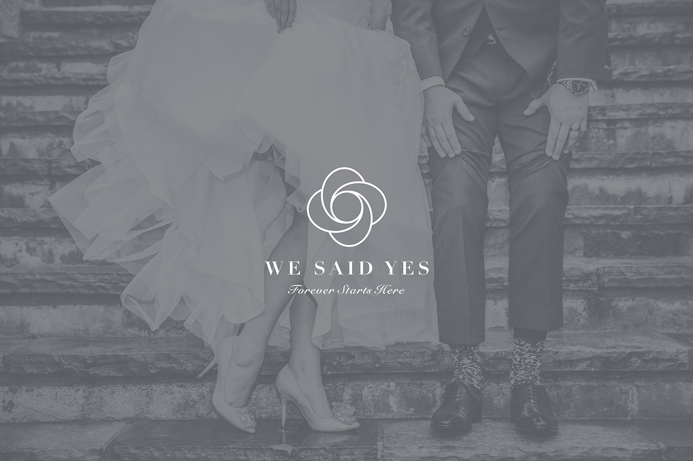
We Said Yes
Branding
Forever Starts Here
(Español)
We Said Yes consiste en un wedding planner book. Ayuda a la organización del evento de la pareja recién comprometida. Los clientes necesitaban un logotipo sencillo, con simbolismo y que haga referencia a las bodas.
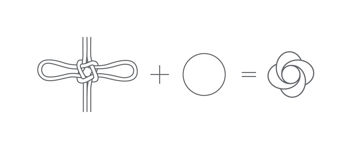
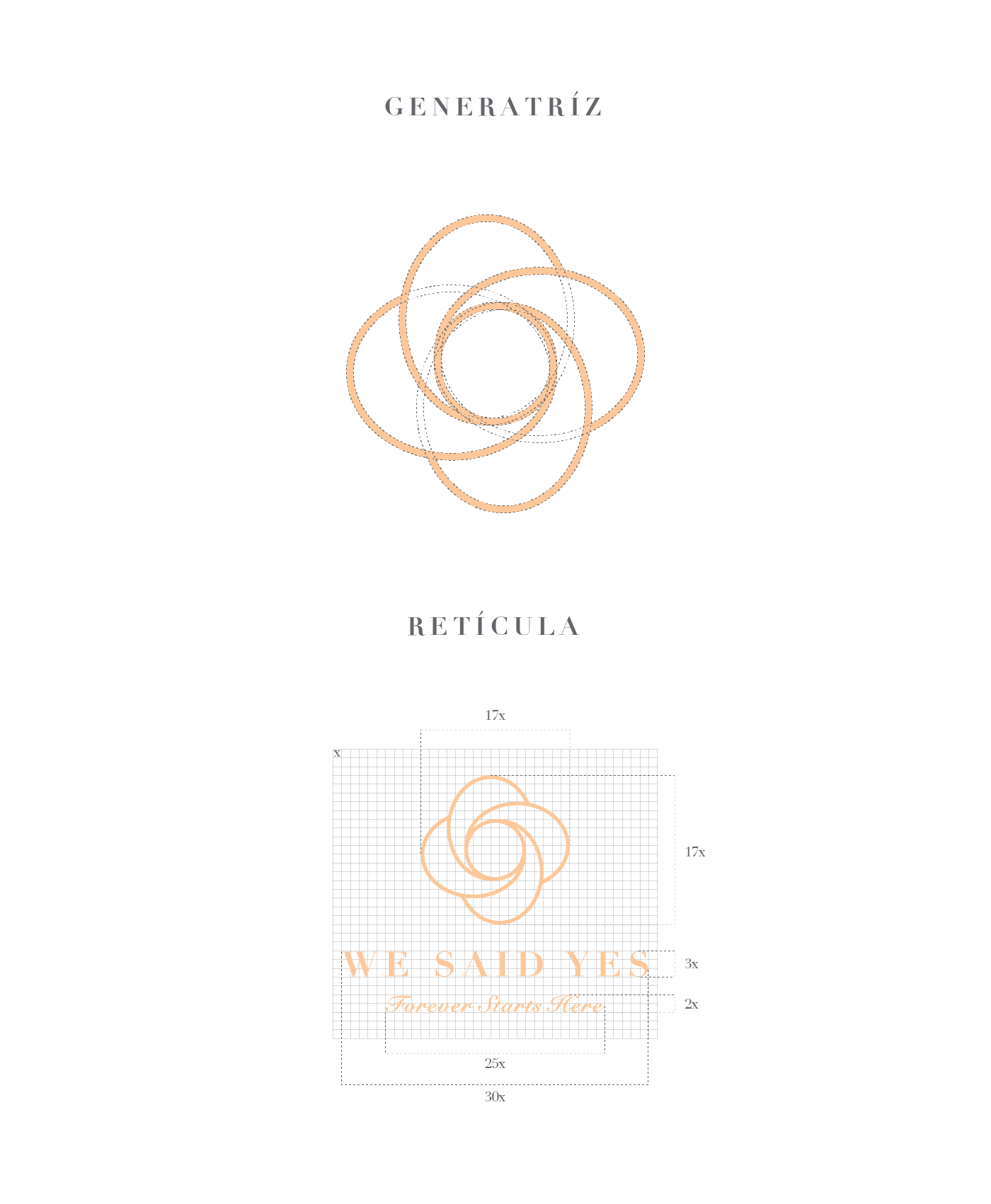
La inspiración para el diseño del imagotipo fue el nudo de los enamorados, llamado así por estar formado de dos nudos simples entrelazados, se usan como símbolo del amor que une a dos personas. El nudo se encuentra representado por medio de un icono gráfico al centro y arriba de la composición, su centro circular significa el inicio de una historia que se va desarrollando por medio del nudo de los enamorados hasta el infinito. El nudo representa la unión, el soporte y el trabajo en equipo de un matrimonio.
We Said Yes está representado con una tipografía serif con altos contrastes, las astas de los caracteres representan el soporte que se da mutuamente la pareja, el estilo de la fuente simula columnas griegas, y la composición aporta soporte al icono gráfico.
El slogan Forever Starts Here utiliza una tipografía script cálida y romántica, que va perfecta con la temática de las bodas.
La marca posee una amplia gama cromática que representa a la mujer con sus tonos cálidos y al hombre con los tonos fríos.
El color verde esmeralda representa felicidad, bienestar y progreso, es un tono considerado positivo. El color verde pastel significa nuevos comienzos y es un tono muy estable. El marrón es un color que tiene como significados resistencia, defensa, confianza y permanencia. El tono durazno representa cariño y protección. El gris frío es usado como tono neutro, destaca su elegancia en el branding. El color blanco es símbolo de las bodas y es asociado con la pureza y elegancia.
(English)
We said yes consists on a wedding planner book that Helps the event organization of the newly engaged couple. The creators of the content needed a name that implied the idea of the book and the teamwork of the bride and the groom to work towards the planning of the wedding, simple logo, with symbolism and that made reference to weddings.
The inspiration for the design of the imagotype is the knot of lovers, named for the style of the intertwined eyes. The knot is found by means of a graphic icon at the center and above the image, its circular center signifies the beginning of a story that unfolds through the knot of lovers to infinity. The knot represents union, support and work in a marriage team.
We said yes is represented by a serial typography with high contrasts, the stars of the characters represent the support of the couple, the style of the font simulates Greek columns, and the source of the ideas to the graphic icon.
The motto Forever Starts Here uses a warm and romantic typographical writing, which is perfect with the theme of weddings.
The brand has a wide chromatic range that represents the woman with its warm tones and the man with the cold tones.
The emerald green color represents happiness, wellbeing and progress, it is a positive tone. Pastel green means new beginnings and is a very stable tone. Brown is a color that has as its meaning resistance, defense, trust and permanence. The peach tone represents love and protection. Cold gray is used as a neutral tone, emphasizes its elegance in branding. The color white is the symbol of weddings and the one associated with purity and elegance.
Credits
Design: Vale Petit
Switch Marketing 2017