


S P A C E D
LOGO COMPETITION
THE BRIEF
In occasion of the Epicurrence event Dann Petty (@DannPetty) organized a contest about a fictional company which would offer affordable trips to the Moon, other planets and back. The challenge was to crate a logo for a technologic company but with a modern feel and which could appeal to a target audience between 25 and 45 y.o.
Keywords were: Virgin American, Tesla/Audi, Nike, Rolex, Apple Watch, white shoes, iMac Pro, Pixel 2 XL in white, Stormtroopers + The Darkside, more Coke than Pepsi, Mini Cooper, Elon Musk.
The tagline was: To space and back, safely.
PROCESS AND CONCEPT
To design the logo I started from an illustration that soon became the Icon of a fictional app for the company. There the focus of the narrative is the travel to new mysterious worlds as a new exciting experience. Everything happens safely and quickly as suggested by the colored line, which as a straight trajectory passes through the letters and reaches the new planet, built with the half shape of a circle, which is the D of the logo as well. Professionalism in the Tech business is communicated by the color palette, with a small accent of light blue to keep the brand fresh and oriented to a young audience, yet its solid, geometric structure portrays reliability and prepares the customers to its High-End experience.
The future is already happening.

This under is the Icon for the SPACED app.

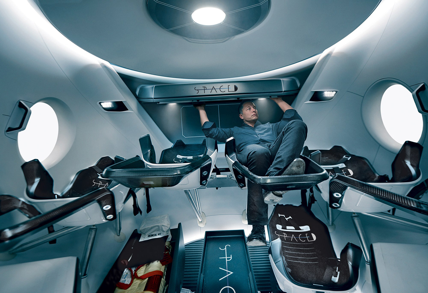
Other examples of application of the logo on space ships and space suits.


THANKS FOR WATCHING!


