Barilla New Logo & Packaging Project
I worked on one of the biggest pasta company "Barilla" of the world.
The company was founded in 1877 as a bakery shop in Parma, Italy by Pietro Barilla. The company is privately held, and remains in the fourth generation of Barilla family ownership and control through three brothers, chairman Guido Barilla, and vice chairmen Luca Barilla and Paolo Barilla.
Problem
The brand produces very quality pastas all around the world. But they have ordinary logo & packing at market. It might be better
01 - Logo Regeneration
First of all, I wanted to make this company's logo better. I want to get rid of that red shape and shadows on it. Then I took only the type of logo. At the end; I left space seems like pasta piece between two L letter. That makes the logo more minimal and significant


02 - Subjects & Preview
This project have 4 different titles for new packages. These are; for Kids, Typographic, Minimal and Retro/Vintage. All packs designed after a long researches and informations. This project became one of my best that I work on it. Especially for kids.

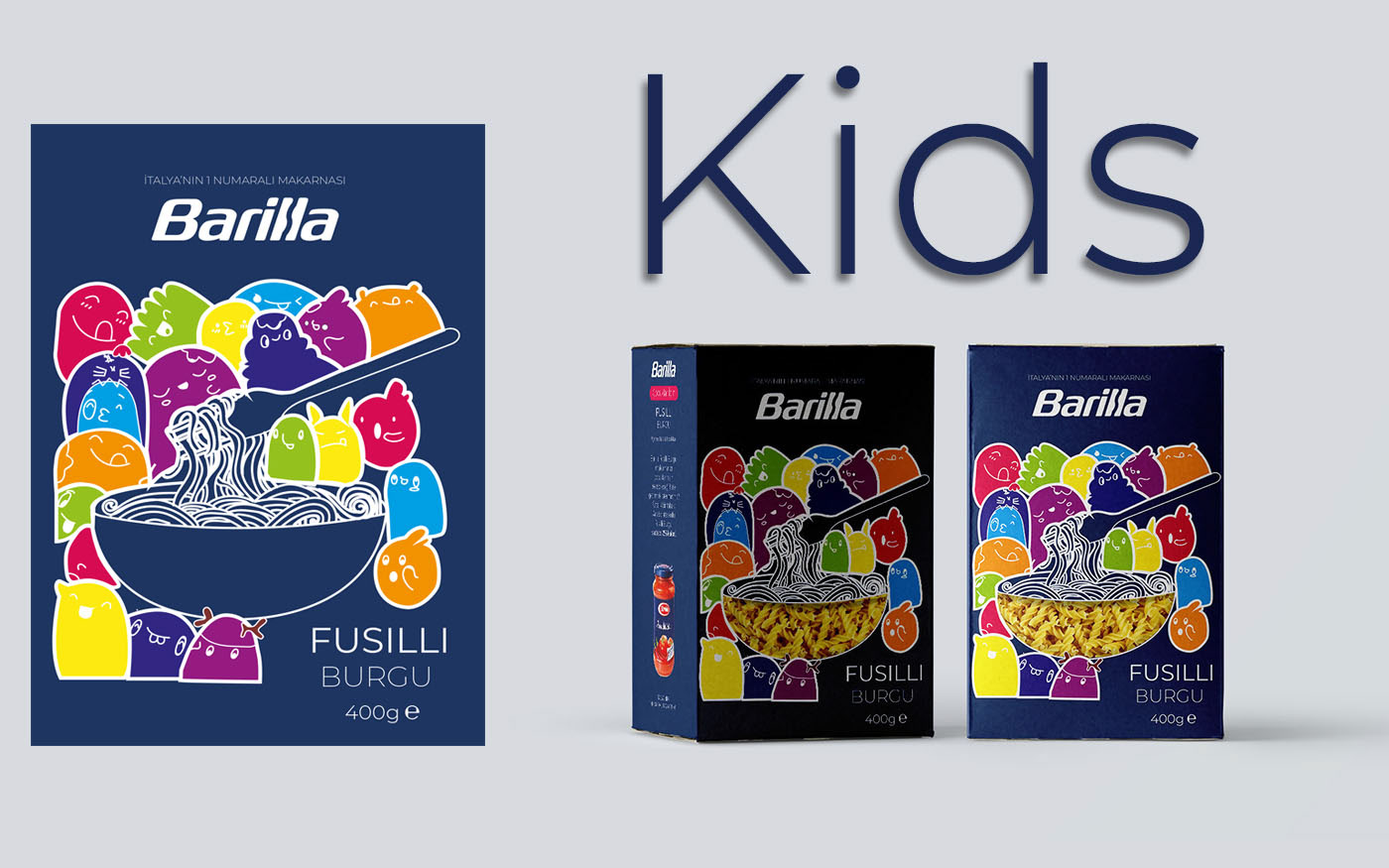
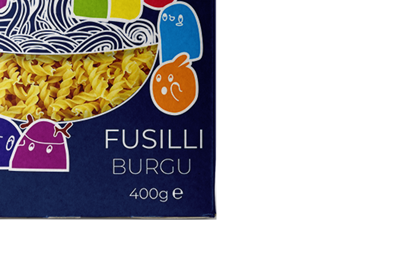
A - For Kids
On this work, I created some symphatethic heroes for kids. I wanted to make it alluring to sell more.
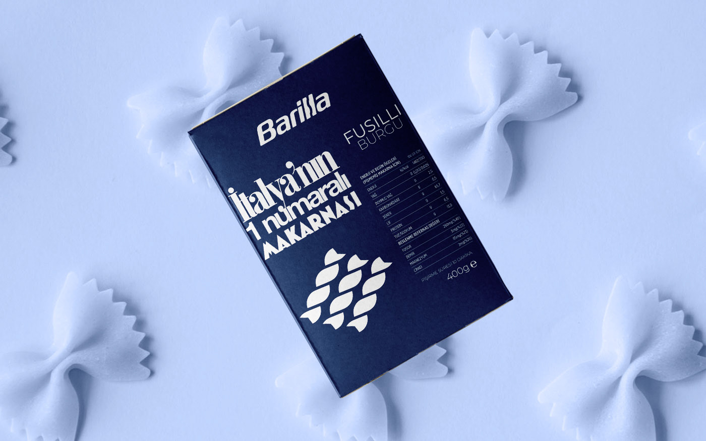
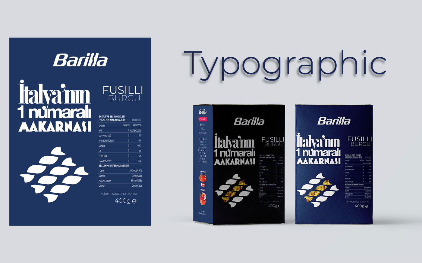
B- Typographic
On this work; I used 3 different fonts at the front side of the box. Differently; I put the energy and nutritional values to the front.

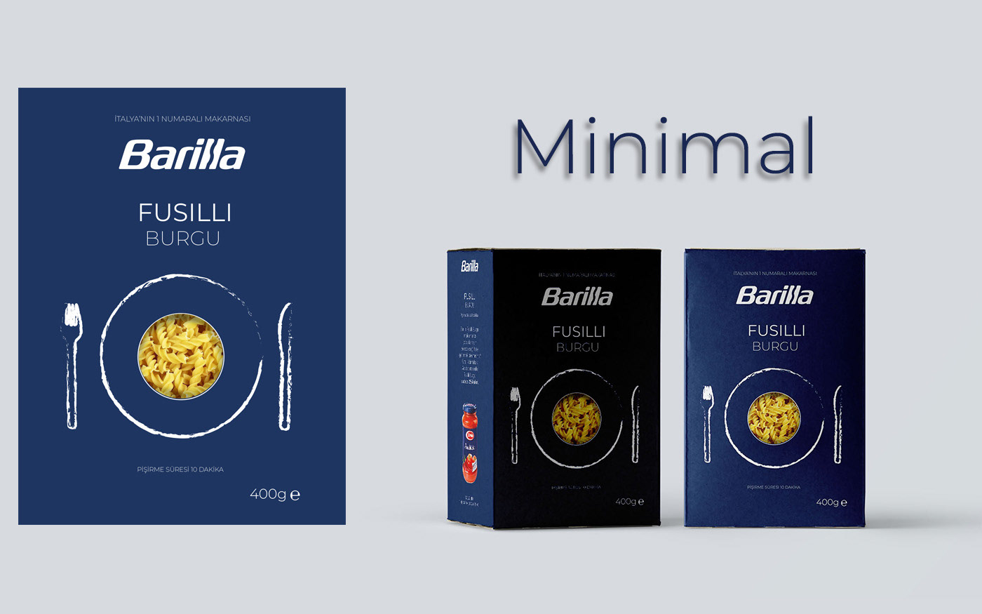
C - Minimal
On minimal Pack, Simply I put plate, fork and knife sketch frontside of the box.

D - Vintage/ Retro
For the Vintage/Retro packing; I put Barilla's old illustration. Also I create new traditional ornaments sides of package.