
E-mail Template Redesign for Gramex
The Marketing Department (MarCom) requested a template for the newsletter they send to the members once a month through their mail system. This template should follow Gramex’s visual identity and be readable across different devices.
The Marketing Department (MarCom) requested a template for the newsletter they send to the members once a month through their mail system. This template should follow Gramex’s visual identity and be readable across different devices.
My Role
I was responsible for the whole design process.
Timeline

Tools and Methods
- Design methodology: Design Thinking
- User research via contextual interview
- User research via data from the analytics section of the e-mail marketing platform
- Creation of high-fidelity mockups with Adobe Photoshop
- Creation of an interactive mockup with HTML and CSS
- Test of the prototype with different mail clients
- Presentation of the solution
- Implementation of the solution in the e-mail marketing platform
- Crash course to MarCom about how to use the template
The Process
I started the project by performing a contextual interview, in which I asked MarCom to make a dummy newsletter. From this interview I discovered 4 key pain points, that MarCom ranked in the order of importance:
1) The template had 2 columns and featured too much information, with seemingly no logical order of what is most important to communicate to the Gramex members
2) The dummy newsletter did not render well in some of the mail clients we used to test it
3) The links and the headlines on the left sidebar had the same visual style and behavior, which could create confusion among the members
4) MarCom experienced problems finding pictures with the right size, because they did not know the dimensions that were hard-coded in the template
The following images show the original template, and a sample newsletter.


The second step was to use the data provided by the e-mail marketing platform to investigate which devices and e-mail clients were used when reading the past newsletters. The 5 most used e-mail clients were chosen to have a design that would be compliant to them, irrespective of whether they were used on mobile devices or stationary or laptop computers. This decision would start the research with respect to the technical requirements that need to be fulfilled.

I made a first design iteration of the redesigned template in which I focused on elements from information architecture, where the news would be organized and featured in the order of importance with the most important news on the top section, full width and with a picture hero style. The call-to-action elements changed from links to buttons, with a specific visual style that makes them quickly visible.
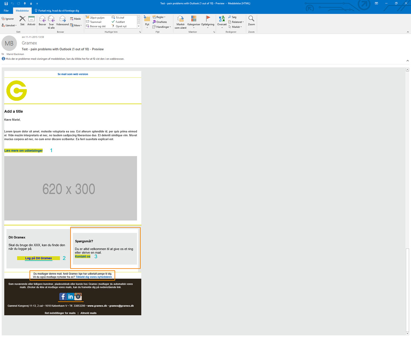
This iteration consisted of a Photoshop mockup and an HTML/CSS prototype. This coded version of the mail template was tested on the chosen mail clients and devices, but the test e-mails did not display properly in about 60% of the clients and devices, due to each client's own quirks regarding HTML e-mail. For example, from testing the prototype in Outlook for Windows, we experienced the following issues:
- The newsletter is not in the center of the e-mail
- The call-to-action (CTA) buttons do not have the padding that I programmed (numbered in blue)
- The CTA button text “Log på Dit Gramex” does not have the coded blue color (underlined in blue), that the other 2 CTA buttons have
- The column to the right (boxed in orange) is not aligned with the column to the left
- No padding on part of the disclaimer text (boxed in orange)
- No space between the social media icons (underlined in orange)
On iteration #2 I managed to solve some of the spacing and alignment issues, but the padding inside the 2 small columns disappeared and the buttons (numbered in blue) and the social icons (underlined in orange) do not render properly.
The orange and red background colors were used as a mean for me to see how the elements that I had problems with rendered. I removed these colors when the testing was completed.

After reading about the challenges of how different mail clients treated HTML code, I made a one-column template in the mail system, that rendered successfully in all the main clients we tested. In addition to the features mentioned above, the new template has placeholders indicating the picture size in pixels, thus facilitating finding or editing the pictures to use.
End Result
The new template was presented to MarCom, who was satisfied with the results. In addition to implementing the new template to the mail system, MarCom got a crash course in how to use the template to make the newsletters.


Left to right: the newsletter template, sample newsletter in Outlook for desktop and on Gmail on mobile.
Impact
Since the implementation of the new template, the following metrics showed improvement within the first 3 months:
- The bounce rate decreased by 11%
- The unsubscribes rate decreased by about 50%
- The number of people who opened the newsletter increased by 5%
