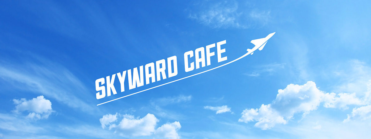
I was tasked with creating a new name and graphic identity for a food building at the Hill Air Force Base in Utah. The building had seen better days, so a name that signaled change and a positive new direction felt appropriate. The base is also home to plenty of fighter jets, with many test flights taking place each day. The Skyward Cafe logo shares that same inspirational feeling and upward movement.
The supporting graphics reference WW2-era brush scripts, combined with slab-serifs and iconography relevant to both the food being served and the tools employed by the military each day to evoke a strong, workmanlike feel that is both classic with a modern implementation.


The restaurant overhaul also added a new food genre that the base didn’t have before: Asian. Tiger Wok needed a logo and look that would differentiate itself from the other food offerings in the cafe while still fitting the same visual aesthetic. A separate logo, using the same brush script as the rest of the identity, further connects the cafe to it’s location.

