
Sensorium - SCAD Materials Library
The Sensorium is SCAD's concept for a unified materials library that can be accesed by any student. This will allow them to research for new materials to use for their upcoming projects, as well as add materials they've found around the web. The main student population targeted with this project would be students within the Industrial Design and Furniture Design departments. It is also for anyone that works with materials to build models or prototypes.

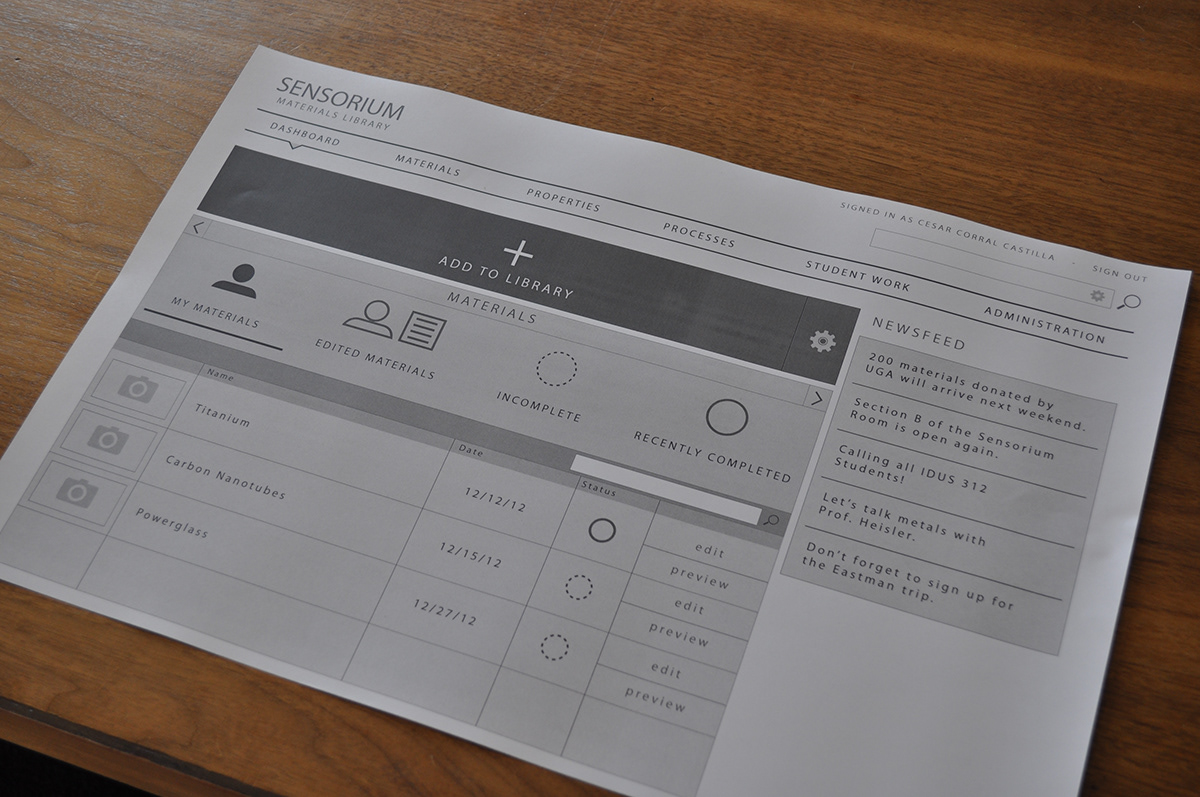
The new homescreen layout is simple and straightforward, allowing the user to quickly find what they came to do.
The New Sensorium
Every single aspect of the new interface was designed with the user in mind. Starting from the Homepage, with a streamlined layout and user requested features, to a much simplified and intuitive Add Material process, the new Sensorium Experience is a better way for students to add, discover and navigate through the content, letting them search for inspiration when thinking about materials for their upcoming projects, as well as adding new ones to inspire their peers.

The New Sensorium has a beautiful interface, with images to quickly identify materials and faster access to important actions.

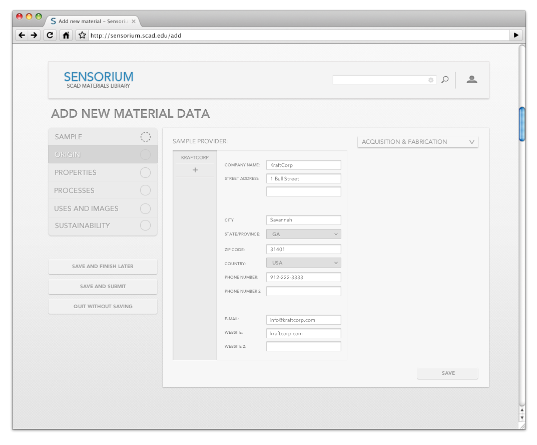
First page of add material. This concept lets you scroll through different panels to see content at a glance.
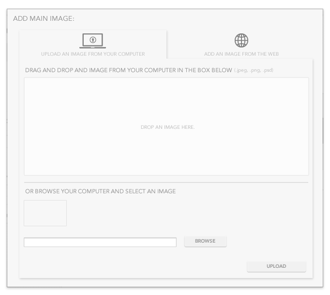
Add an image dialog. Dialogs were redesigned from the ground up based on user feedback.

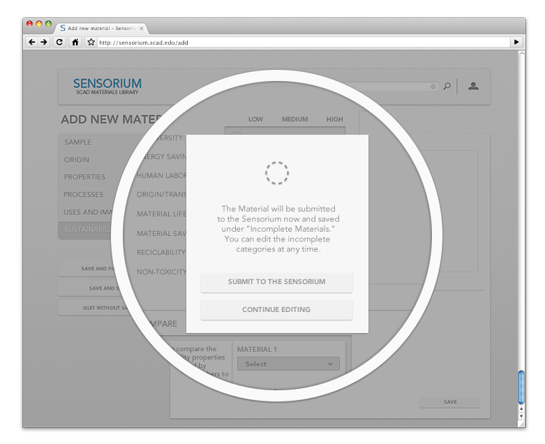
Users get instant feedback from the system after they save. They can jump between panels to fill up the ones they have information for. If they don't have information for the other panels, any student can come at a later time and add aditional information.


The Uses Panel in the old prototype was completely redesigned. Users needed more Sources options to document material uses as well as an Image Gallery. Both features were included in the New Sensorium.
This was the starting prototype for the class, given to us by the teacher.

This is the "add material" process in the old prototype.

Each graph represents the percentage of users that found that particular experience to present the most usability problems.
Usability Testing
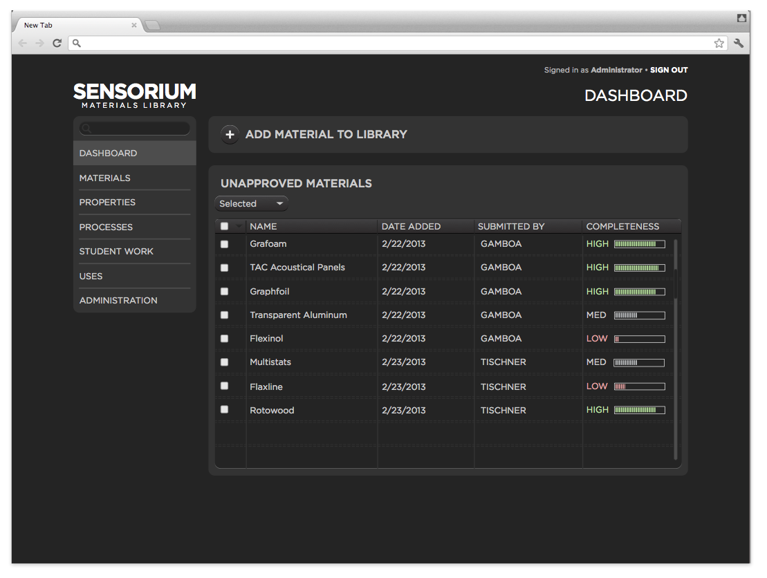
The first experience which users found out to have the most usability problems was the Home Page Layout (first screenshot of the old prototype.) This page was misleading to most of the users we interviewed. While the users weren't sure where the left side bar would take them, some of them where inclined to click on the “Material” option in that list, instead of the “Add Material To Library“ option in the top of the page, which led us to think that this option is not succesfully displayed. Other problems include confusion about what “Unaproved Materials“ is, the “Completness“ progress bar, and the location of materials that the user has personally submitted in the library.
The second experience which user had problems with was the Edit Material Data process (second screenshot of the old prototype.) This experience was confusing and had poor usability to 90% of the people we interviewed. They were mostly confused by the “tabs“ system that is used to edit the new material data. They didn’t know that they had to click on the different “tabs“ to edit a different set of information. The save and edit button was found to be redundant too, adding one unecessary step to the process. Finally, people wished that entering the sample information (the first page of the process) felt more like a part of the overall process instead of a separate action.
Other minor problems described by the users that were solved in the Final Concept:
Add a Description Box
Request for a Unified Gallery
System Feedback for Saving
"My Added Materials" is missing
Unapproved Materials is secondary
Show pictures at a glancein the Home Page
The Uses Layout feels incomplete
Add Different Uses other than Pictures or Videos (Links to Blogs, Articles, Documents, etc.)
Multiple Providers for Materials or Samples
List of Options for Processes
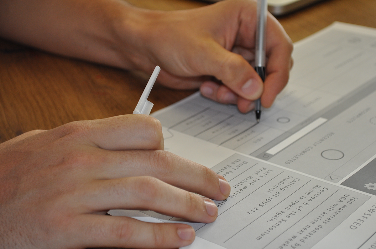
Here are some pictures of the usability testing phase, in which we had users go through the old prototype, as well as our new proposed interface, designing with them along the way.
The wireframe of the new proposed interface. Our teacher recommended us to print them so that testers could write feedback or even draw solution they would want in the final design.

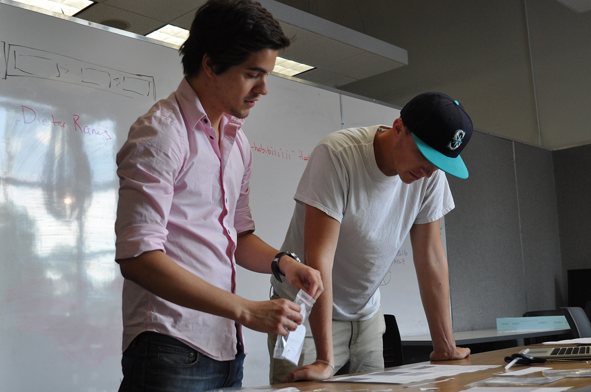


Debating.


The shoes I wore to the testing day.


User-drawn solution were a great way to understand their requests.


That's a wrap.


