PURSUIT OF THE COMMON GOOD
THE PURSUIT
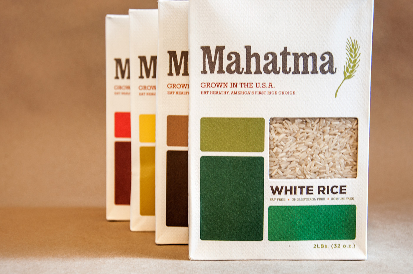
Students were given an existing product found in most supermarkets. The purpose of this project is to redesign its packaging and to explore a strong shelf presence as well as promote the message of quality. We also needed to develop line extensions. I was tasked with redesigning the American rice brand, Mahatma, owned by Riviana Foods, Inc. Mahatma is America’s first major rice brand.
THE ACQUISITION
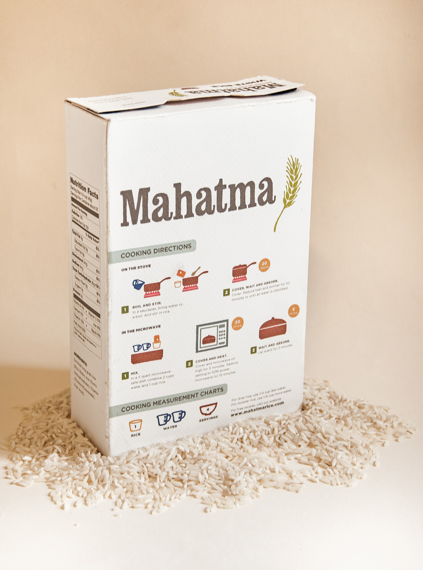
The original packaging of Mahatma was a plastic bag. I redesigned the packagingusing a box that makes the product recognizable on the shelf, makes it easy to store and keeps the rice fresh. The keywords for the concept are family, homemade, and American. I focused my target audience on shoppers who eat rice more than three days a week. The key consideration for rebranding the mass market line is to increase the products’ visibility over the other rice brands on the shelf. I explored type hierarchy and identified what is the most important information for consumers to distinguish in
the packaging.
THE OUTCOME
To make the newly designed packaging distinguishable in the supermarket environment, I redesigned the logo by typesetting it with Clarendon Condensed Bold to keep an American feel. I created line extensions for white rice, brown rice, wild rice and red rice mix by using different colors to separate each line. The frontside graphics are inspired by a rice paddy field with a die-cut technique to show the rice. On the back are step- by-step cooking instructions using hand- drawn icons.