
Toongabbie Christian College Re-branding
Transforming places, people & the community.
Overview:
Toongabbie Christian College is a Kindergarten to Year 12 school in Western Sydney, NSW, Australia. Established in 1981 and originally conceived as a community christian school created by the local church group, the school now boast 900+ students ranging from primary and secondary school. The school went through various name changes from Toongabbie Christian Baptist Community School to Toongabbie Christian School to now Toongabbie Christian College.
An assessment of the current identity found that the staff, students and community felt the school needed to be re-positioned with a public perception of looking and feeling undervalued. As a college it further needed to be taken through a business and branding exercise to take the next step in its evolution. The private schooling market across Australia is very competitive and it was felt that the current positioning did not accurately reflect their current position in the market and their future vision.
Handle Branding was engaged to re-brand the school in its entirety from the naming, positioning, colours to the complete rollout and application. Handle’s engagement has been over a period of time whilst helping with the transition and application of their new brand we have watched it empower positive change and responsibility. The re-brand has created a more unified branding presence and a completely new position in the market.
Project needs:
From initial meeting it was agreed that internally the executive staff and broader staff need to work through a brand values, mission and vision process, this was arranged through a third party to which Handle also participated in over the period of a weekend. The exercise brought out the past, current and future concerns of the positioning of the school and how a new identity would be appropriate, it further helped unify the school team as they all worked collectively to change the school for the better.
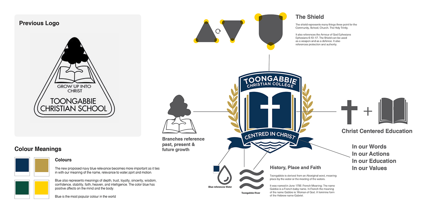
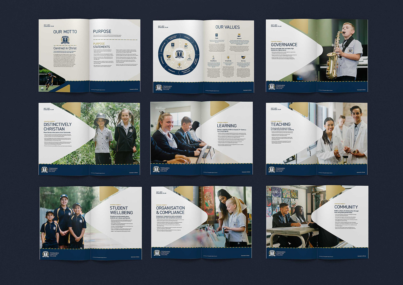
After the brand values, mission and vision was created this gave a good insight into how the school needed to move forward. Terms such as dated, in-consistent, feeling like the ‘poorer cousin’, relevant, proud, honourable where all themes that would need to be reflected in the creative process. It was evident that being a “newer school” that they needed to anchor off their history and their value to which they bring to the community. Whilst the school wanted to look modern it need to reflect a sense of purpose and stature. An identity and creative was needed to reference the past, present and future direction of the new college. This framework and foundation of the new identity and creative would lend itself to a new set of rules, creating consistency in it’s application and rollout.
Design Challenge:
Reflecting on the process their where multiple point of deign challenges some of which include;
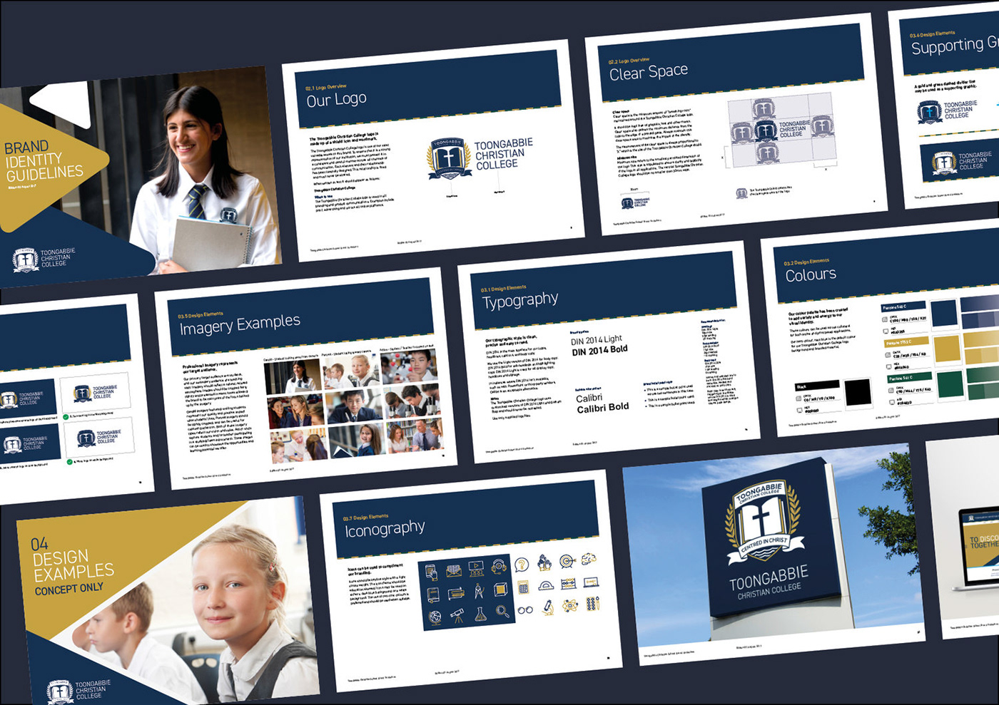
The logo and identity
The creative process of building the visual identity faced the opportunity to build a very “trendy and modern” themed logo that may look good in the short term but not last the test of time due to changing trends. The outlay and application of this logo meant that it would be seen on every asset of the school with a large financial investment and it is very uncommon for schools to rebrand. On reflection of the brief it was imperative to build off the past where we pulled inspiration from to build the new identity, this was seen by evolving elements of the old logo such as re-using the rounded triangle, or using their old green to create a dashed piping, or using element of the tree into leaves to the meaning of the name and it's location.
Presenting the identity
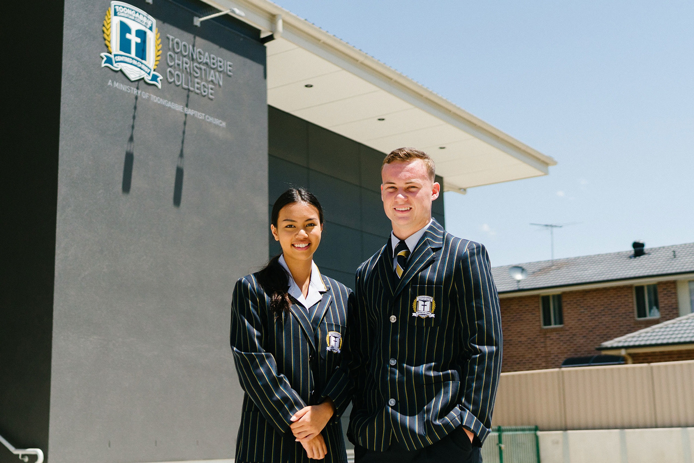
The challenges faced where that we where changing a very public facing brand, one which represented the families, students, staff, board, volunteers and community. Working through and having a solid process and foundation to build the visual identity meant we where to face scrutiny to some degree but was very minimal due to the openness of the process. We were able to present the brand on multiple occasions as an intiative that the now college was undertaking. With previous experience rebrand the a school we learnt that it was important to involve the community in the process and application. Changing 900+ students uniform is very expensive for parents and so it was phased in over a period of time with uniform showcases and presentations to engage the community. The designs where well accepted and was so great that students where asking there parents to change uniform because they looked better.
Application of the identity
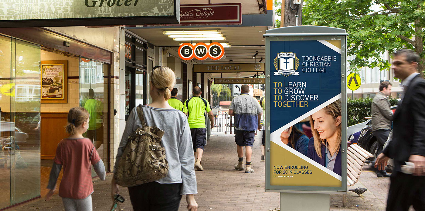
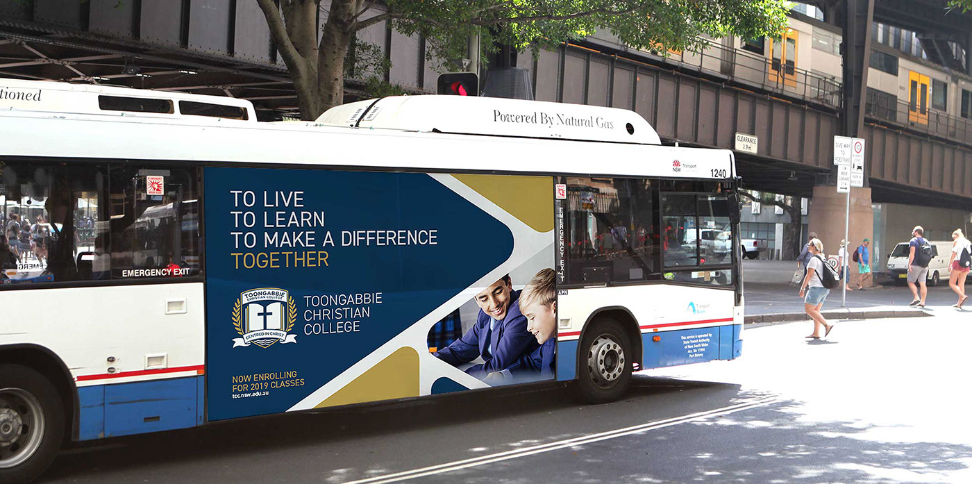
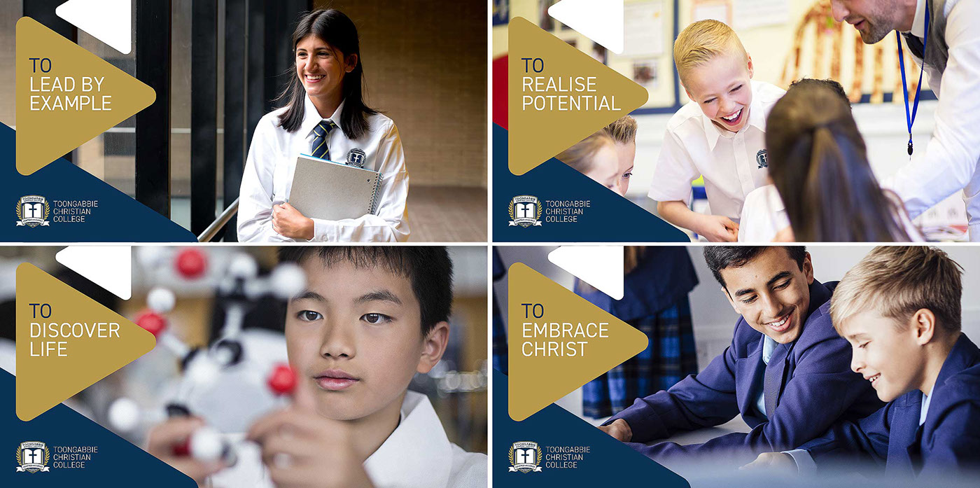
At various points to which the identity and branding has been able to lean back on it’s guidelines and face design challenges. Some of which include the applications of new colours, paint colours, bus applications and school uniforms. During the uniform design phase there where various design meetings to discuss and communicate application of the logo and how we could embroid it i.e on ties and in smaller forms of stitching. During the identity phase we had supplied various forms of the logo which could be adapted to suite the applications in larger formats and smaller and this helped curve the design challenges faced as we had pre-empted and ran test during the design phase. Another challenge we face was in the wrapping of a 44 seater bus which faced it phycial design challenge due it’s size but by leveraging the previous identity use of the triangle we where able to create a stand out design piece.
Effectiveness:
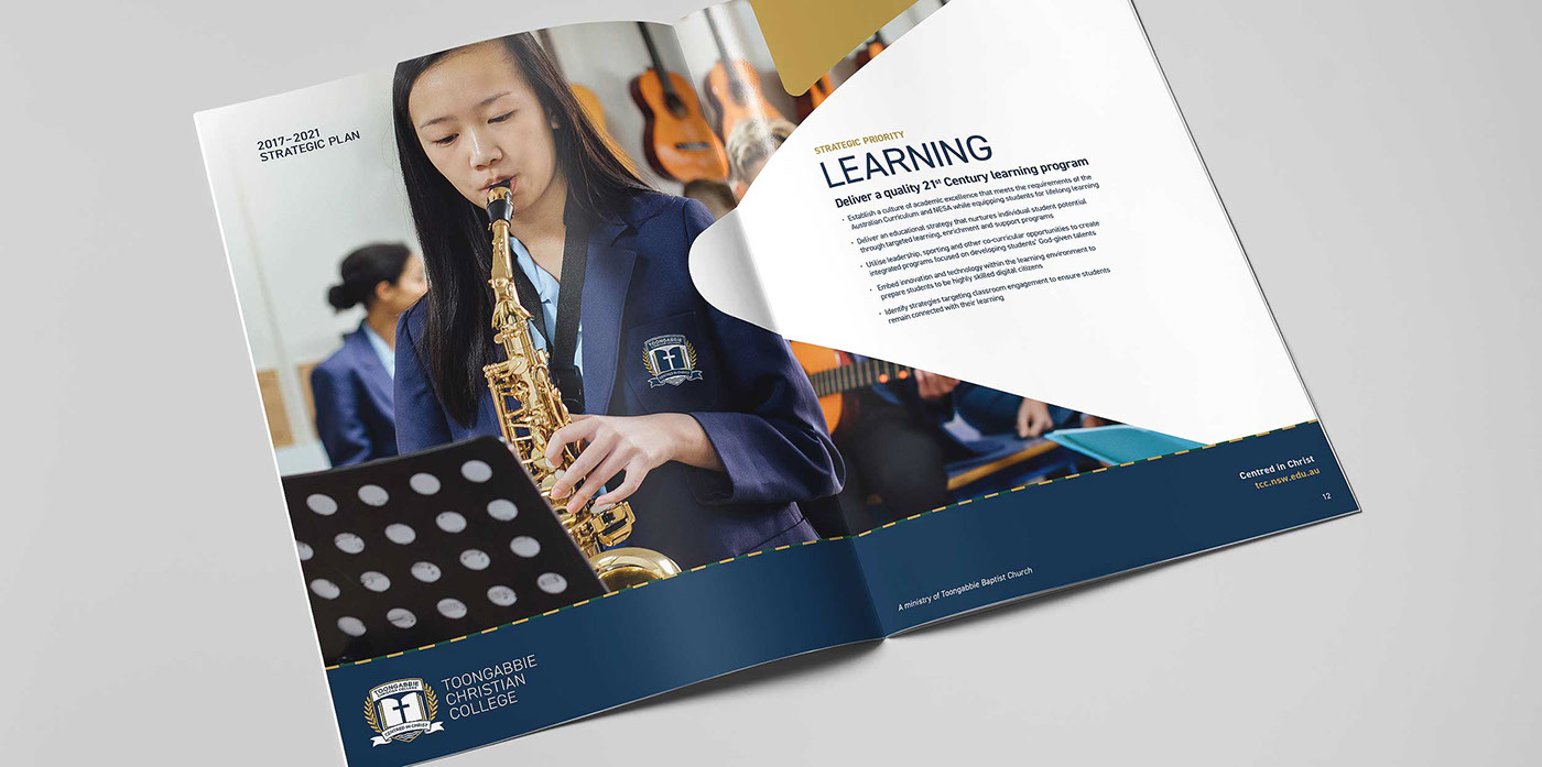
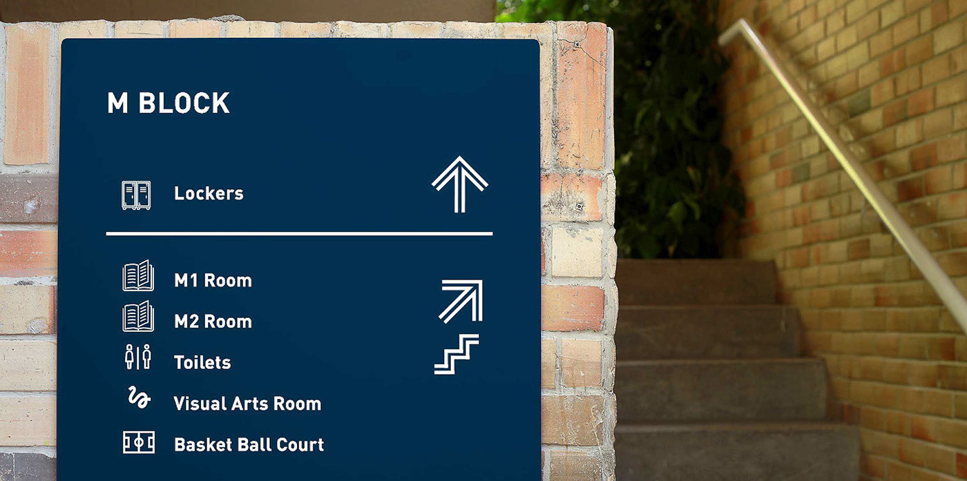
The effectiveness of the new branding, identity and application has really hit stride with a rejunevated outlook on the school. We have been able to shift the internal negative acconations that students would mock such as “Toonscabbie”. We have been able to grow the basis of their previous reputation and build off that shifting community outlook to that of a positive appreciation. The staff feel proud to be working at the school shown in ways of appearance such as changing their dress attire to reflect the new school colours. Students are just outwardly saying its “way better” requesting their uniforms to be changed straight away to which is empowering the pride of their parents. The parent feel that their money is being better spent and further the value of education has increased. The actual reputation of the school has also doubled with influx of new students and promising new buildings. The pride of the school has shifted and they have taken and grown into their new brand. The new tagline to “Grow into Christ” has seen teachings shift to reflect new attitudes and themes, such as kindness and Gratitude for all students. With over 80% of students now wearing their uniforms, we have been able to build off the effectiveness of the new brand with new signage, way finding, bus signage, marketing brochures and applications.
We have been able to effectively transform the identity and attitudes of a place the people and the community it surrounds, and that is very proud moment for all involved.
2020 Transform Design Awards Asia 😁
BEST VISUAL IDENTITY FROM THE EDUCATION SECTOR SILVER


Visit https://www.tcc.nsw.edu.au for live site preview and application


