DESAFIO
A Hiper é uma empresa localizada em Brusque - SC que fornece softwares voltados à gestão de lojas. Eles vieram até nós pois sentiam que a forma que eles tratavam seus próprios objetivos e propósito era exteriorizado de uma forma diferente de como era cultivado dentro da empresa. Dessa forma, neste projeto deveríamos realinhar o Propósito de Marca, Posicionamento e Identidade Visual.
CHALLENGE
Hiper is a company located in Brusque - SC that provides software focused in retail stores management. They came to us because they felt that the way they treated their own goals and purpose was externalized in a different way from how it was grown within the company. Thus, in this project we should realign the Brand Purpose, Brand Positioning and Visual Identity.


ESTRATÉGIA
Através de um processo de imersão que incluiu questionários online, workshops e entrevistas envolvendo toda a equipe, detectamos que a palavra chave que guiava a marca era “felicidade”. Isso manifestava-se não só na cultura empresarial, mas principalmente naquilo que a Hiper considera seu maior objetivo: gerar felicidade ao varejista. Apesar de isto estar bastante claro internamente, a comunicação externa ainda era bastante engessada e não refletia o otimismo da marca nem os atributos que a faziam cumprir seu principal objetivo.
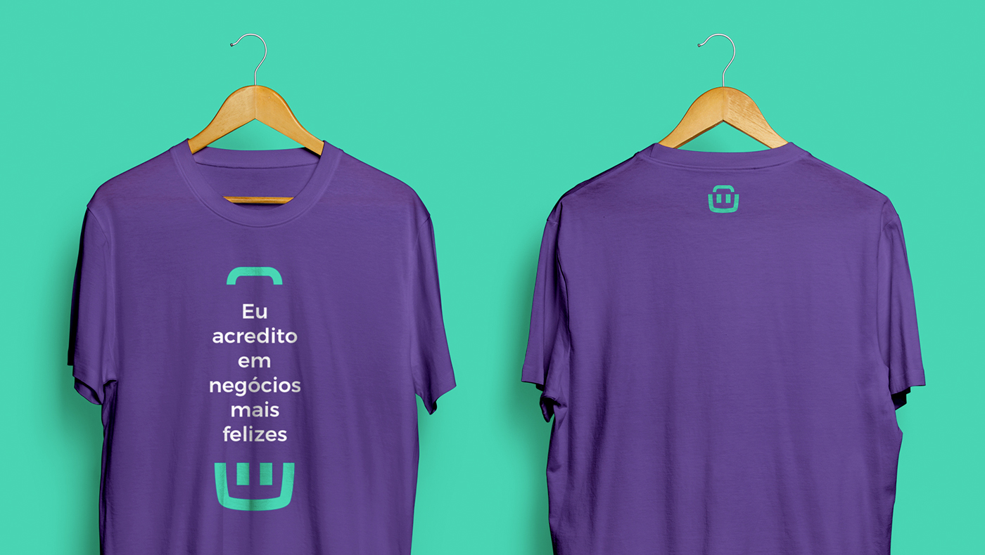
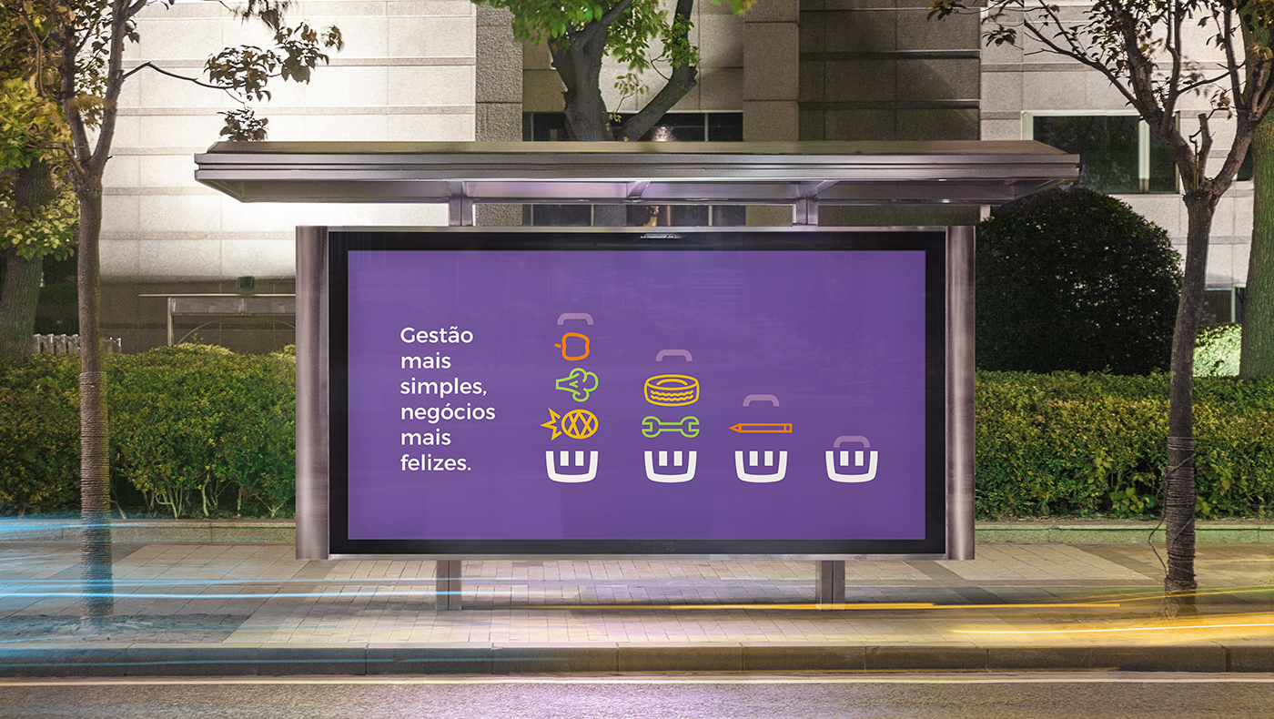
A Hiper preza por softwares extremamente amigáveis, simples e intuitivos, facilitando a vida de seus clientes e fazendo com que tenham mais tempo para outros âmbitos de seus negócios ou mesmo de suas vidas pessoais. Condensamos esse Propósito na tagline “Gestão mais simples, negócios mais felizes”.
STRATEGY
Through a immersion process that included online questionnaires, workshops and interviews involving the whole Hiper team, we detected that the key word that guided the brand was "happiness." This was manifested not only in the corporate culture, but especially in what Hiper considers its main objective: to generate happiness for the retailer. Although this was very clear internally, external communication was still heavily plastered and did not reflect the brand’s optimism nor the attributes that made Hiper fulfill its main objective.
Hiper values extremely friendly, simple and intuitive software, making life easier for its customers and saving them time for other areas of their business or even their personal lives. We condensed this purpose into the tagline "Simpler management, happier business”.


IDENTIDADE VISUAL
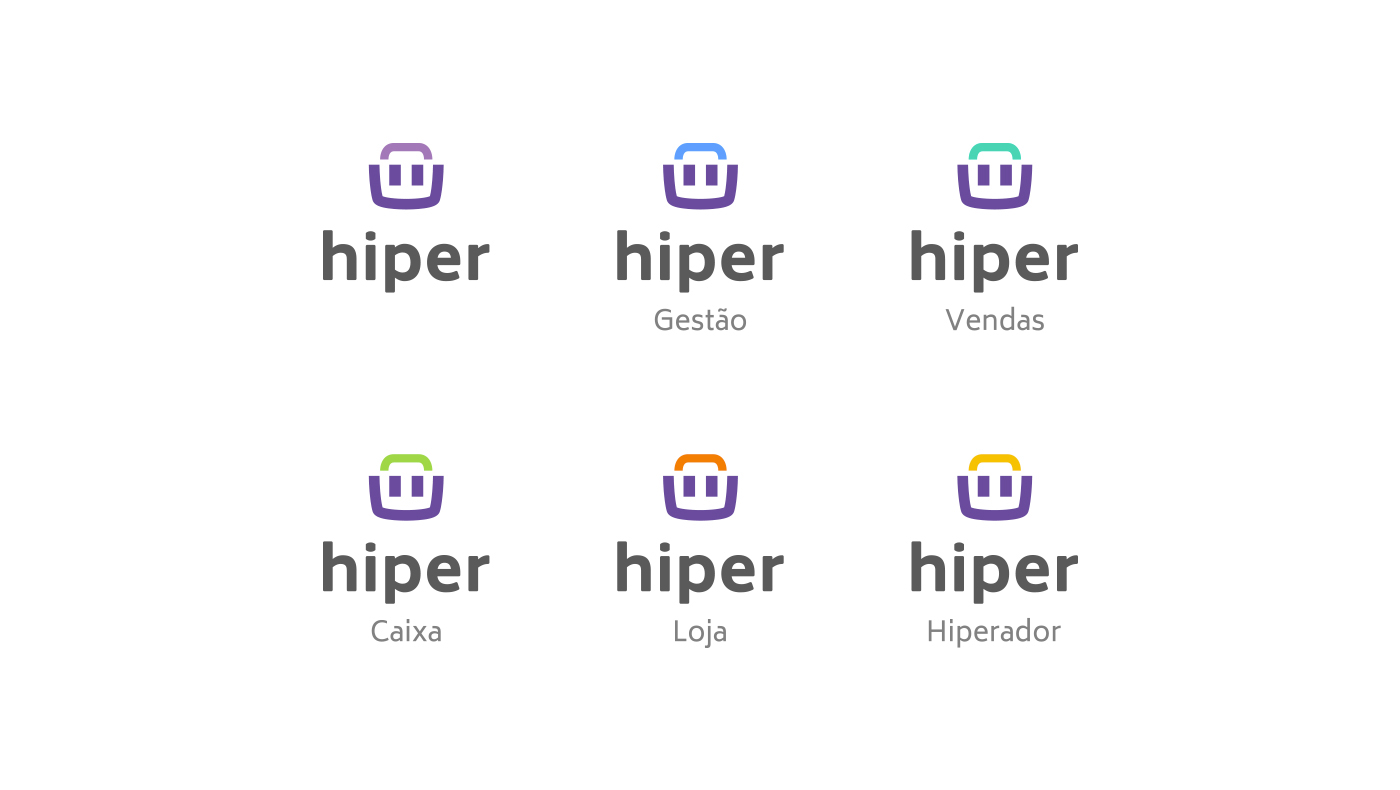
Para capturar o espírito da marca visualmente, buscamos uma identidade alegre, simpática e dinâmica, que permitisse um desdobramento em todos os produtos Hiper, mas que mantivesse a unidade da marca-mãe dentro da arquitetura de marcas.
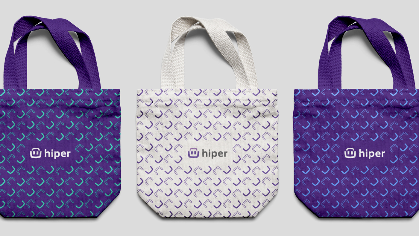
Buscamos referências nos símbolos universais do varejo e escolhemos o cesto de compras como base para o símbolo da marca gráfica. Humanizamos o objeto, desenhando-o como se possuísse olhos e um sorriso, e criando a possibilidade de representar emoções diversas. A identidade foi pautada na expressividade, alegria e paleta cromática do símbolo-personagem.
VISUAL IDENTITY
To visually capture the brand’s spirit, we sought a cheerful, friendly and dynamic identity that would allow its development in all Hiper products, while maintaining the master brand’s unity within brand architecture.
We searched for references in the universal retail symbols and chose the shopping basket as the basis for the brand’s symbol. We humanized the object, drawing it as if it had eyes and a smile, and creating the possibility of representing different emotions. The identity was based on the expressiveness, joy and chromatic palette of the character-symbol.