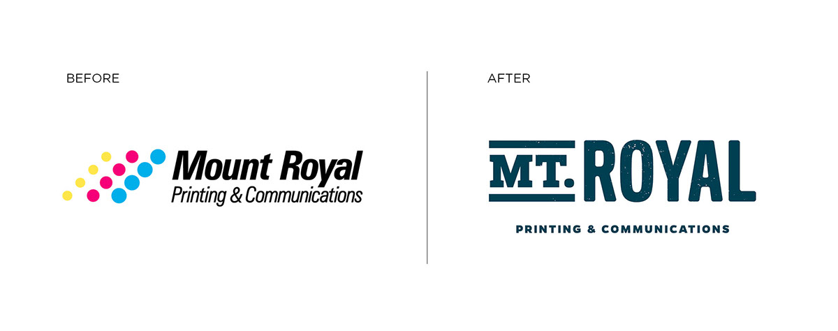
Mt. Royal has been printing in Baltimore for generations. But the company has grown to be more than just a print shop by offering strategy, mailing, and creative as well. They needed a rebrand that would reflect the breadth of their services and carry them into a new era of business.
In response we created a mark that is reminiscent of wood type used on printing presses in the 1900's as an homage to the past generations of this family owned business. We replaced the worn out CMYK color scheme with blue inspired by the "Royal Blue Line" that came through Baltimore's Mt. Royal station. This rebrand took them from blending in with other stale print themed logos to a bold, forward facing identity that won't box them into being a traditional print shop as they grow.


On request by the client we worked with a company that creates templated websites with built in tools for project management. The design had limitations but we were able to make creative use of the image slider by making a "case study anatomy." This section showed photos of projects printed by Mt. Royal along with specs about printing techniques and paper that their customers would find interesting and inspiring. It is a chance to show of notable businesses that Mt. Royal works while showcasing their capabilities.

My role: Art Direction, Logo Design, Branding, Web Design, Production
Credit also goes to the team at idfive who contributed to this project.
Credit also goes to the team at idfive who contributed to this project.