The UI / UX Behind Toppr’s New Pricing Page
In a subscription based product, a simple pricing structure normally consists of:
• Option A
• Option B
• Option C
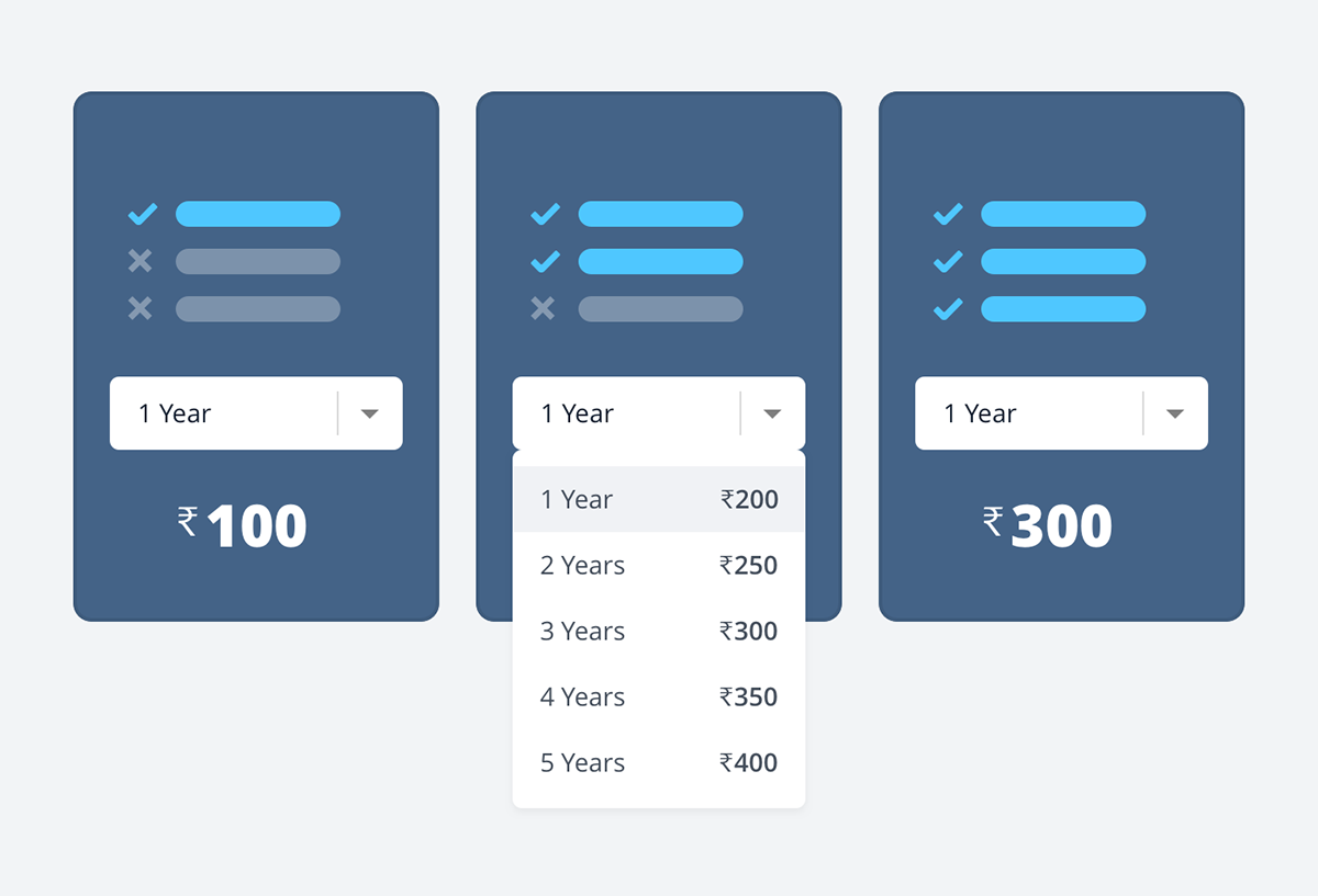
The options A, B and C can be based on duration — 1 year / 2 years / 3 years. Or features — 1 feature / 2 features / 3 features.
Simple Pricing Model: Only single differentiation in plans
Such a pricing model works well, if there’s only one factor that differentiates the plans. In the above example, that factor is duration in case 1 and features in case 2. However, when more factors come into the picture, things become more complex. Consider the example below where both duration and modules decide pricing.
Both duration and feature are deciding factors for pricing here. Hence, the arrangement is more complex.
In the case of Toppr, there are multiple factors that influence pricing. Student’s class, exam’s target year, readymade packages, discounts, custom package etc. to name a few. That is because, firstly, we are a learning app, so we need to cater to an academic year. Hence, keeping things simple and selling fixed 3-month or 6-month subscriptions may be a bit tricky. Secondly, and more importantly, most of these factors actually make it easy for students to choose only what they need specifically.
The challenge for the design team was creating an experience, keeping the complexity in mind, yet making it relatively simple for the user to comprehend.
Factors at Play
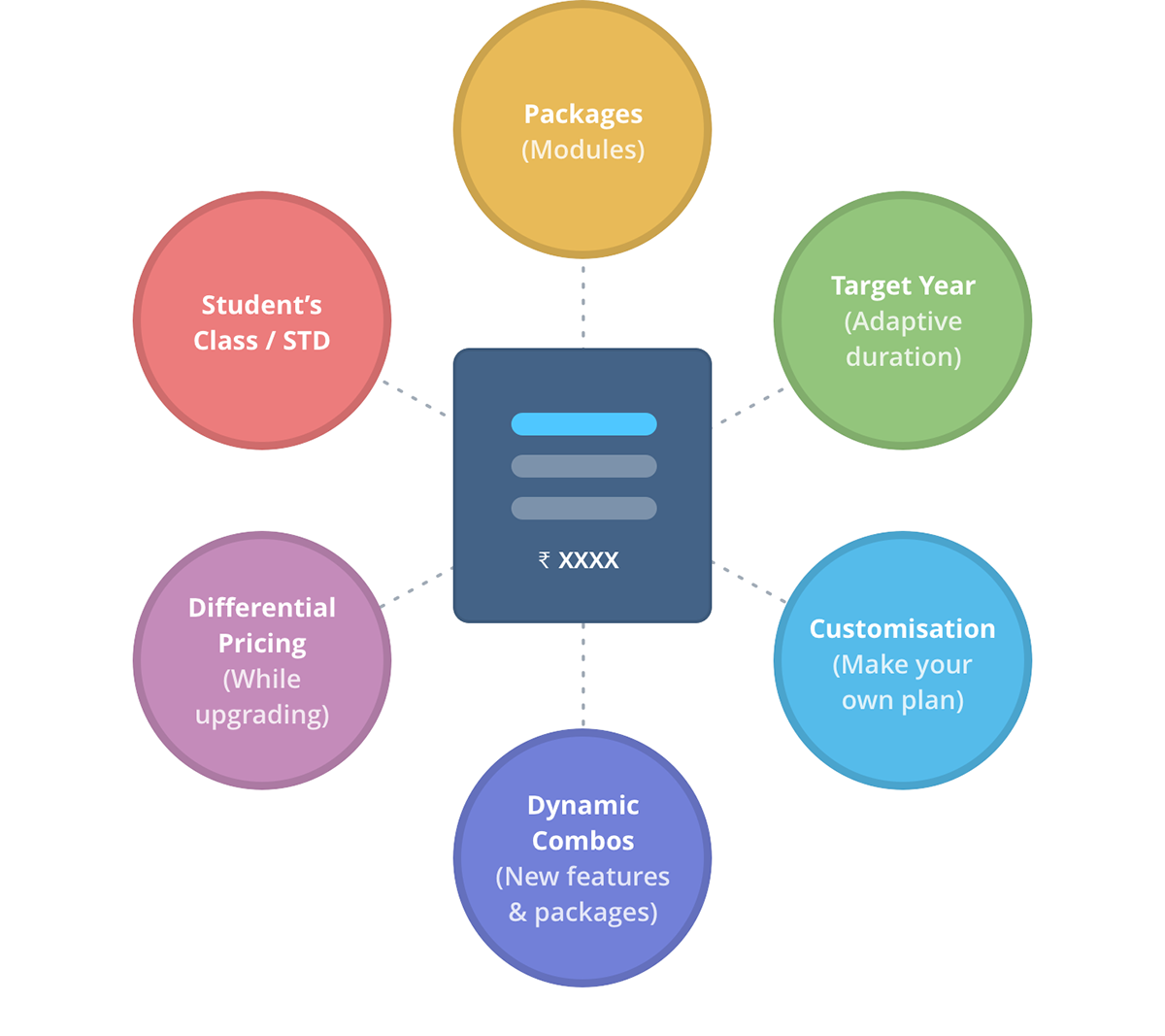
Unlike a simple pricing structure, Toppr’s pricing is influenced by many factors
Let’s understand some of the factors that influence pricing at Toppr:
1. Student’s class — The system needs to know which class the user is studying in. This enables it to show the range of classes and target years that can be covered. For example, selecting class 10 will offer you 3 options: (a) buy for class 10, (b) buy for classes 10 and 11 and (c) buy for classes 10, 11 and 12. Selecting standard 8 will give 4 options, and so on.
2. Target year — This is the year the student aims to attempt their main exam(s) in. Knowing this, not only helps the system offer comprehensive plans and best deals, it also helps it customise the syllabus and determine user stats better.
3. Packages — Each package contains certain modules of the platform. Like a combo pack, the modules collectively cost less within a package, than if you buy them individually.
4. Custom package — Though there are readymade packages available, you can build your own package to best suit your needs by hand picking individual modules.
5. Differential pricing while upgrading — It means that if you have already bought a plan, you will only pay for the difference in cost, while upgrading to a better package or a longer target year.
6. Instant discounts — Every time you add an item to your basket, there’s some instant discount applied in the overall amount. So basically, the more you buy, the more you end up saving.
7. Flexible combos — Packages may change and new combinations may spring up from time to time. However this does not take anything away from what a user purchased. To avoid confusion, the user only deals with individual modules the next time they upgrade, instead of going through packages again.
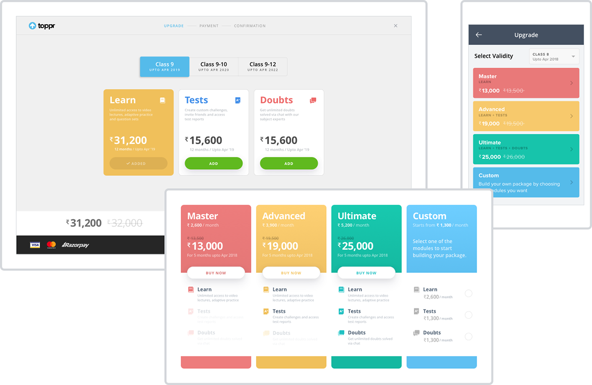
Old Design
It is worth mentioning here that the previous design was also built keeping these details in mind. Hence, it came down to identifying improvements and learning from existing data rather than introducing a new idea altogether. Since the redesign coincided with Toppr’s launch of version 4, it gave us the opportunity to redo the UI and essentially the overall experience.

Old Design: Step 1 was to identify areas of improvement.
We knew that putting the custom unit together with the rest of the packages is the way forward. Because it would put the user in a better position to compare between his/her selections and prebuilt packages. Needless to say, real estate was a constraint earlier. During the revamp, we combined two modules into one, because of which the packages decreased to 3 from 4. This made it easier for us to incorporate the changes we had in mind. In the new design, an extra unit in the interface which held amount calculations was removed completely. What we got in the end, was a design that did not compromise with important data, yet occupied less than half of the real estate. At the same time we had to ensure that things didn’t look too busy or cluttered.

Deconstructing the new unit
The following decisions were made in the revamped design:
• The amount unit and call-to-action (CTA) together made the 1st block of a package. The content of that package — modules covered, was made supplementary information that came after the action button in information hierarchy. This may be slightly off conventional standards where the CTA often follows the content. But we knew that the length of content was relatively compact. So we didn’t run into a case where the action button ever scrolls out of the viewport, neither in standard monitor sizes nor tablets. That would have otherwise necessitated a bottom CTA.
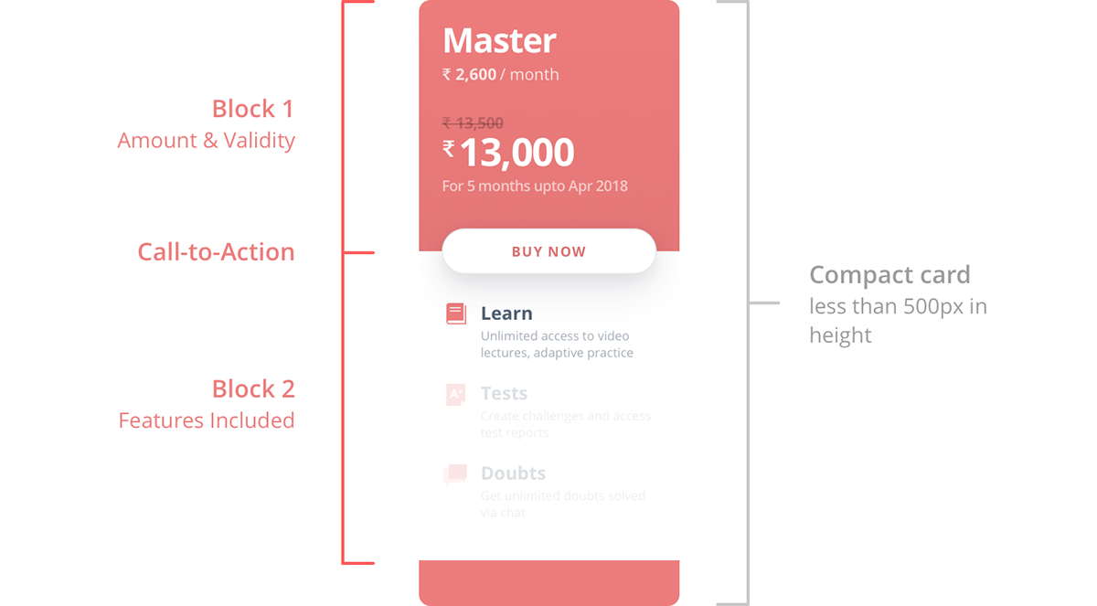
Compact size ensures the CTA remains in viewport in web and tablet
• All 3 packages contain description of each module— Learn, Tests and Doubts. Since module descriptions were well covered, we could afford to use that space in Custom Packages for the prices instead.

Custom package has amount under every feature instead of its description
• The top block of Custom Package has two states. The default state shows a little information about what ‘Custom’ means. When the user selects an item below, state 2 activates, which shows the total amount along with cut price, duration and a CTA — just like the other 3 packages. This approach ensured visual consistency between the cards while at the same time, cut down any need for unnecessary real estate as the user progresses through the journey.

Custom Package: 2-states of top block
• The ‘select class’ input disappears if a user is logged in already, since the system is aware of that information. Apart from that, the design continues to be consistent.

Student’s class/ std not captured when logged in since the system is aware of that
Upgrading, a different experience
Under normal circumstances, the user would go through a similar experience in either buying a plan (for the first time) or upgrading it. In our case, the situation is a bit different. At Toppr, packages and modules are very dynamic and may change from time to time in our constant endeavour to evolve. So a user who bought plan A earlier:
1. might not find plan A among new packages
2. might find plan A constituting a different combination
In any case, going through the same experience may cause the user to become more confused than confident. Hence, as a conscious decision, we introduced a different experience for upgrading.
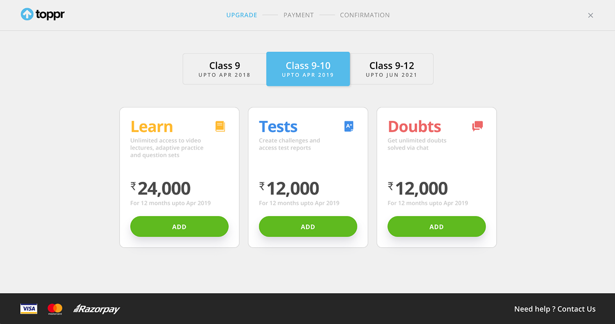
Upgrading shows individual features instead of prebuilt packages
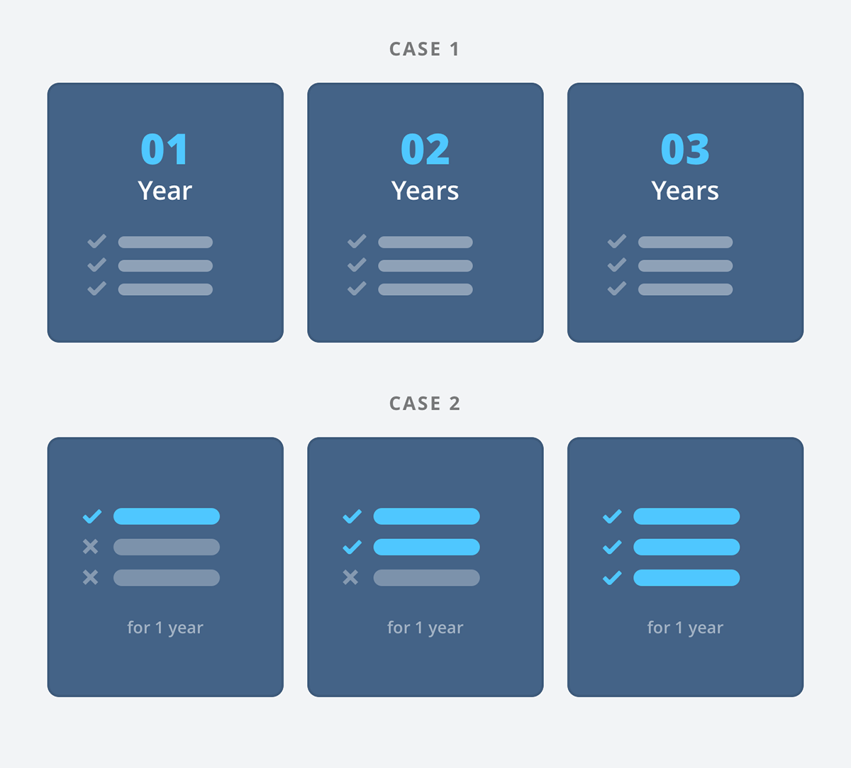
In the upgrade process, the user sees modules instead of packages. He/she instantly knows which modules are already active and which ones aren’t, in a particular target year. To help ease things further, the user lands on the target year that is most relevant in terms of extending or buying modules. Let’s explore this by looking at two examples.
CASE 1 — Simple
Let’s say you buy a full package for standard 9. All modules expire in standard 9 (year 1). So when you decide to upgrade, you land on standard 10 (year 2) instead of landing on standard 9 (year 1) on the upgrade page, since there’s no real action that you can take in standard 9(year 1).
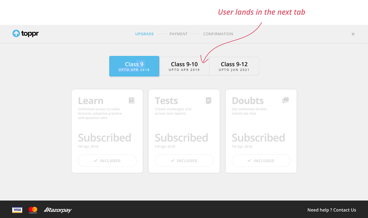
Case 1: Landing on this page is redundant since there’s no action the user can take here
CASE 2 —Not so simple
You can certainly buy modules for a common target year, all at once (in a single checkout). However, in the interest of users, Toppr allows them to buy modules on separate occasions as well, with separate target years. Let’s say you buy all 3 modules separately such that all of them cover year 1. But
1. Module A expires in year 1
2. Module B expires in year 2 and
3. Module C expires in year 3.
Now, when you decide to upgrade again, you will land on year 3 where you get the opportunity to equal all 3 packages. Year 1 won’t have any action at all (since all 3 modules are covered) while year 2 will only help you extend module A.

Case 2: User lands on the third tab (year 3) to maximise upgrade
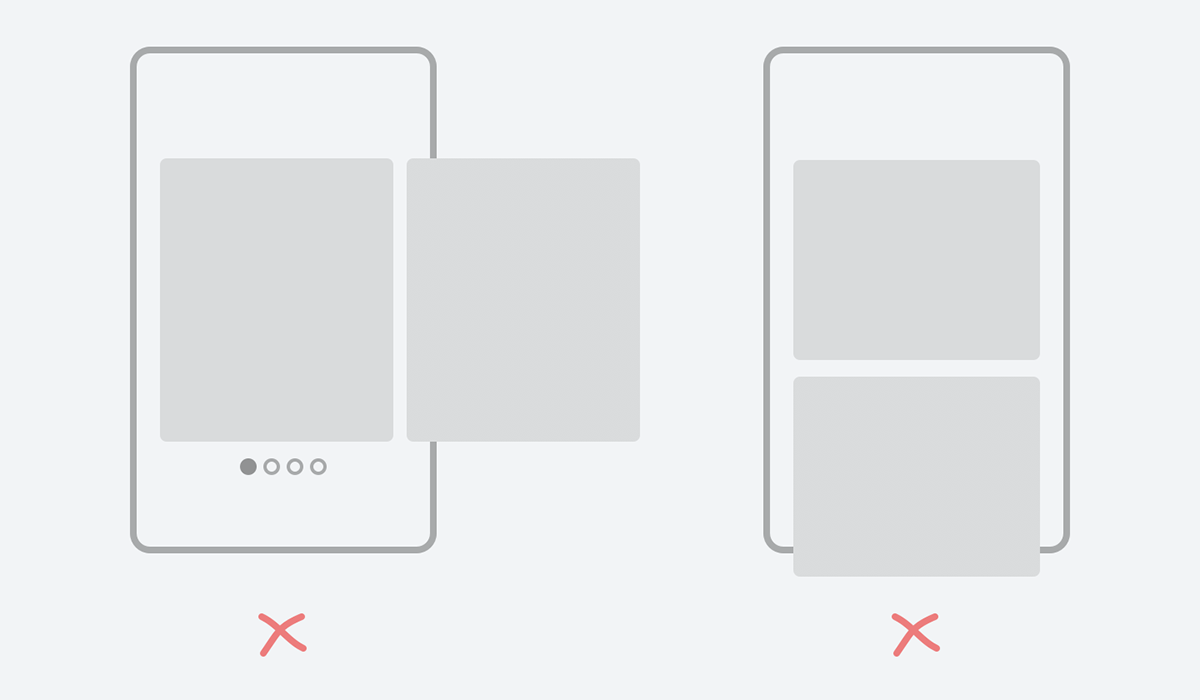
Mobile Adaptation
Like web and tablet, our biggest priority in mobile was the same — the user should be able to see all packages at a single glance for better comparison. That is why early sketches of swipe-able cards or even tabs were ruled out. Cards distributed vertically were not an option either, since, some package would inadvertently go beyond the viewport, specially in mobile web where space constraints are stronger.
Early explorations in mobile
We realised early that the most practical approach was to introduce bars in mobile— sleek horizontal strips containing only the most important data upfront. Loading these bars with too much content about the package would increase their height, making it counter productive to our efforts.
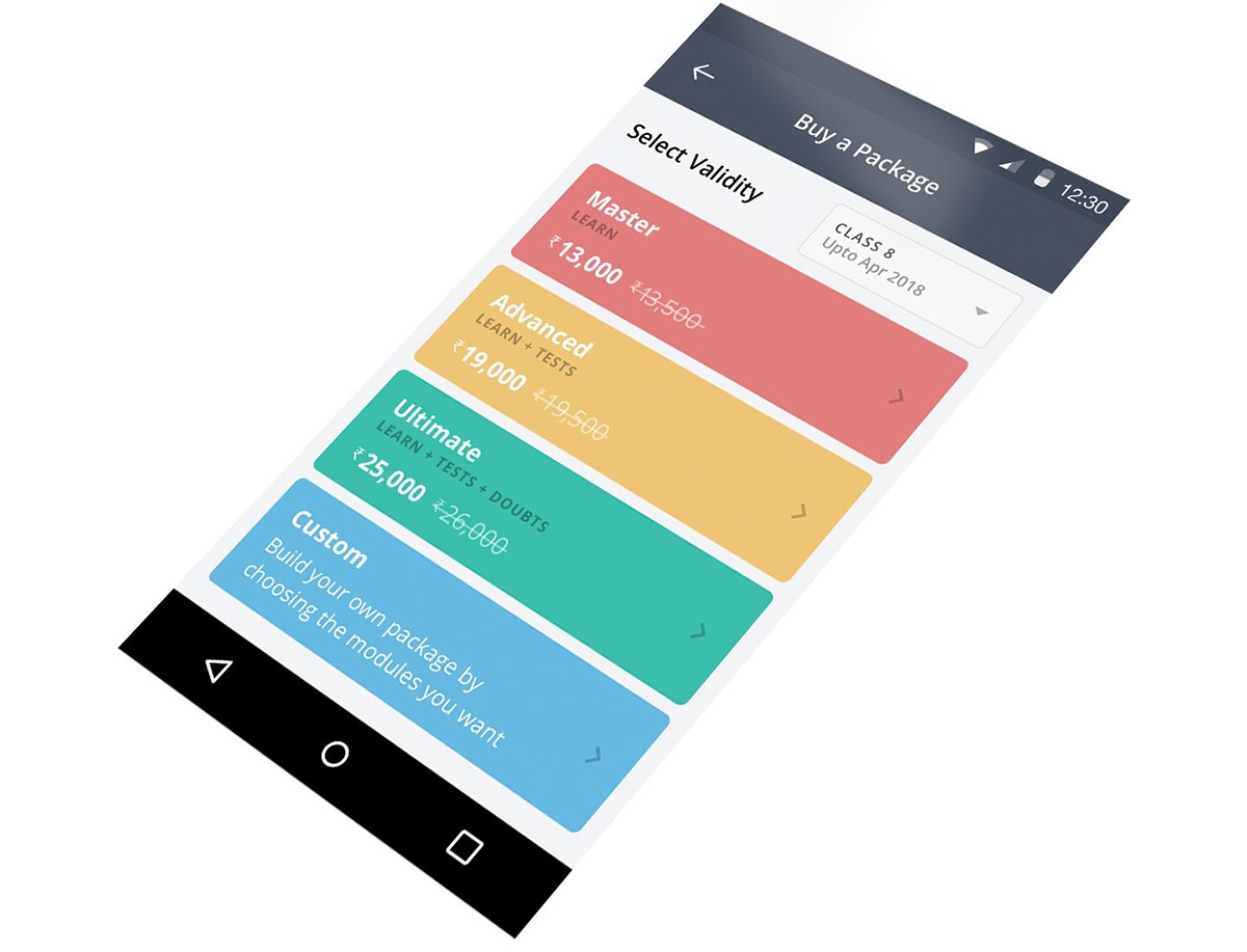
To best optimise for available viewport and save on vertical space, we made the following decisions
• The description of each module was moved from home to an inner page. Tap on an item to see what Learn, Tests or Doubts mean. Similarly, monthly rate of a package was also shown in drill-down.
• Since duration of the packages was already clubbed with the Select Validity dropdown, there was no need to repeat the information inside each bar.
• No separate button for call-to-action was introduced, each bar on the home screen was a tappable CTA in itself.
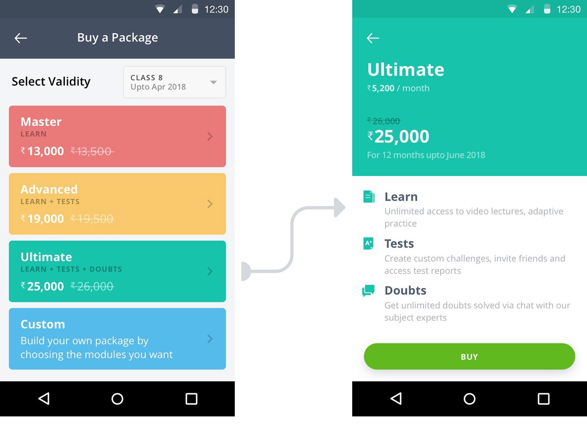
Information distributed between 2 levels for optimisation
Further Improvements
The new pricing experience has been deployed across all platforms — web, tablet, mobile and mobile web. Our next focus is to collect quantitative and qualitative feedback from users, even as we ourselves try to evaluate how we can improve further. If you have bought a package on Toppr or plan to do so, feel free to share your experience with us. We’re always open to your feedback.


