

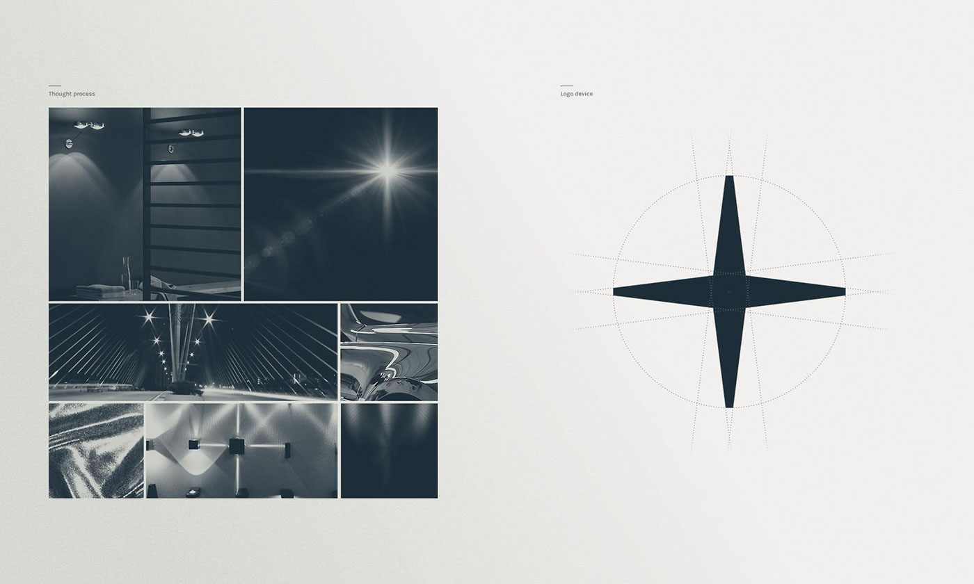


Inspired by light’s reflections, its interaction with spaces and materials, we created a geometrical symbol complementing the typeface. The result is a simple yet iconic mark.
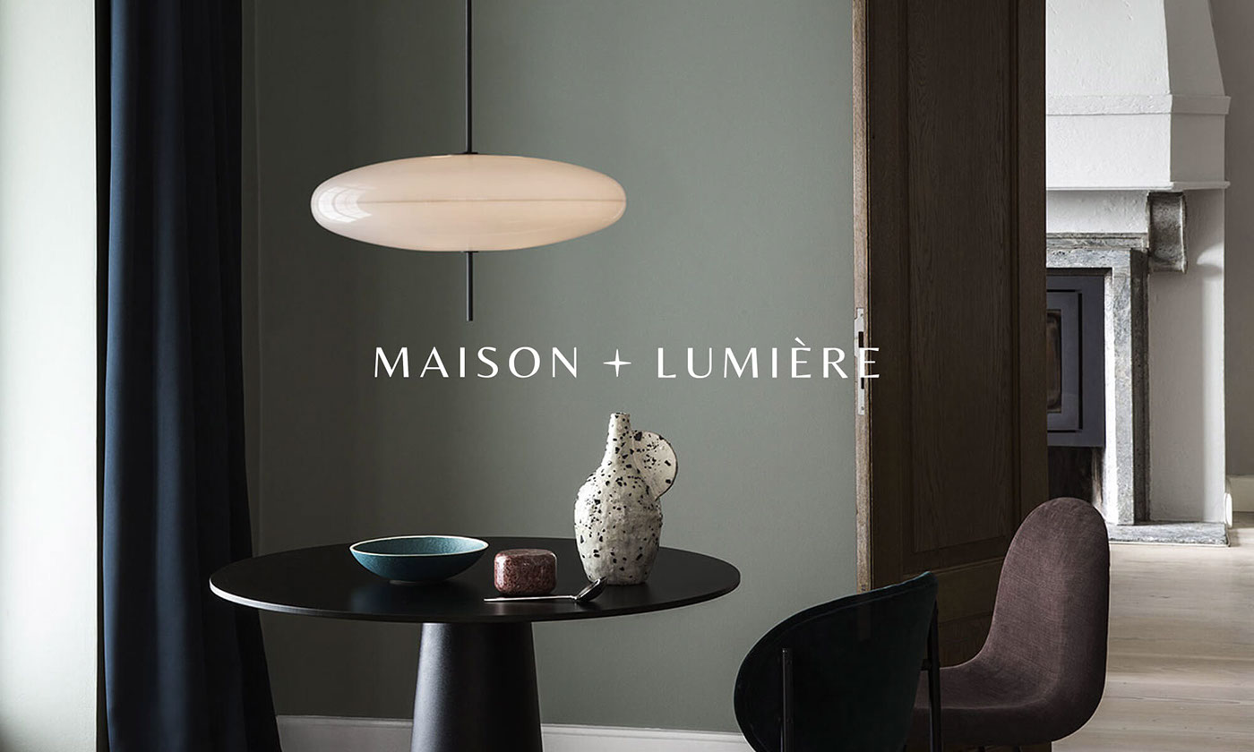
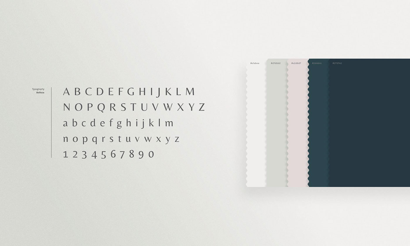
The wordmark, consisting of a hybrid serif and sans-serif typeface for this luxury interior and lighting brand, strikes a balance between the classical and contemporary collections carefully selected by Maison et Lumière. The velvety dark turquoise together with a spectrum of beautifully complementing pastel colours also help to accentuate this balance by introducing bold, dark tones paired with softer, lighter ones.
A responsive version of the logo was created with the intention of being used in scenarios where space is limited, adding more to the brand’s supporting elements.
Thank you for visiting! View more of our work on projetnoir.com
