BookMyShow — UX Case Study
A while ago, I got an opportunity to do a UX assignment on BookMyShow, an event booking app based in India. Though the app covers a multitude of events — from theatre to sports to activities, my focus was primarily on movie ticket booking as the product is probably most associated with it. The following case study explores user engagement and booking flow improvements in BMS mobile app.

Image source: Google PlayStore
01 — Approach
I based my approach on making the Home screen a bit more than movie listing page. Think feed, where the primary content continues to be list of movies, but has other engagements as well.
These engagements or interruptions (as I have termed them) in between items help break monotony of a list in general. But more importantly in our case, they create scope for introducing personalised content as well.

Monotony can play a regressive role in engagement.
The current app does have some sort of 'interruption' in the list — sponsored content. But
1) They look similar to other items from layout point of view. That way they don’t offer much visual break as such.
2) The interruption seems to be limited to sponsored content only. That leaves open scope for other (diverse) engagements.
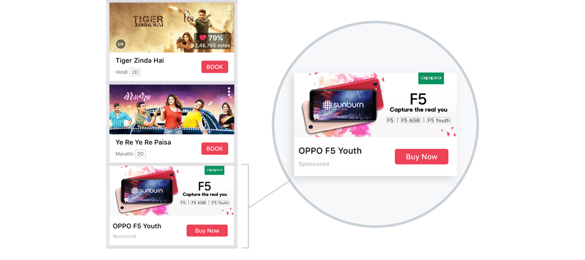
Sponsored content is the only interruption in the list, but they don’t offer visual break either
This assignment explores more of product, content and UX opportunities than UI or visual aesthetics, since a well sorted design language is already in place in the new BMS app. I do not attempt to reinvent much in that regard.
02 — Rethinking the Home Screen
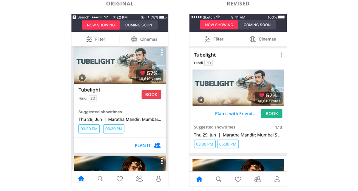
Apart from recommending new engagements, I observed that some tweaks could be done in each card itself (list item) that might improve experience on home screen.
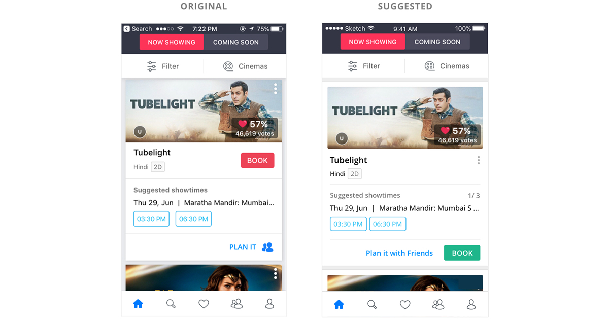
List Item: Original (left) versus suggested redesign (right)
Disclaimer: A full width container need not be advantageous over card layout. It may be recommended if showing more content is a priority (that is, the content deserves more real state). Otherwise cards may work well enough also.
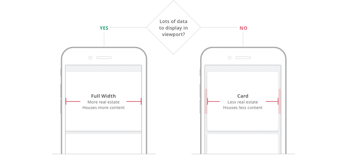
A general reference that may help decide container type
For this assignment purpose, I have gone ahead with full width container for general reference.
Design Teardown
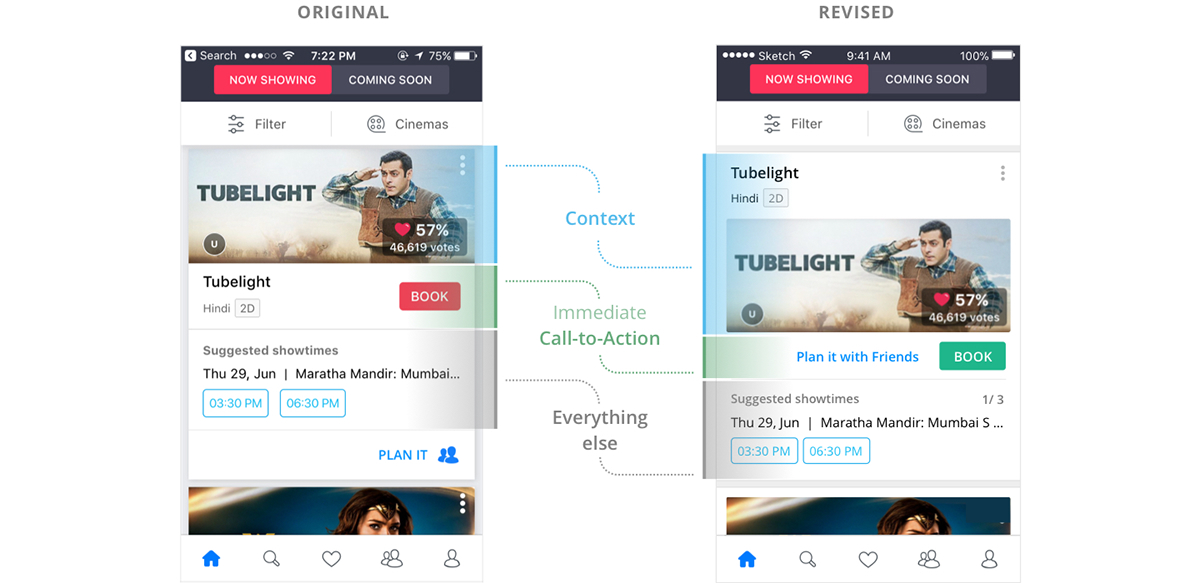
Every iteration in the card redesign has a reason behind it. Here’s a breakdown of why I did, what I did:
Note: There can be valid counter-argument that the primary call-to-action ‘Book’ works best immediately next to the movie title, as in the current app, instead of being all the way down. The user sees Wonder Woman (movie title) and call-to-action ‘Book’ straightaway, while all extra talk comes later.
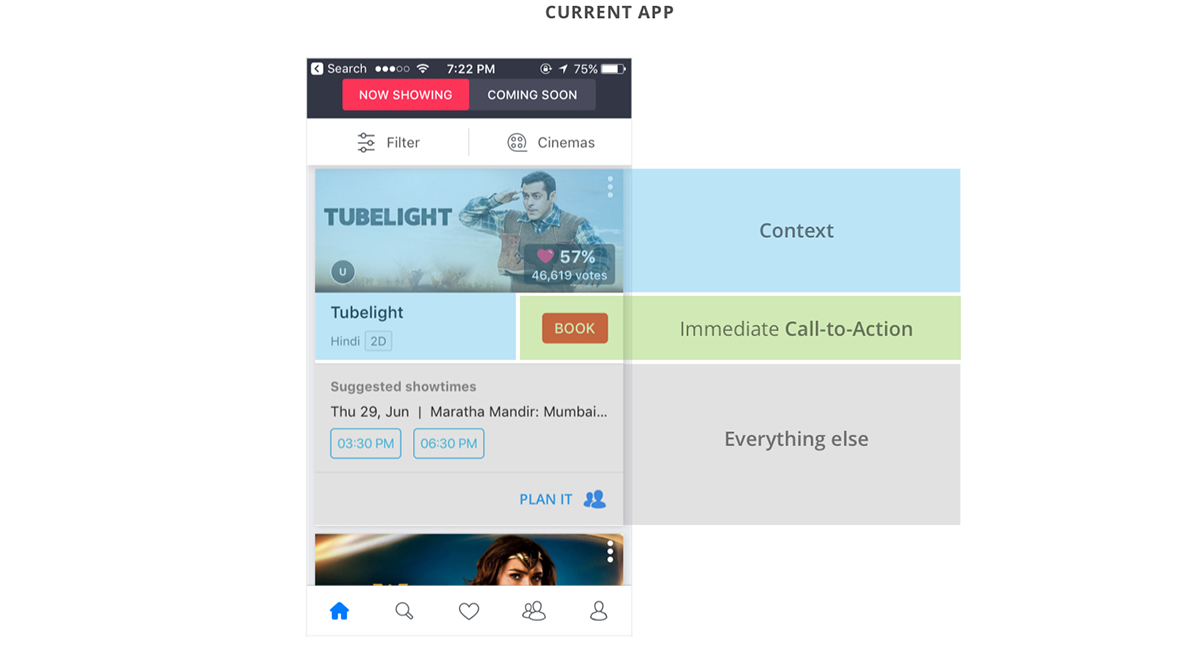
Counter Argument: The current app is better since the call-to-action is immediately next to the context
In that case, we can have the secondary CTA ‘Plan It’ come up instead of ‘Book’ go down. That way the main call-to-action won’t loose it’s optimal position while all other changes can still be carried out. The arrangement will become as shown below:
Call-to-action ‘Book’ can be kept immediately after the title instead of far down at the bottom
03 — Breaking Monotony
As mentioned earlier, engagements other than list of movies can make things more interesting. It can be a guided action, a social snippet or just a dismiss-able notification. At the same time, it isn’t recommended to make such interruptions very frequent.
Below is a list of possible engagements:

04 — Recommended Movies
Recommendations based on popularity / trending are general recommendations. For a more personalised experience, the system needs to learn about the user’s taste. This can be achieved through ratings, a feature that already exists in the app. What seems to be missing though is feedback loop — the system auto-asking how was the movie after the user watches it.
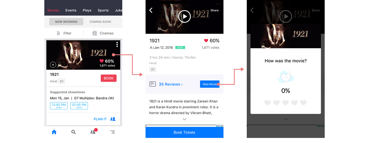
Currently, movie rating is dependent on user’s self-discovery instead of being a feedback loop
It can be argued here that the system never knows if you watched the movie. You might have booked that ticket for someone else, or missed the show altogether. But then such edge case exists for other services too — you may book a cab for another person or order stuff online for someone else. You are still asked how was the experience every time, in order to collect maximum data.
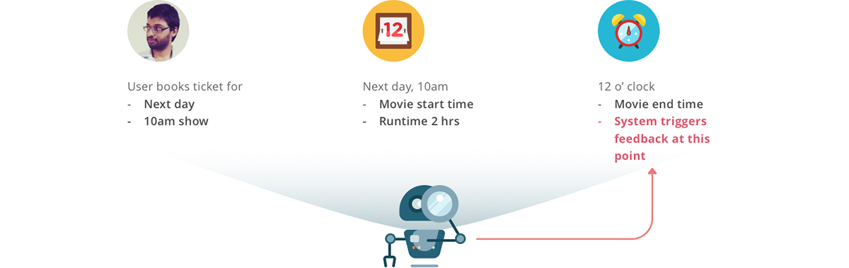
Another question arises: how does the system know when to trigger feedback? That can happen once a booked movie is past its screening date & time, plus its total runtime (system has all 3 information).
Machine learning based on this feedback loop can build the foundation of recommended movies. Let’s say the system identifies 100 people who are similar to you in terms of movie-rating pattern. Now if they like a movie that you haven’t watched yet (that is, not booked yet in the app), it will be recommended to you. A recommendation scale can also be introduced for a more personalised experience.
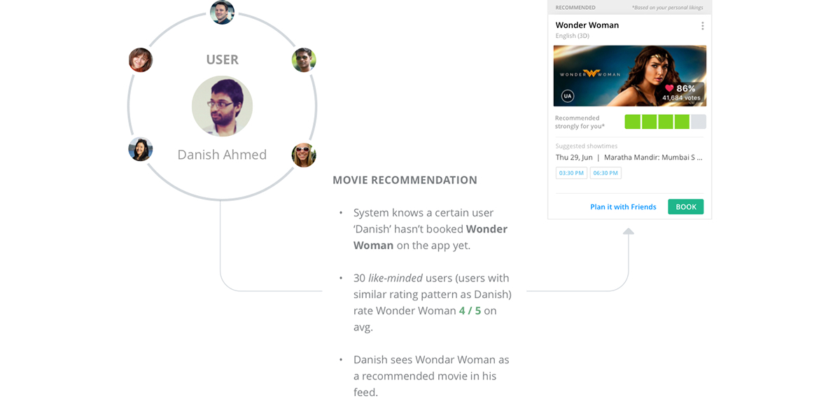
Machine learning can lay the logic behind personalised movie recommendation
05 — Optimising the Booking Flow
To me, the current app looks quite sorted already in UI, as well as UX to a great extent. So it really came down to identifying scope of improvement here and there more than reinventing the wheel. Here are the things I identified that may improve booking flow:
A) Omit the ‘Select No. of Seats’ step
In the current booking flow, the user first lands on a modal to select how many seats. After that s/he lands on seat layout page to select the position of seats.
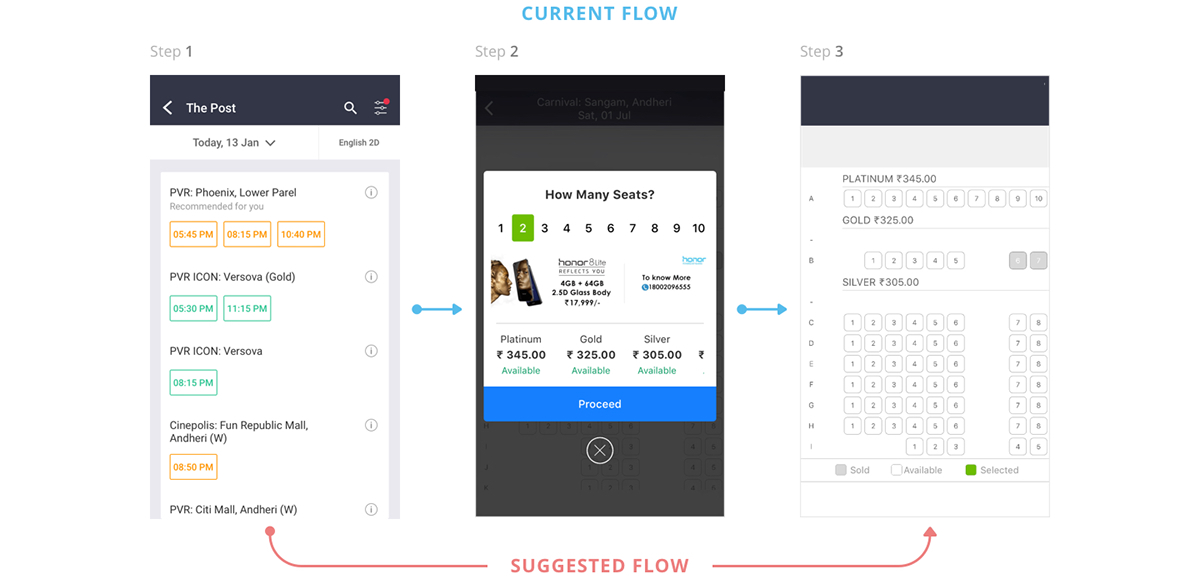
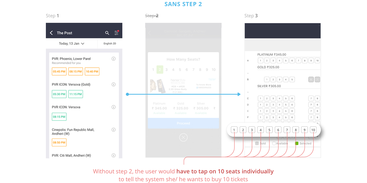
Instead of this, the user can directly land on the seat layout step. That screen can capture both inputs — how many seats + position, from the user, thus saving an extra previous step and a few taps.
But there’s a catch here: On the face, it may look like you are saving a step by removing ‘select number of seats’ modal. But directly landing on seating layout may actually increase the clicks, specially in cases of more than 3 seats.
E.g., lets say you you need to book 10 seats and you land directly on seat layout step. You would need to select 10 seats individually (equals 10 taps) in order to tell the system how many seats you want. That is precisely where a preceding ‘How Many Seats’ step helps, as in the current app.
But this issue can be solved by introducing a simple popup in seating layout.
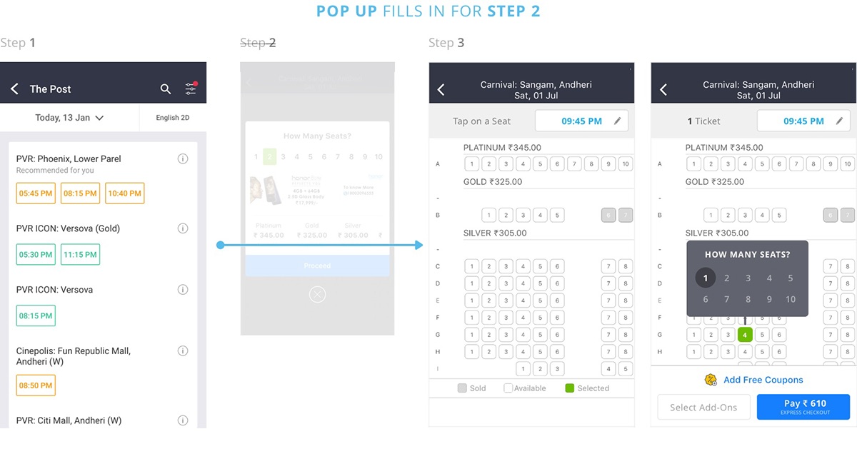
The immediate advantage of this arrangement is that it not only gives a psychological upper hand of having less steps, it reduces the number of clicks for almost all cases — tickets 1 to 10. For users looking to buy only 1 ticket, it actually cuts down number of clicks by half than the current app.
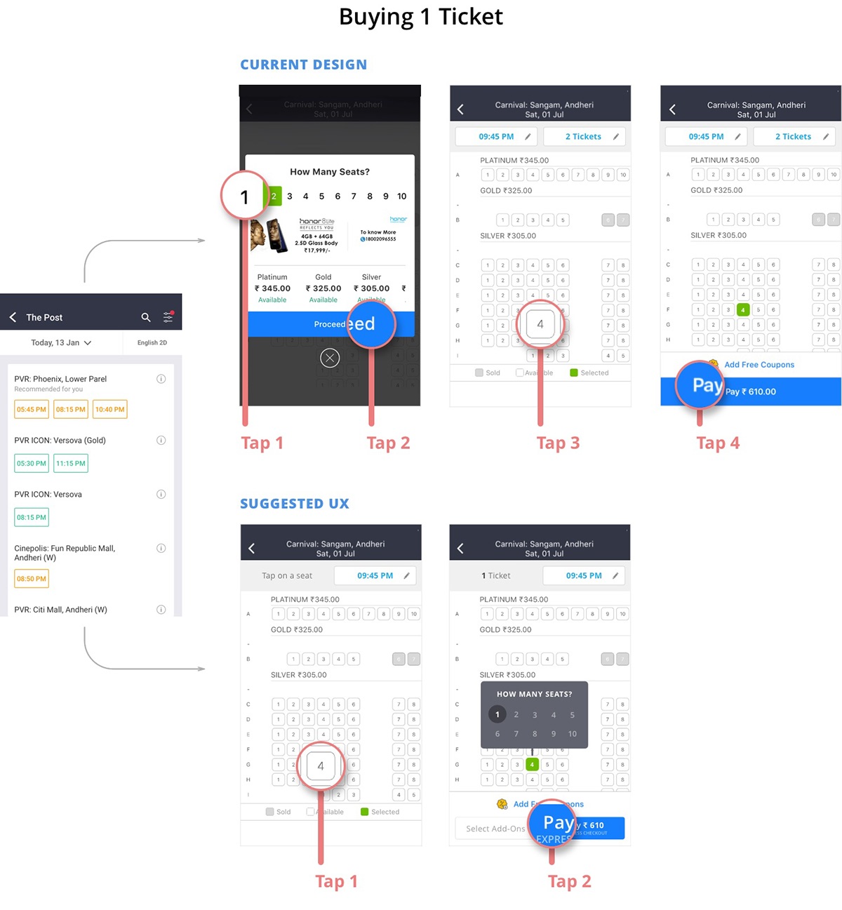
Buying a Single Ticket: The current app requires 4 taps from point A to B, which reduces by half to 2 taps in the suggested redesign
Apart from reducing clicks, the suggested flow also opens possibilities of booking tickets across seat segments (viz. Gold/ Platinum etc) in the checkout. The current BMS app allows booking in only a single seat type at a time. Part reason of this limitation could be the pre-selection of no of seats — how will you tell the system the split of 10 seats between Gold, Platinum and Silver? That limitation ceases to exist in the new suggested flow.

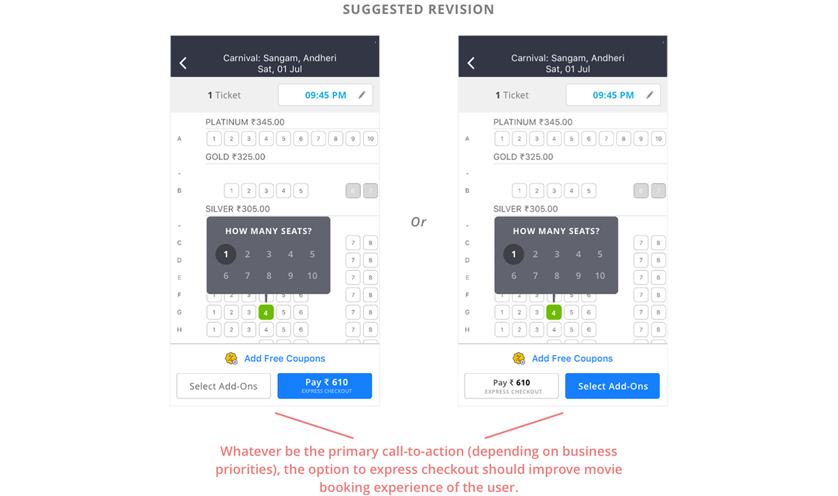
B) Introduce Express Checkout
Currently, after selecting seats, the call-to-action button ‘Pay Rs. XXX’ takes the user to an Add-ons page (‘Grab a Bite’).

Currently, ‘Pay’ button takes the user to add-ons screen
What is happening here is that even though buying these Add-Ons is not mandatory per say (the step is skippable), going through this navigation is, even for users who do not solicit it. While add-ons may be important from BMS’ revenue point of view, an option to express checkout would make things appear less forceful to the user.
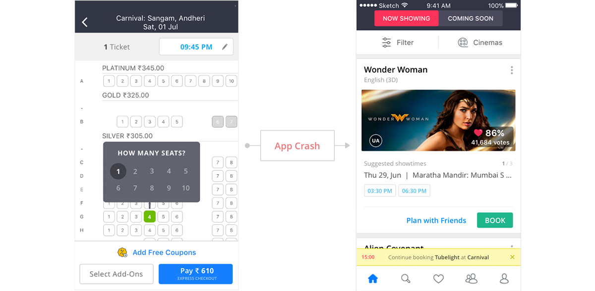
C) Continue Unfinished Checkout
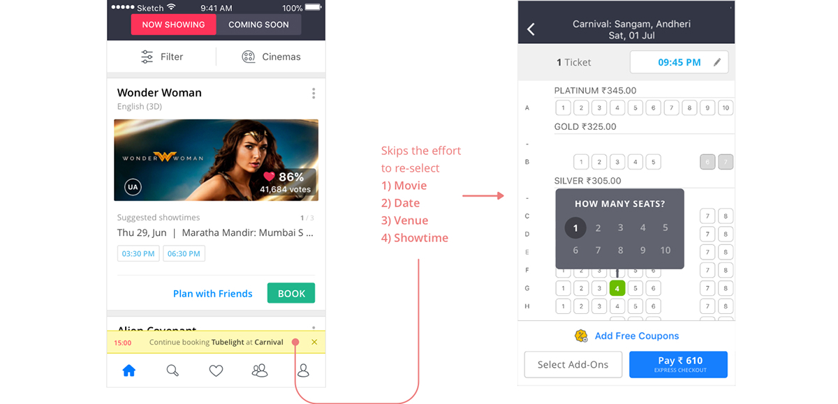
If the system has data available of an unfinished or failed checkout (app crash/ server error) for some time, say 15 min, the user can be nudged to continue from where s/he left. This would specially be helpful in instances where users advanced well into checkout.
In such a situation, a single tap can take the user directly to the seat selection step, thereby saving effort of reselecting the 1) movie 2) date 3) venue and 4) showtime, information s/he already filled a while ago.
Closing Note
As mentioned at the start, this draft explores areas of potential improvement in user engagement. Wireframes or UI are suggestive. There may be things that require further tweaks or directions that need rethinking depending on hard data at hand.
Feel free to share your thoughts and points/ counterpoints in the comment section below.


