

Uber Design Challenge
This is a design challenge that Uber issued to me in 2017. This was communicated to me through a recruiter of an external agency. I asked for feedback in exchange for the time I put into their design challenge, which the recruiter turned down, so I declined submitting for the challenge. What I did was, for the sake of my portfolio, I went ahead with what I would have done. Here is the information communicated to me in the details of the design challenge:
Designer Exercise
"Please redesign the screen below from the jetBlue iOS app. Make it feel cleaner, better organized, and more in tune with modern mobile design trends (while staying true to the jetBlue brand). You must include all the content and functionality from the screen provided, but you can arrange elements in the way you think best. Also include one motion study or prototype of a UI interaction or state transition. Provide an overview of your process and decisions so we understand the reasoning behind your final design."

NOTE: The screenshot above was provided by uber and is not a product of my work.
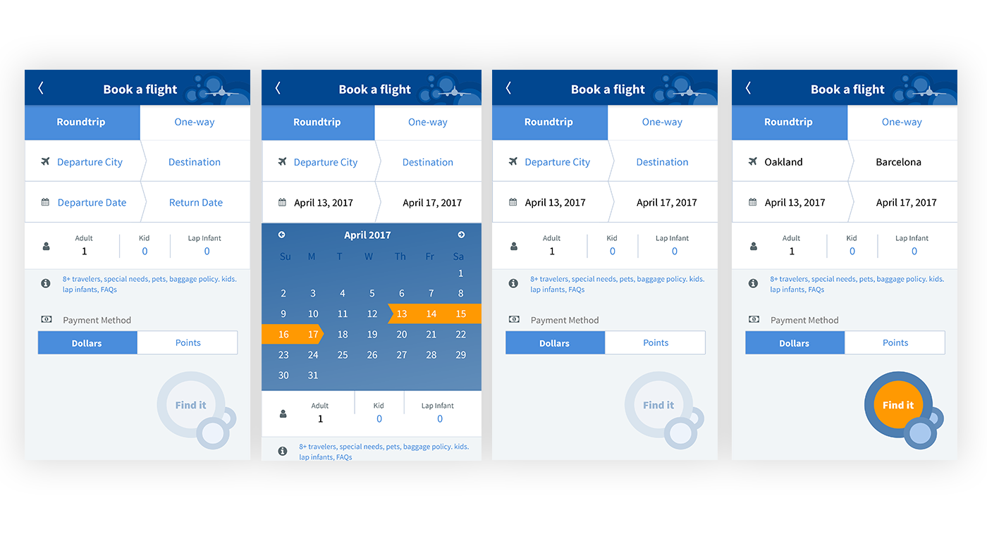
This is what I presented...
Key Issues
Use of blue throughout the UI makes all screen elements appear clickable, making actionable elements less pronounced. Icon sizing detracts from more relevant content, degrades the visual hierarchy, muddies the layout and conveys the wrong actions. Also, there is an inconsistent use of orange as selected and actionable states.
Sketches
After looking at the JetBlue website, loading the app on my phone and poking around the internet for brand guidelines, associated graphics, etc..I started sketching. I explored some creative/unique ways of tying in the design and functionality with JetBlue’s look-and-feel (bubbles). I also explored a couple transitions more in-line with iOS patterns, and "current trends".

Mockups
After determining a couple directions from my sketch phase, I quickly mocked up some screens, exploring layout and content. The screen on the left was intended to be a swipe through navigation with an animated image to show the completed steps of the process. The center mockup screen concept was a spin-off of LinkedIn’s clumping of information and the one the right more of a straight forward pass at simply cleaning up the existing screen.

Final Execution
For my final design I incorporated graphic elements from JetBlue, which inspired the look-and-feel of all screen elements. Orange is used as a highlight, to present the current action over all other page elements. The corporate website uses black fonts so I felt comfortable leveraging black for completed items and static text. Arrows in the top buttons are intended to reinforce the direction of travel. The buttons are bigger to optimize screen real-estate and improved hit areas. The circular button is a spin off of Material Design’s Floating Action Button, another "current trend".


