I'll tell you, I have so many versions of these that it's hard to find the one I'm actually looking for. Symbiotic Design is now a branding and intelectual properties management company. Every website I ever designed was killed by the client. I even had a "web designer" friend replace my beautiful, elegant HTML5 and CSS3 coding using industry standard best practices so that I would finally be able to showcase My work and he gutted it and put it on tables. That was the one of the last nails in My "Design" career's coffin, after 14 years in the business I didn't have but a couple of really old sites in My portfolio (my wife's and mine).
Now I manage premium domain names, Trademarks and brands. I offer domain name registrations, hosting, servers and webmaster tools on one of the largest and most sophisticated networks in America as Domain Hostmaster. I blog a little, and I love to design fonts the most because I actually have something in my portfolio when I'm done that others don't screw-up.

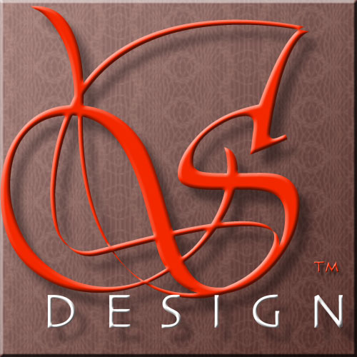
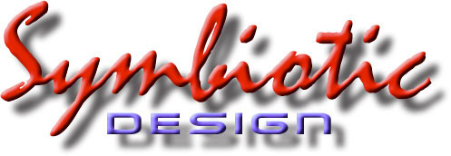
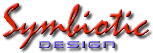
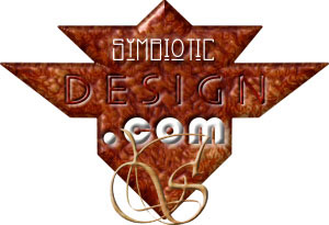
The Moonglow version (the next 2 logo images given below) was used on dark pages. Back then, I didn't want every page of the website to look exactly alike. This broke all the design rules, but I did it long before there were rules. Certain sections had a different page format, but the consitancy was that the logo was always big (much larger than the sizes presented here, required due to the modern web design format) and right in your face for the beginning years. Some people commented that they could stare at it for hours.


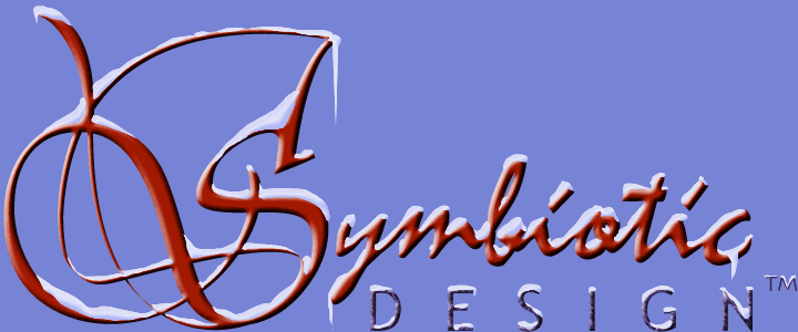
Of course, like any designer, I loved to play with the logo. So I would dress it up once in a while for certain occasians. The version with the the snow and icicles shown below required a whole new backdrop, so it was only used on a couple pages that I could change. Then, I made snowflakes fall in the background. It was really annoying and cool all at the same time. But those were the days when we designers were trying to top each other to be the IT siite sighting when "anything goes".
Here, we do back in time. The earliest versions of the Trademark never made it to the site, but I was proud of how it developed along...
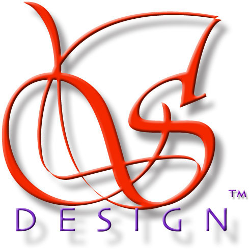
The original experiment of the logo for Symbiotic Design (seen above) was actually blended with a version I did for the first name I had chosen for the company.
Of course, from these beginings, there were many other versions that never saw the light of day (until now, such as the roll-over versions shown here, above & below).
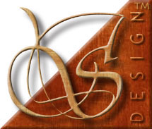
It was only when I incorporated the signature S that it started coming together...

The Symbiotic signature S actually came from trying to design the original logo for the company, under a name I couldn't have...
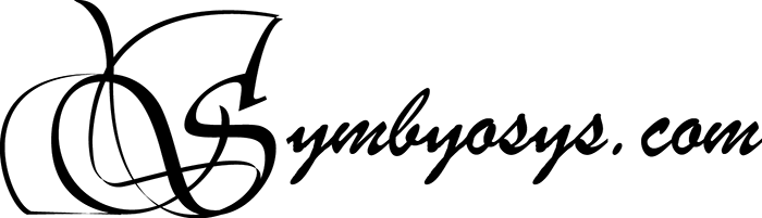
The name was from a failed independent video game project company name that I tried to aqcuire from My friend, George Wawro, but he never registered the name and so I took the "Symbiotic Design" name as a compromise.

This image above shows the work on the Symbiotic signature S, I know some were curious as to how I developed it.

Technically, the term 'website' was supposed to be two words. But when I look at it that way, I pronounce it differently, as two words. So I do prefer the spelling of 'website'. But the dictionary was never up-to-date with technology because it just moved too fast. Still, even though I preferred the spelling as one word, I had to watch out for those that would point fingers and try to embarass. Hence, the term website is incorrectly spelled above as two words so that it conformed to the dictionary spelling (which didn't have a 'website', but has 'web' and 'site').

These were My own instructions to keep me on task when I traced the whole image in Illustrator, adding my own style to the Mistral font curves of 'ymbiotic'. Notice how exact the two i characters are to each other, with no variation? That wouldn't happen in a real signature, they would be very similar, but there would be some deviation. That's what tracing the font was intended to fix from the start, but I also changed other things for clarity or to project a much more smoother handwriting.
Even the .com version of the brand has to be addressed. These two images (above and below) represent the rollover states. Behance doesn't support rollovers, as far as I know, so in order to communicate the effect, they are included as individual images. Also note that Behance doesn't support transparent PNG or Animated GIFs, which actually makes preparing all this stuff for Behance more of a chore than need be (please take note, Behance!).

In the old days, we had to fight for every pixel when PC's were 'good' if they displayed a 640px x 480px color screen (NTSC broadcast television standard) or better. This verticle version (above) would stream down an edge of some pages.
Eventually, as computer and monitor screen resolutions increased, I wanted to incorporate the Symbiotic signature S into the .com brand version of the name. The above is a failed attempt. Below is what I wound-up with in the end. I would place our email address usernames before it and use it throughout the site, and use it on other brands as the head company, as well.

I also owned other domains that I wanted to protect that inspired other versions of the brand. From the outset of their berth, these following 'S Design' versions of the logos were incorporated into the overall branding of the site...
These are just a sampling of all the versions I did. Some were actually quite psychadelic, as that was the era I grew-up in.