
Rebranding a company focused
on the creation of culture.
Brand identity for Westbank, Canada's leading luxury residential and mixed-use real estate development company, dedicated to city building and the creation of beautiful buildings.
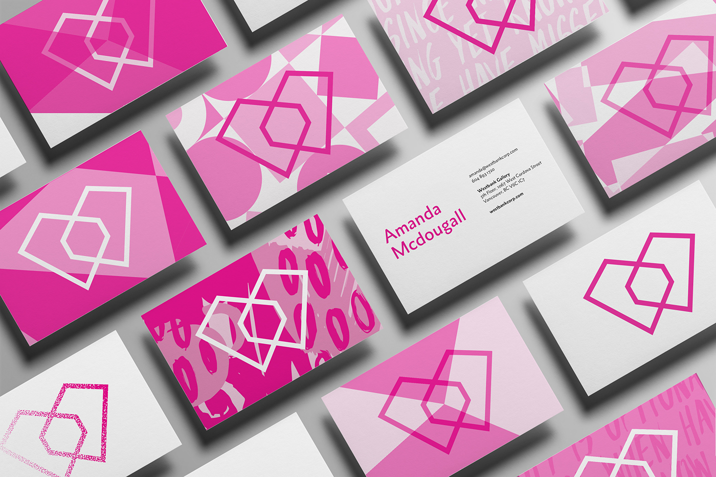
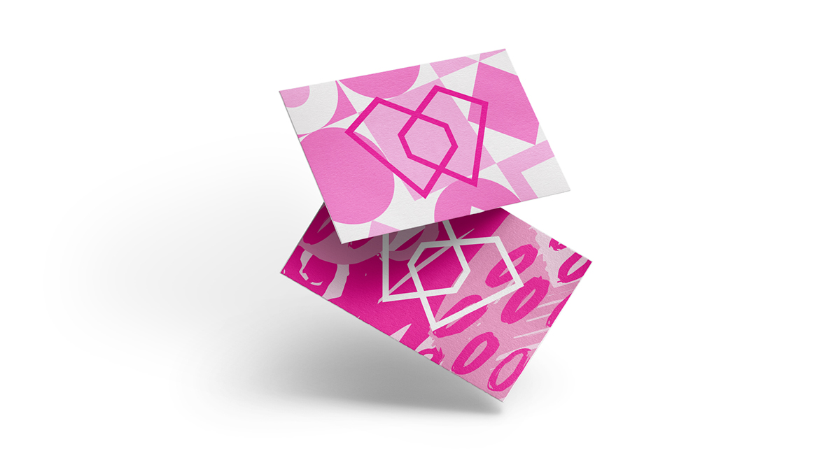
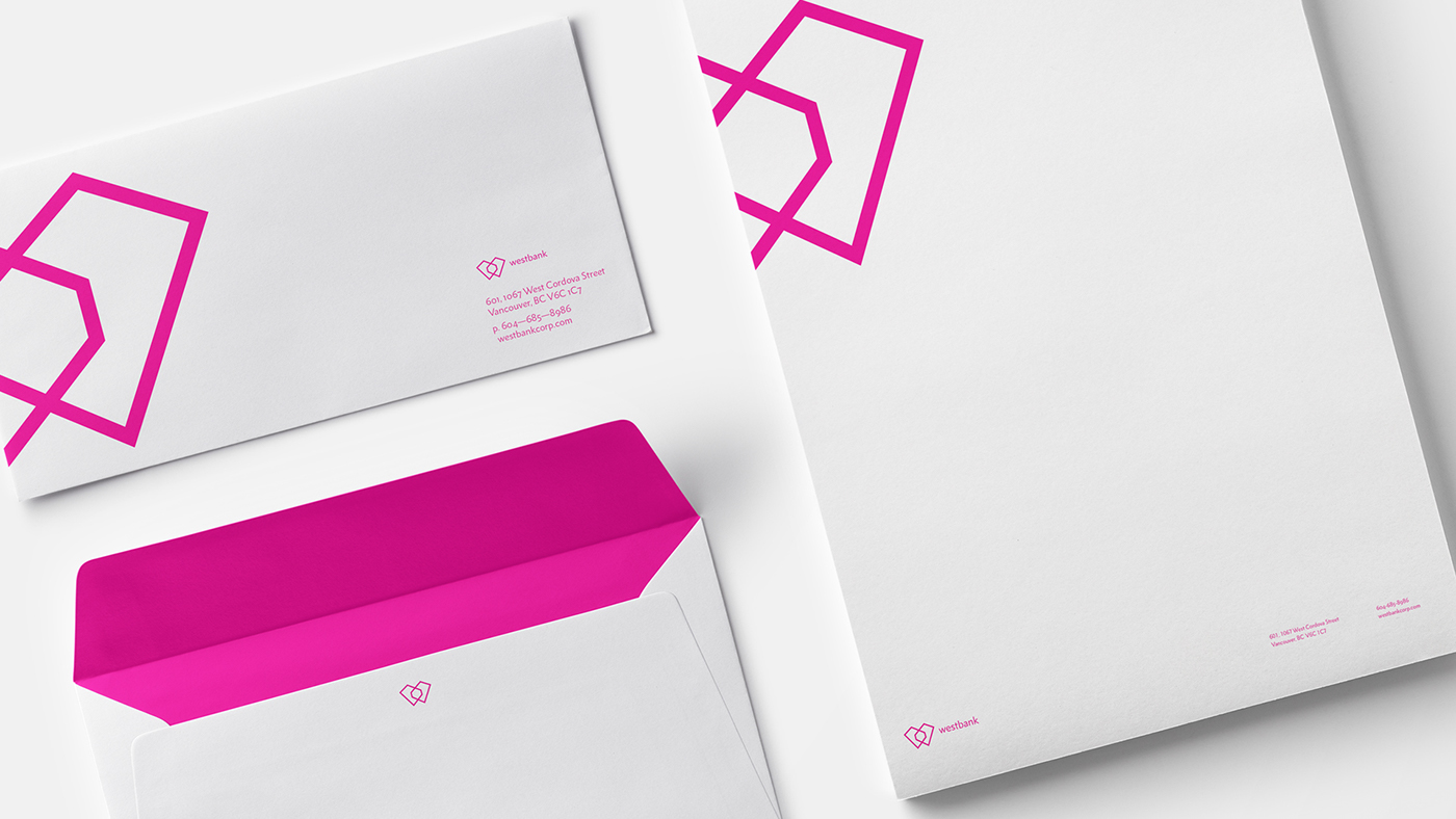
We did not look for a logo that behaves like a logo: timeless, hyper-resilient, fixed. We wanted to design a logo that would represent the constant flux of a company that does many different things constantly and that is always ready to embark on something new. Resulting in a logo that is a recognizable, instant symbol of who Westbank is and carrying the elegance, power, iconic value and accessibility of a new type of company: a culture company.
To bring Westbank's fundamental values to life, we created a symbol for their ethos. It needed to be simple yet striking, creative yet ordered, while being sufficiently flexible to work across a diverse canvas of uses and implementations.
The "Winged" marque was born.
The "Winged" marque was born.




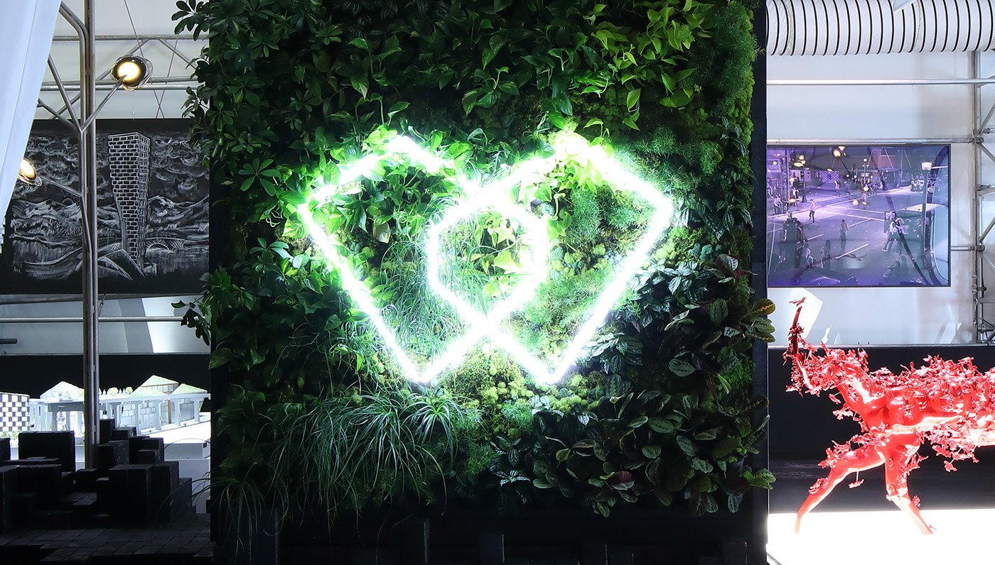
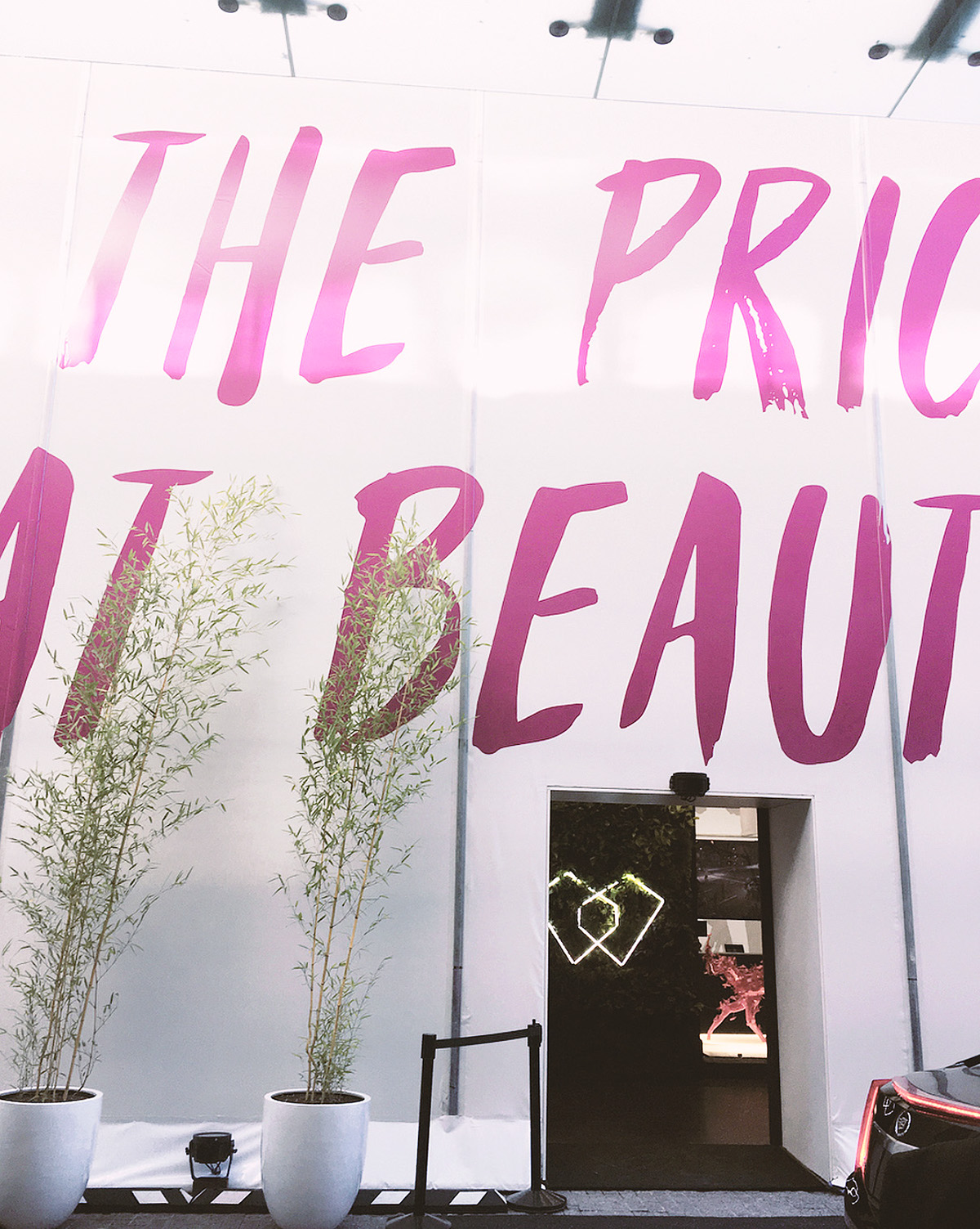
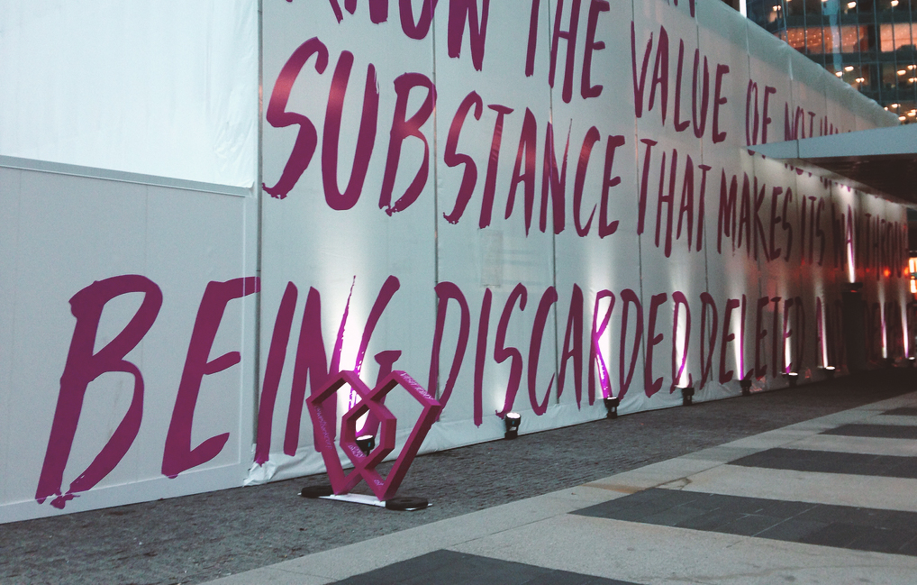
The culmination of the rebrand was peaked at its launch even, the 'Fight For Beauty' exhibition in Toronto, Canada, expressing the evolution of the brand and sharing its journey, offering a glimpse into the brand and encapsulating the architecture, artistry, design, fashion and city-building initiatives that have come to define Westbank's practice.
"Inside you will see public art projects undertaken with world-class creatives, architecture from architects who are artists in their own right, fashion by some of the greatest designers in recent history, a custom Fazioli piano designed by an architect to respond to the typology of their building. Each of these works demonstrate in a profound way that a craft practised well, is an art form." — Westbank
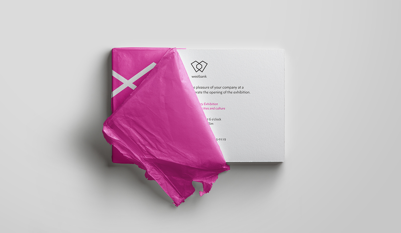
Guests were invited to tear apart the package in order to reach their invitation, illustrating the "fight for beauty" concept.







Brand guidelines




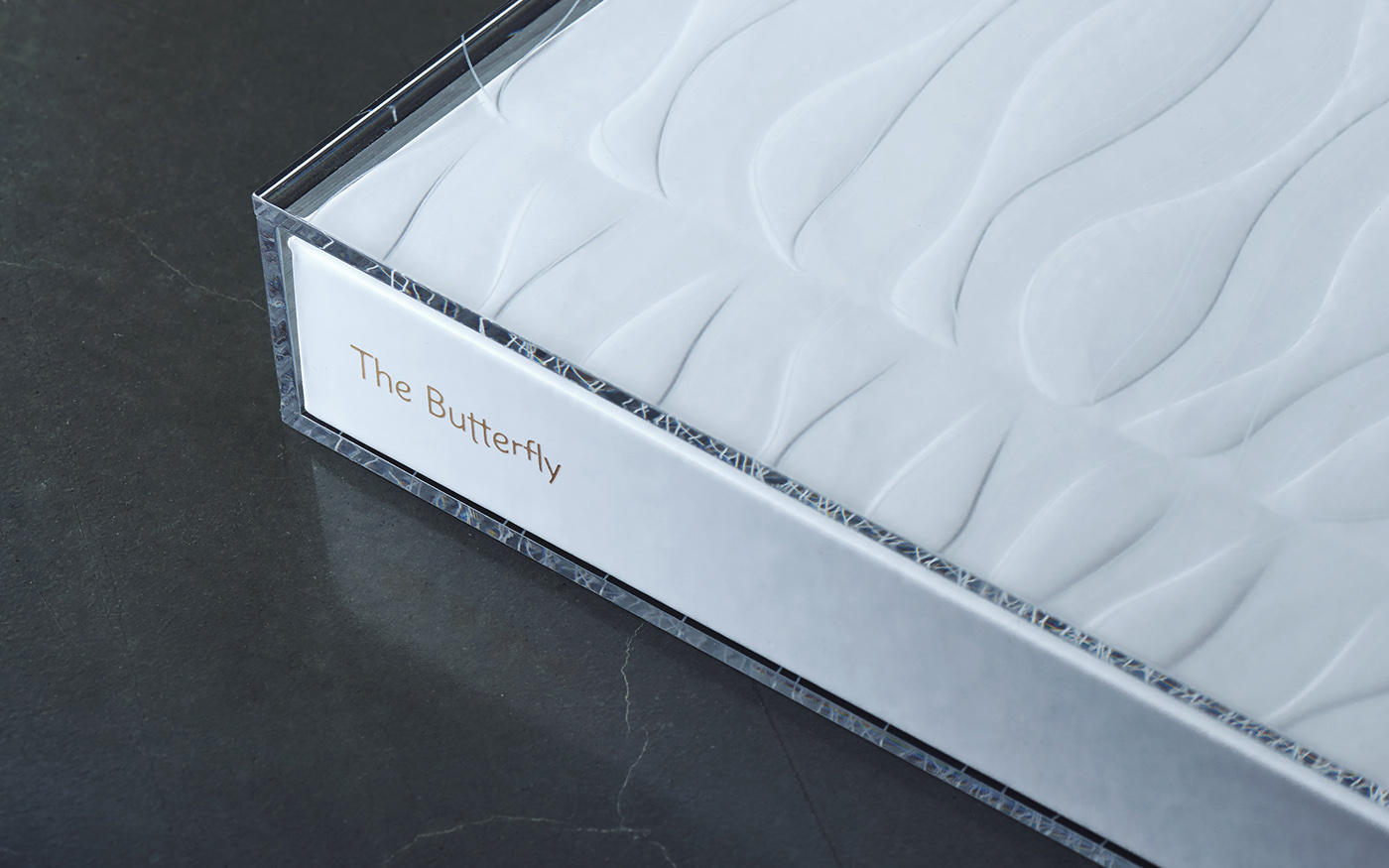
The Butterfly Book
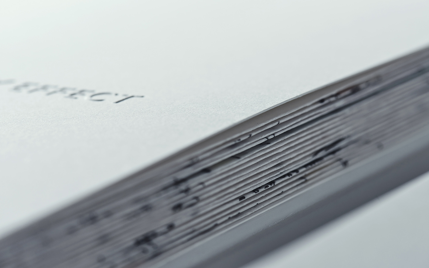
Collaborating with the AKQA Tokyo team, we co designed "The Butterfly", a book which is the combination of its two halves: The Butterfly Effect book & The Ingredients book. This piece was created to showcase the background story, the creative process and the floor plans of Westbank's new project: The Butterfly.
The lines of The Butterfly building were illustrated on the book cover, being embossed on the hard cover and engraved on the acrylic case of the book.





Creative Direction: Claudia Cristovão
Art Direction: João Oliveira / Mirelle Majas
Design: João Oliveira / Mirelle Majas
Copywriting: Selda Yurekten
Project Management: Catherine Steele
Art Direction: João Oliveira / Mirelle Majas
Design: João Oliveira / Mirelle Majas
Copywriting: Selda Yurekten
Project Management: Catherine Steele
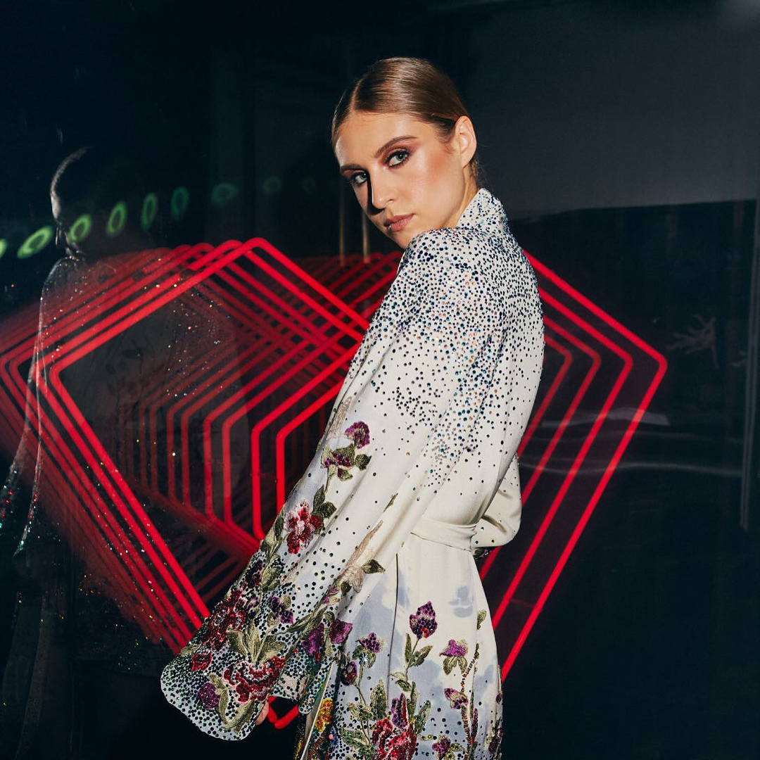
Neon Installation by Tangible Interaction


