


New tools and visual technics give a good excuse to show off old art-works with a new touch. In spite of that the cinemagraphy was presented a decade ago. I've just discovered it to my own purposes and fell in love with it. Hopefully, you would share this excitement as I do.

book front end-paper
Book design
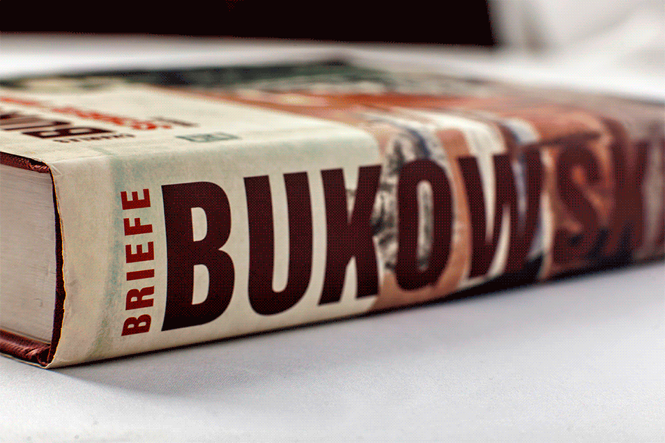
My foreign experience in book design took place in the most beautiful German city Hamburg, in 2006. This is when I met Charles Bukowski's controversial novel, while designing his autobiographical book "Schreie vom balkon" for Gingko Press.
I considered that one of the difficulties would be working with alien language to me. Setting up copy in German supposed to have some specifics which I came across in multiple articles dedicated to typesetting subject. However, it was a brilliant opportunity to check all the typographical principles I had practiced already and the ones I learned in the works of Jan Tschichold, writings by Robert Bringhurst and numerous books on typography matter.
Last but not least, I could experience, how one of my favorite type families, Fairplex, would sit in a long run. I must admit, this type is a masterpiece, designed and developed by a truly talented person – Zuzana Licko, Emigre.
The book became bestseller a year later, probably not due to my approach to design but fully due to the author. However, it's really hard to resist temptation to think otherwise.
Illustration
I had to spend half a year selecting ratios, dividing space, calculating type areas for a perfect line, looking for appropriate typesetting method to get a properly organized body.
The most interesting part showed off when it came to the cover. The solution was on a surface. The cover must be a mirror of Bukowski's life. No modern look, no fancy dressing, no glittering finishing, no spotlights, digital cameras and contemporary graphic arts. It should be the truth. Mood of a lonely man, a fighter, forgotten but honest to himself and having strength to stand against the severe destiny.
I took a pencil and drew Bukowski to my understanding. The rough pencil texture - just like his ups and downs, brown sad color - dirt and emptiness, his best friend as a symbol of cheap motel rooms and street benches. A glass of wine was a sip of oxygen to a man in thoughts, who was looking for a way out through a poem.

the drawing based on the foto by Michael Montfort
P.S.
This is for those who are suffering from lack of conviction


