

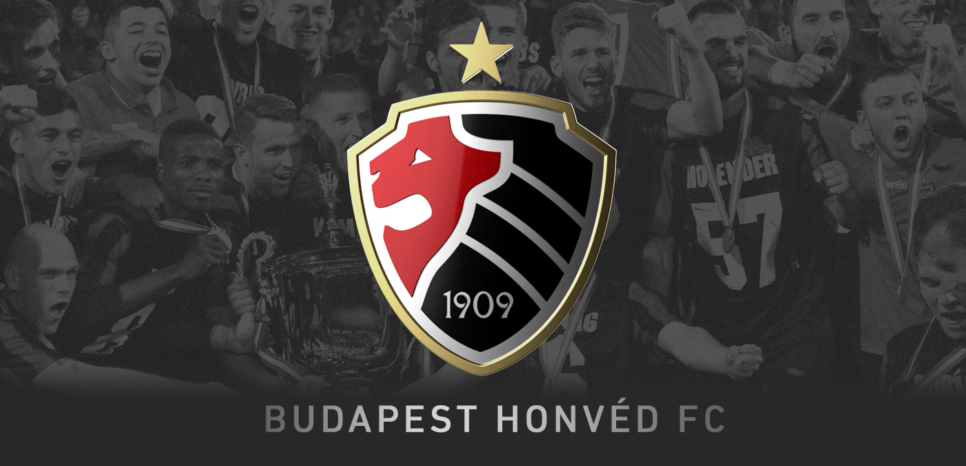
IDENTITY CONCEPT 2018
As a designer and fan of Ferenc Puskás' only Hungarian football team I imagined a new logo.
Honvéd's identity has changed many times over the more than 100 years. Even the name has changed.
So we have a huge tradition but the current logo has many weaknesses.
I aimed to design a logo that contains the past but also looks iconic and fresh.
Previous logos of the club
Honvéd had very different logos along its more than 100 years.
The most common elements are the colors (red and black) and the lion symbol.

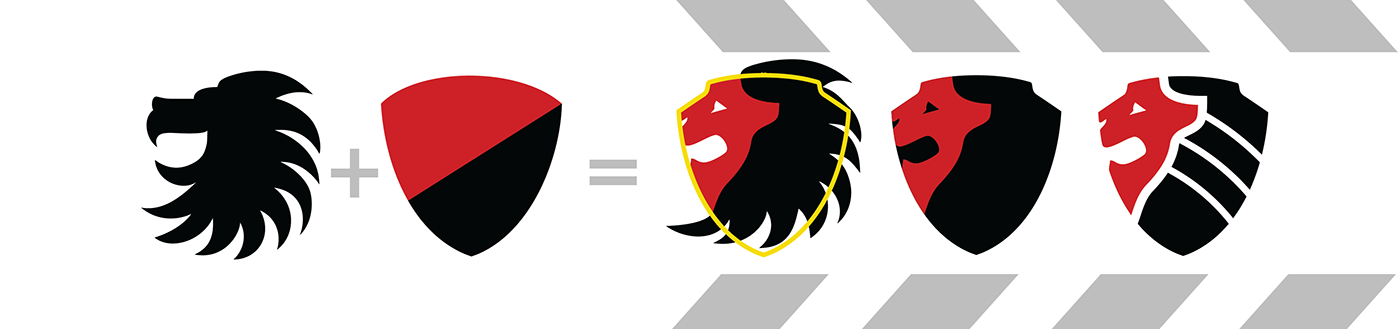
Creation of the new logo
I combined the lion head symbol with the shield shape.
The head and the mane are divided like the red and black parts of the oldest (Kispesti AC) logo.
A drew three curved lines into the mane for the easier understanding of the symbol.
These lines also remind us to the classic football.
The final design
3D effect and flat logo in colors.

The logo must look good in one color versions as well.

Colors
PRIMARY COLORS SECONDARY COLORS

Typography
Hupp Antiqua NF Bold
I found a font from the same year as Honvéd was established.
Hupp Antiqua was designed by Otto Hupp.


Possible evolution of the logo
The star showing that Honvéd is a 10+ times champion is like a crown to the lion.
This is how the stars would look after winning 20 and 30 national championship titles.
(Until now Honvéd has won 14 times.)


Website

Printed identity elements
Stamp, business cards and letter.


Photos of players in this presentation were made by Viktor Babar and Bálint Sarkadi.


