
Nordbeans
coffee roasters brand | 2015 – 2017
my work: brand consulting – art direction – webdesign concept – communication concept
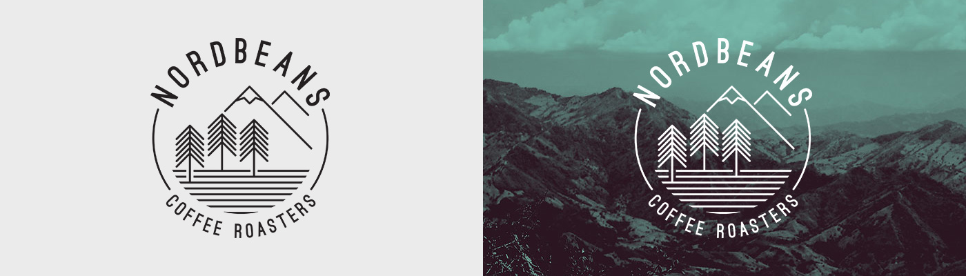
Logo – not just for hipsters
After the first talks about the brand's naming and positioning we started to work on logo design. We decided for a look a bit different from other roasters. No coffee beans and some unusual colours. The whole concept is based on Nordic approach to roasting and Nordbeans base location on the north of the state between two mountain ranges.
Packaging with unique identity
Nordbeans brand is made mainly by the product. With packaging we wanted to reflect concept of the brand. Nordic approach is abstractly presented by forest animals used as avatars for espresso blends (ex. Deer'spresso). The same style is used for private brands (ex. Bambi made for Ambiente – Ambi).

Manifesto subscribed by hashtag
Nordbeans always wanted to make the best coffee possible. We wanted to say that the guys from Nordbeans carefully control all steps in the production from plantations to your cup. So we came with a manifesto which you can "subscribe" by use hashtag #IKnowMyCoffee (#ZnámSvouKávu). The hashtag now creates an umbrella brand for all activities of the company and it is heavily used by the coffee (and brand) lovers.
– the whole manifesto you can find on www.nordbeans.cz

Direct sale through e-shop
Coffee is best between 10th and 40th day after roasting. No doubt that direct sale from roaster to coffee lovers was needed. We created a website with lightweight shop with easy navigation and short order process. Other content is made by news from social media or fresh articles on the Nordbeans blog.

Showreel of Nordbeans brand
(czech voiceover)
made in SMWORKS – digital agency


