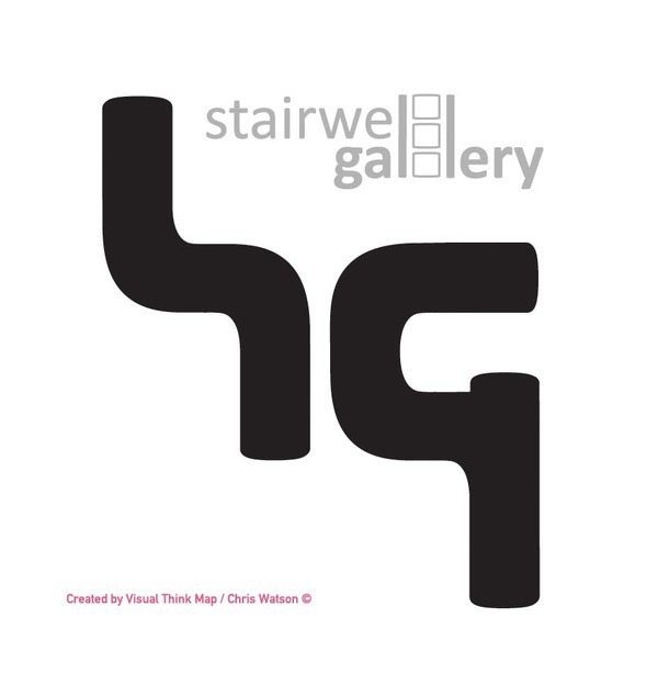
Stairwell Gallery Logo
Acrylic Sign
Acrylic Sign
I recently have done a logo identity for a college that has a stairs space they wanted to use to exhibit students work.
I wanted to play with negative space and keep to black and white, as they walls in the space are white breeze blocks, so black would contrast well.
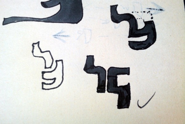
I like abstracting forms of letters, i think you can make the viewer work a little to realise. You want to make it unique and quirky works. The S is good after initial sketches, and after playing around with the arrangement i think it still connotes the stairs.
Well they approved, i am currently getting the 2 letters cut out of acrylic and having them mounted stood of the wall. Each character would be individually cut out of a3 acrylic sheets using a laser cutter they have at the college in the engineering department, so had to work to size constraints.
Will post a picture of when it is overall complete.
The main department using it is Photography, so they wanted to make the ( II ) intimate to a photo negative.
I wanted to play with negative space and keep to black and white, as they walls in the space are white breeze blocks, so black would contrast well.
I like abstracting forms of letters, i think you can make the viewer work a little to realise. You want to make it unique and quirky works. The S is good after initial sketches, and after playing around with the arrangement i think it still connotes the stairs.
Well they approved, i am currently getting the 2 letters cut out of acrylic and having them mounted stood of the wall. Each character would be individually cut out of a3 acrylic sheets using a laser cutter they have at the college in the engineering department, so had to work to size constraints.
Will post a picture of when it is overall complete.
The main department using it is Photography, so they wanted to make the ( II ) intimate to a photo negative.

THIS IS A SAMPLE CAPTION.