dT Jakob started as a revival by Gustavo Soares for Paul van der Laan’s class at the Type and Media Masters, in The Hague, NL – back in 2007. There are quite a few excellent geometric sans typefaces available, but we did want to make our contribution and have a fine geometric face to offer. dT Jakob was born out of Erbar, by Jakob Erbar, one of the very first geometric sans, released in metal around 1926. Our goal was to make a versatile typeface, that handles display and text typography beautifully. To achieve that we designed a complete range of weights, matching italics and lots of OpenType Features. Hope you enjoy it :D
EXTENSIVE WEIGHT RANGE WITH MATCHING ITALICS
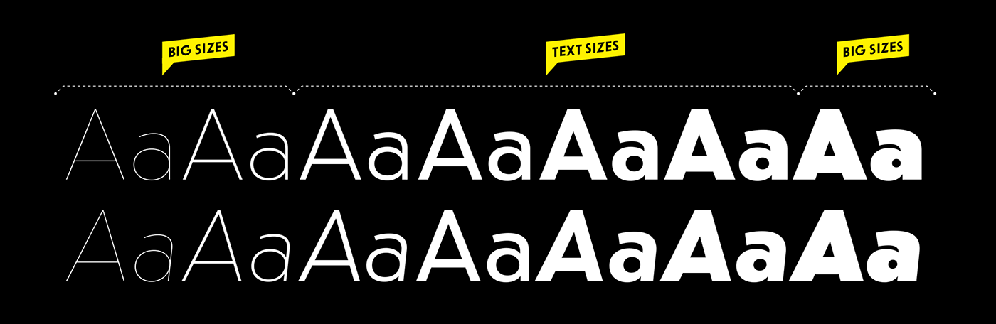
Our goal with dT Jakob was to provide a robust and versatile typeface for both display and text typography.
While the lighter weights are ready for really big sizes, there is a traditional range of text sizes and a Black weight that is a blast – all with matching italics.

POINTY ALTERNATES
We just had to design these pointy caps – they add so much flavour to the words and are such a nice match to other geometric shapes… Access via OT All Alternates, aka Stylistic Set 1, or navigate the Glyphs Panel/Flyout Menu to check what the options are.
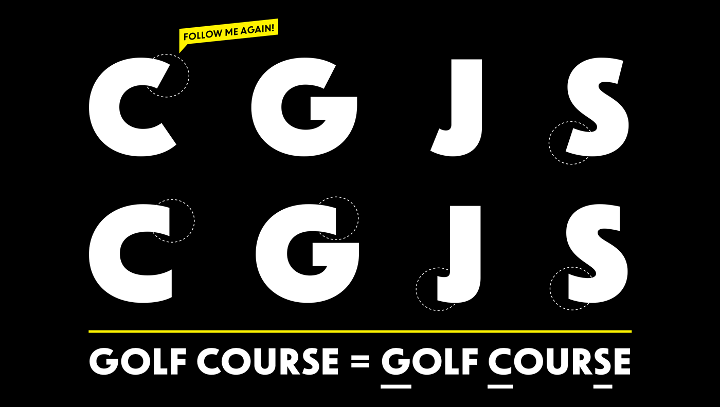
STRAIGHT TERMINALS FOR TIGHTER SETTINGS
Ok, geometric typefaces are not the best option if you are looking for a tight setting. BUT, we crafted straight terminals that will use less space while delivering a fantastic humanistic touch to the geometry.
Access via OT Straight Terminals, aka Stylistic Set 2.
Access via OT Straight Terminals, aka Stylistic Set 2.
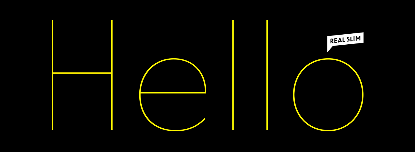
READY FOR THE BIG BANG!
Hairlines are tough to design, but we did our part.
Blow these babies on the wall and send us happy pictures mkt@dooType.com
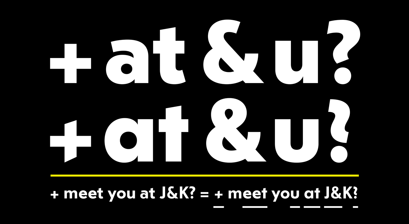
SHAPE THE MESSAGE WITH DISTINCT SHAPES
With dT Jakob you can go geometric all the way, or use more functional shapes when performance is needed. There are many alternates to fit your typographic needs.
Access everything through the OT All Alternates, aka Stylistic Set 1, or navigate the Glyphs Panel/Flyout Menu to check what the options are.
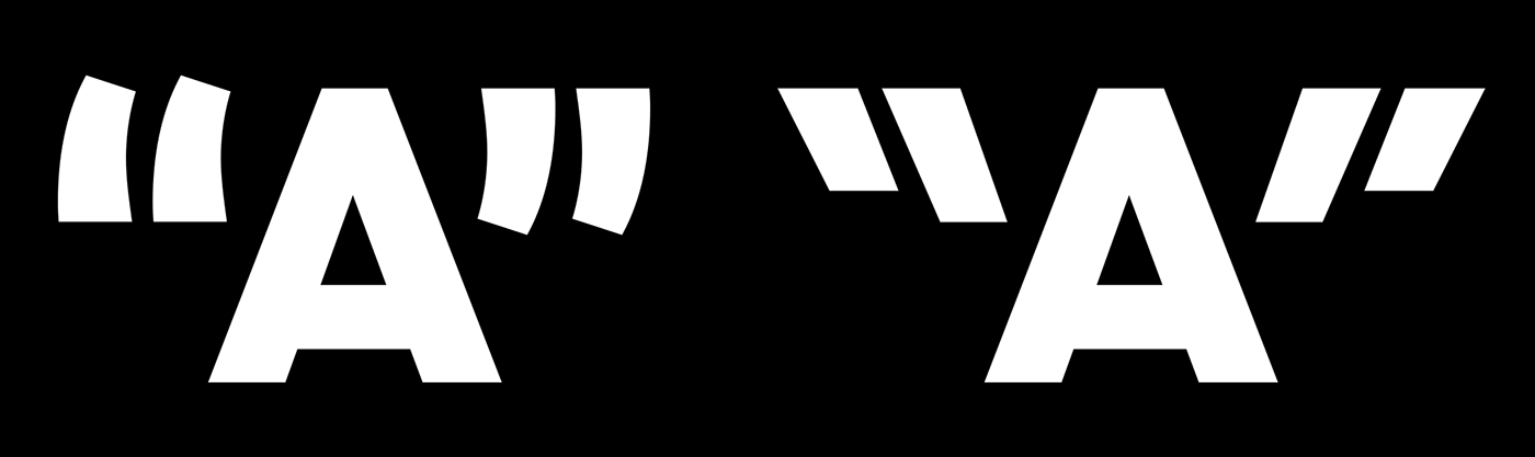
HIT THAT TEXT WITH PUNCHY QUOTES
If by any means you want to add extra spices to the mix, grab dT Jakob’s as
OT Punch Quotation Marks, aka Stylistic Set 4, or from the Glyphs Panel.
OT Punch Quotation Marks, aka Stylistic Set 4, or from the Glyphs Panel.
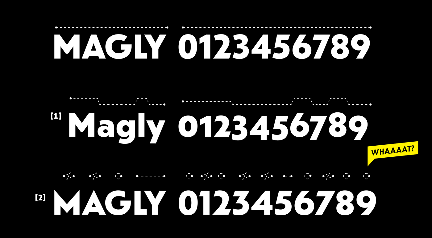
VARIOUS FIGURES, FOR VARIOUS NEEDS
Yes, this is mostly a display typeface, but we did tailor it for text as well. So, if you want to use dT Jakob
for copy just turn on Oldstyle Figures [1] – readers will appreciate. Now, if you want to rock the boat,
go for OT Geometric Figures [2], aka Stylistic Set 3.
for copy just turn on Oldstyle Figures [1] – readers will appreciate. Now, if you want to rock the boat,
go for OT Geometric Figures [2], aka Stylistic Set 3.
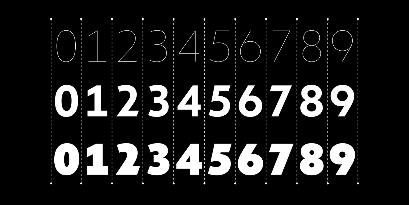
WE GOT YOUR TABLE & INTERFACE COVERED
Tabular Figures, as these mono-spaced numerals are known, will improve your graphs & tables. We have
also made them evenly spaced accross all weights – because we share your passion for neat typography.
also made them evenly spaced accross all weights – because we share your passion for neat typography.
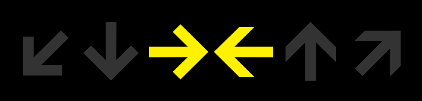
2 SETS OF ARROWS
Arrows are personal, so we designed two sets. Access via Glyphs Panel, or Unicode 2190–2199.

