
Dear design lovers,
let us introduce the
Dear Budapest, image and interior design
Dear Budapest, image and interior design
The background:
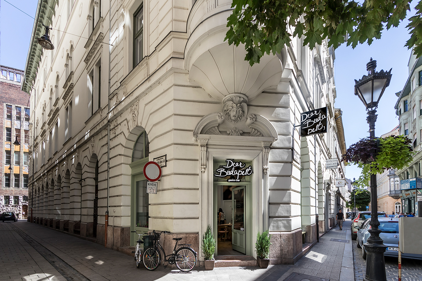
On the corner of the bustling Veres Pálné street and Pilinszky thoroughfare lied once a tiny corner jewelry store. Bianca, the new owner asked us to transform it into an ultra-hyggelig bistro.
On the corner of the bustling Veres Pálné street and Pilinszky thoroughfare lied once a tiny corner jewelry store. Bianca, the new owner asked us to transform it into an ultra-hyggelig bistro.
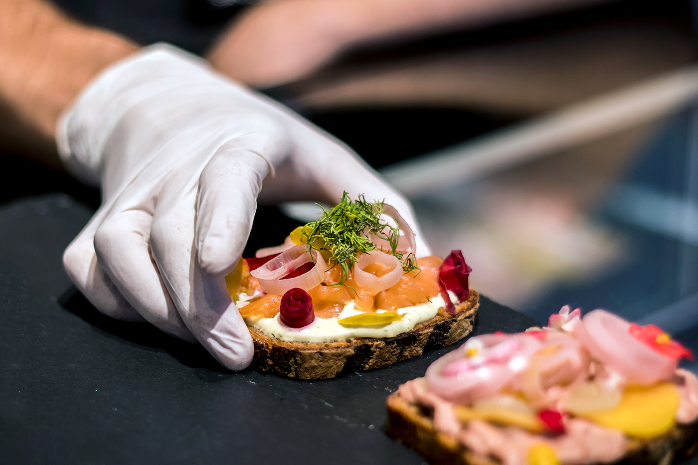
She came up with the name, a gastronomic love letter to the city of Budapest; Dear Budapest. Her dream was a cozy open-faced sandwich bistro whose ‘well-dressed’ savory offerings make the grade from Budapest to Copenhagen and beyond.
The logo:
We hand-wrote the logo, as one would a love letter, so that it would be completely unique. When we finally chose the perfect lettering out of the many different versions sketched one after the other, we complemented it with three different kinds of Indian ink that echoed the different decorative elements on the sandwiches. We combined the handwritten logo with a special font, to draw a contrast between it and the slogan.


The colors:
We chose three brand colors that we knew would also work wonderfully throughout the interior design: light pink, petrol green and gold. This way, we made sure that the colors appeared not only in the graphics, but were also reflected in the interior design elements.
We chose three brand colors that we knew would also work wonderfully throughout the interior design: light pink, petrol green and gold. This way, we made sure that the colors appeared not only in the graphics, but were also reflected in the interior design elements.


Typography:
Each sign was handwritten with Indian ink, just like the logo. There were no icons, instead we wrote everything so that it would match the name, as if they themselves were greeting the incoming guests.


The interior:
Squeezing both a fully-equipped prep kitchen and a serving counter and seating area into a 53m2 space meant that before interior design could even come into the question, a well-developed floor plan had to arrange every appliance and chair to a T. Once all gadgets and furniture had been shoehorned in, we took a note from the restaurant’s carefully constructed sandwiches and began looking up to make use of the generous ceiling height.
The dropped ceiling was immediately removed to reveal the original elegantly arched ceiling and liberate extra meters of space. The newfound height was accentuated with fresh vivid wallpaper and a characteristically bold wall menu, while the sidewalls were treated with a rich petrol green wainscotting which served the dual purpose of dividing the space vertically while economizing on space.
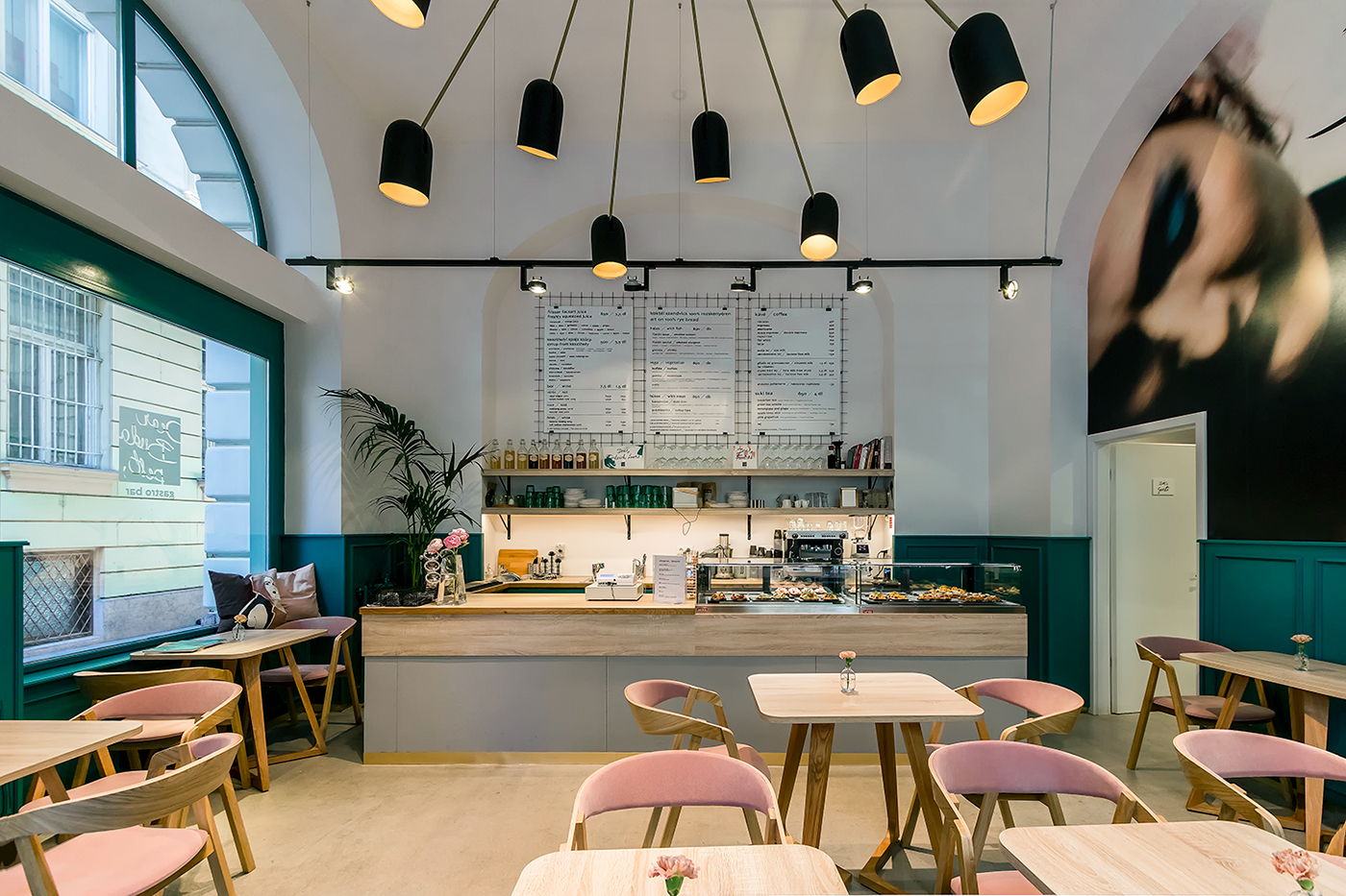
Working together, we harmonized each element of the space from the brand logo to the interior lighting. The high ceiling was also painted a matte-black to create a chic and romantic atmosphere for the guests. The vibrant open-faced sandwiches laid out on a black background on the promo poster are a perfect mirror image for their edible versions laid out on dark platters in the bistro counter, while light pink chairs, gold accents and green walls and dishes emphasized the brand colors.


The snug space was crowned by an all-encompassing modern chandelier; the many-legged lighting replaced space-consuming individual spotlights on each table and carefully shed a warm, even light across the guests without sniping one out directly with a direct laser beam. Eventually Lumoconcept was chosen to help custom design the dear monstrosity.


Branding and packaging:
We applied the splatters and typography throughout the entire brand design, and the logo, colors and messages can be adjusted to whatever feels right.


The team:
Owner: Bianca Juhász
Owner: Bianca Juhász
Graphic designers: Dia Ghyczy and Dani Máté
Architect and interior designer: Studio Bunyik
Strategy: Nora Lugosi
Lamp design: Lumoconcept
Constructor: Komopex
Photo: Gábor Schlosser
Architect and interior designer: Studio Bunyik
Strategy: Nora Lugosi
Lamp design: Lumoconcept
Constructor: Komopex
Photo: Gábor Schlosser


