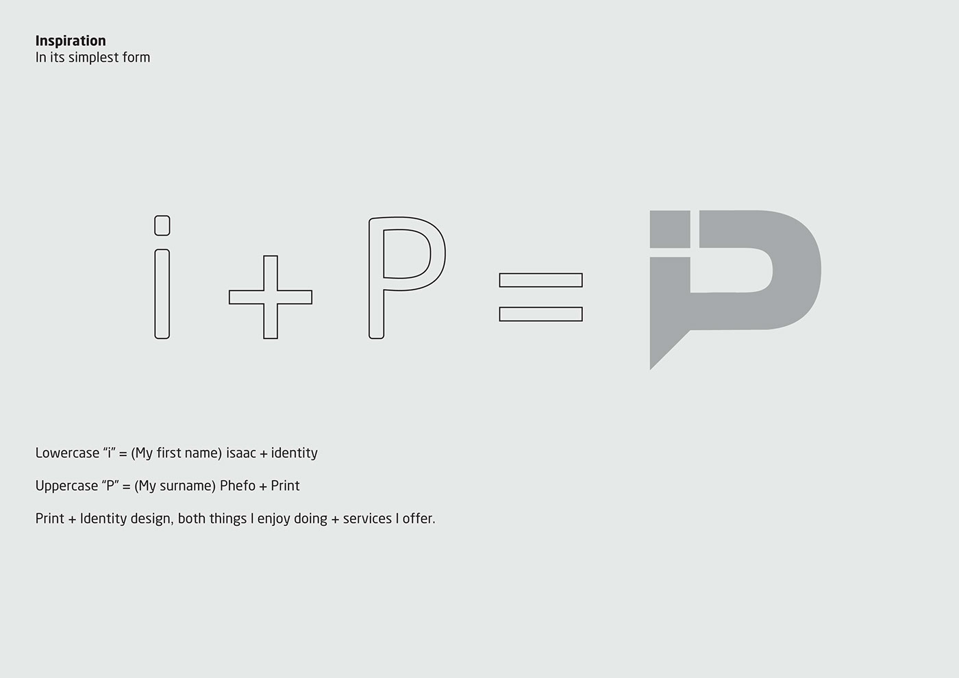
After 4 years of having my logo, I decided I needed a new identity. I wanted something simple that was bold, clean and striking. My old logo was designed without any meaning behind it, at the time I just wanted a logotype, although some still say it looks 'good' I felt that it was cluttered and I needed something that was a lot more simple and clean.
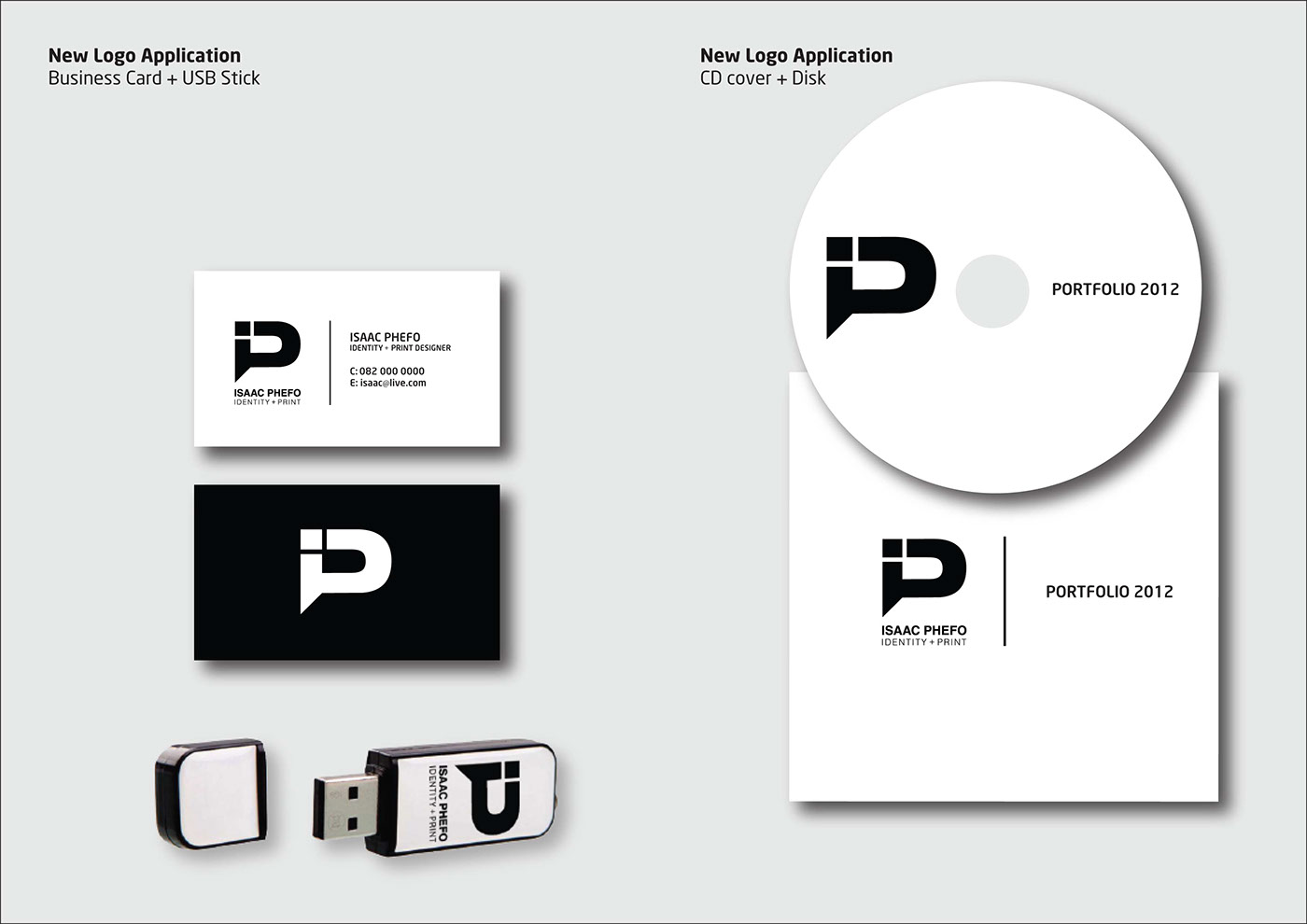
I love black and white and when it comes to printing stationery it works out to be a lot cheaper.
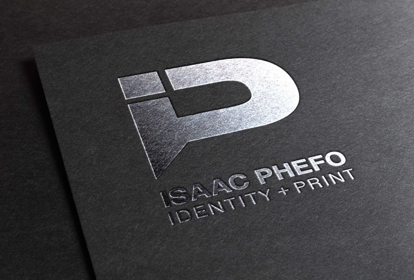
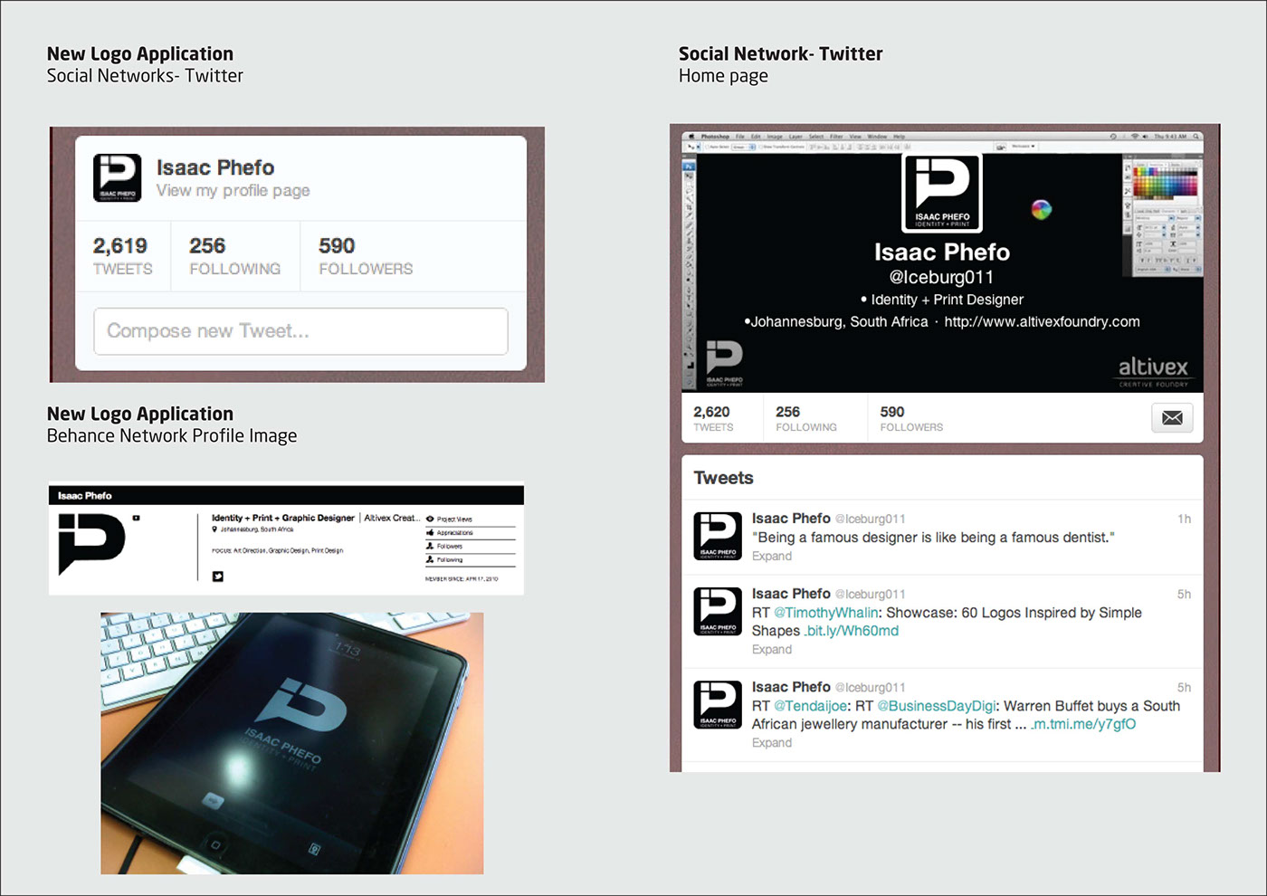
Below is my new logo.
Let me know what you guys think.. Is it an improvement from the old one?
Enjoy.
I love black and white and when it comes to printing stationery it works out to be a lot cheaper.
Below is my new logo.
Let me know what you guys think.. Is it an improvement from the old one?
Enjoy.


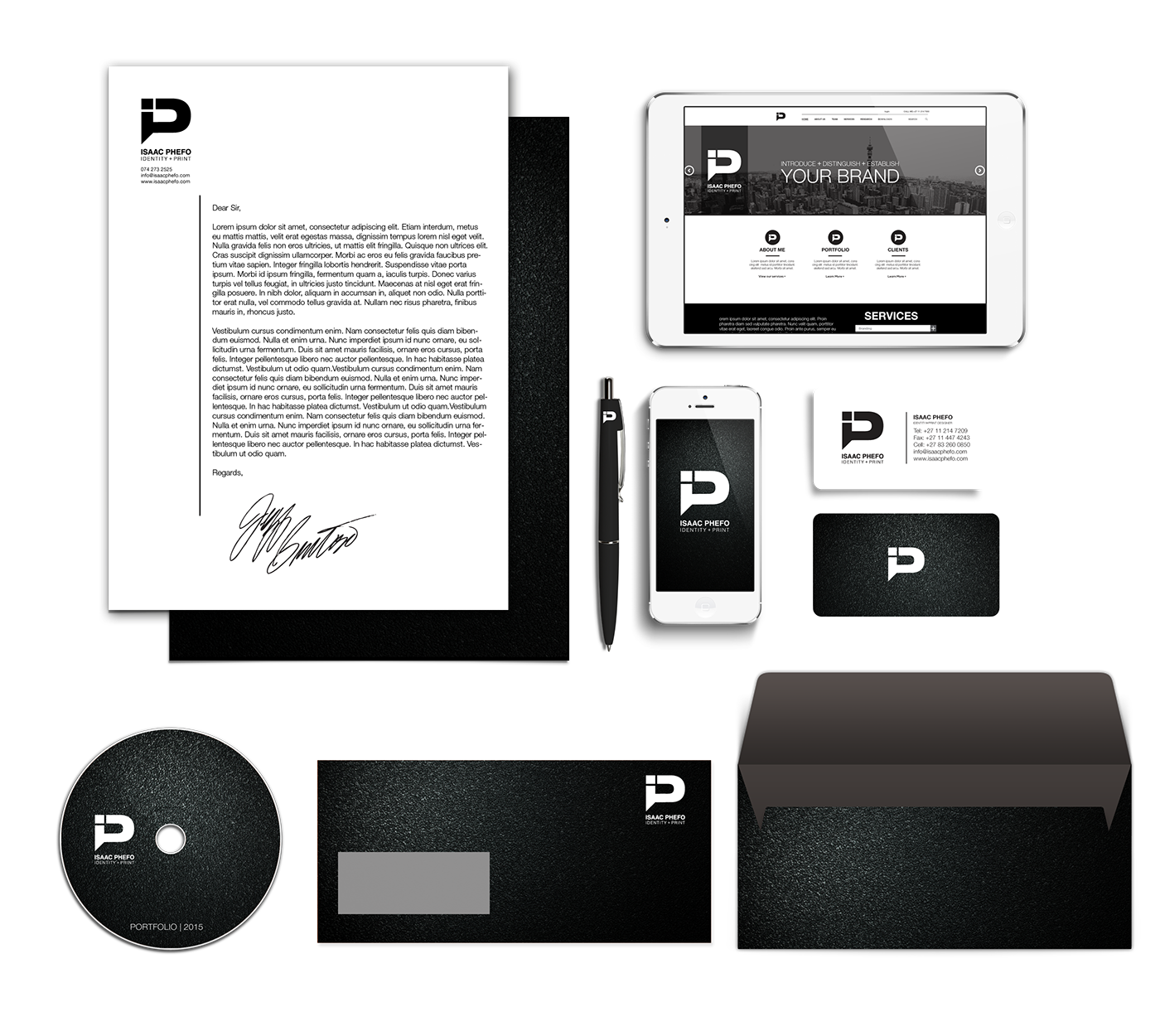
It's been 3 years since I've changed my Personal Brand Identity so I decided to freshen up my "image" slightly by adding in a textured black background to some of my stationery. Let me know your thoughts.