

El libro de arena
Typographical interpretations of Jorge Luis Borges short stories from The Book of Sand
/ Typograficzna interpretacja opowiadań Jorge Luis Borges'a ze zbioru pt. Księga Piasku. /
I would like to show you some of my works that were created as a typographic impression on Borges short novels. I focused on the letter as the main medium. I wanted to put a spirit (genius loci) of each short story on every poster. As a result, you can see a mix of the the titles and its typographic interpretations (I used polish titles, so don't feel disturbed if you know the book). Each work was 20x40 cm and presented on a big, grey passe-partout (about B1 format). The 13 works (same as number of stories in The Book of Saints) where created as a part of my bachelor degree diploma under the guidance of a prof. Adam Kamiński. I will show you some of them and I would really appreciate if you give me feedback.
/ Przedstawiam prace, które stworzyłem chcąc zilustrować opowiadania znajdujących się w zbiorze "Księga Piasku" Jorge Luisa Borgesa. Narzędziem mojej komunikacji była litera - pragnąłem, aby każda z kompozycji oddawała ducha danej opowieści, zarówno przez samą atmosferę, jak i typograficzną interpretację i przedstawienie tytułu. Zapraszam do oceny efektów.
Całość składająca się z 13 prac oraz minimalistycznych animacji poniższych kompozycji, została stworzona pod kierunkiem dr hab. Adama Kamińskiego. Efektem obrony była ocena bardzo dobra oraz wyróżnienie. /

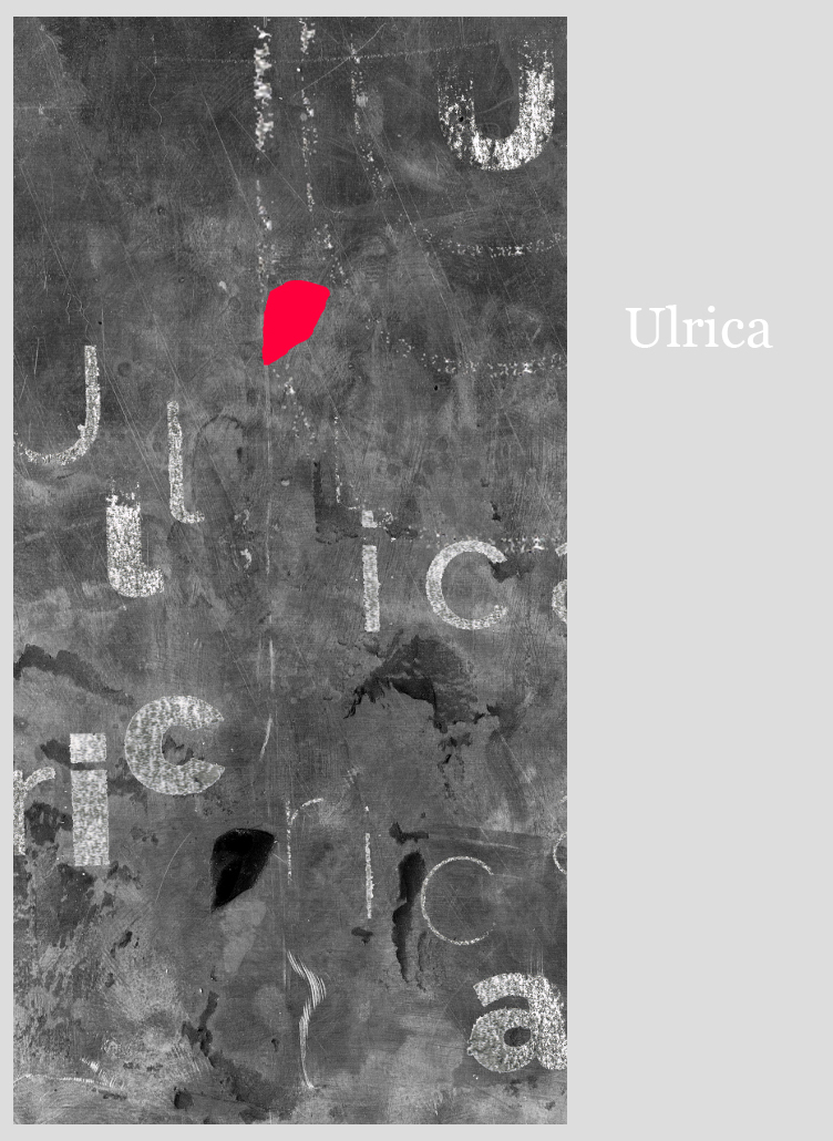
Ulrica is the only story Borges wrote about love, and the love affair in this particular example is a thing of an old, tired man, who used to expected only death in his life. The feeling is unexpected, special and it happends so immiedietly that it becomes a magic, oniric remembering right away. The narrator felt that he wasn't worthy enough to feel love anymore in his life.
/ Ulrica jest wyjątkowa w twórczości Borgesa, który poza tym jednym opowiadaniem o miłości pisał tylko w swojej poezji. Narracja jest prowadzona z perspektywy starego człowieka, który bardziej spodziewa się przybycia śmierci niż paroksyzmu uczuć. Gdy więc nieoczekiwana miłość się przydarza, to jest przeżyciem tak wyjątkowym i niespodziewanym, że staje się z miejsca wspomnieniem magicznym, onirycznym, na które narrator w swoim odczuciu nie zasłużył. Stąd też powtarzające się, przykryte mgłą niepamięci motywy liternicze, które różnicując się (tak jak wspomnienia) z trudem układają się w jedno imię. /

There are more Things was Borges tribute to H.P. Lovecraft (who's stories I really enjoyed in middle school). This is why I put this exaggerated, chubby font on a shuffled mountain slope, which will inevitably burst out and reveal its scary mystery. What will come out of it? It is the brightest of the works and the only one in which kitsch was intended by me.
/ There are more Things to hołd dla Lovecrafta, a skoro tak, to przesadzony, kulfoniasty font umiejscowiłem na górskim zboczu, które całe rozedrgane niechybnie zaraz rozerwie się od środka ujawniając przerażającą tajemnicę. Co z niego wyjdzie? To najjaśniejsza z prac i jedyna, w której kicz był przeze mnie zamierzony... /

The bribe (polish Fortel) is the darkest of my works. Instead of the childish personification of the monster (as in the poster above) it focuses on really scary and intimate topics: the issues of morality and vanity.
/ Fortel to za to najmroczniejsza z prac, bo zamiast dziecięcego uosobienia potwora (jak wyżej) dotyka naprawdę strasznych i bliskich nam tematów: kwestii moralności i próżności. /

Avelino Arredondo tells us a story of a political murder committed becouse of the faith in ideals. I wanted to show this in the simplest possible way using typography.
/ Avelino Arredondo opowiada o morderstwie politycznym, popełnionym z ideałów. Chciałem pokazać to w możliwie prosty sposób korzystając z typografii. I mógłbym napisać o tej pracy dużo, ale mam wrażenie że nie trzeba. /

The other is one of my favourite stories about the topic of fecht/wraith of the living/Doppelgänger. With the polish typography of the word Tamten (the other) shown here it is really hard to decide which one is the real one even though we know that they are blured memory of the same person (just in different time).
/ Tamten podejmuje stary temat sobowtóra, "który w Anglii nosi nazwę fecht lub bardziej literacko wraith of the living. W Niemczech - Doppelgänger." Polska typografia "tamten" zakłada, że do końca nie wiadomo, który jest którym, choć z pewnością mowa o tej samej osobie, tyle że spotykającą samą siebie w innym (podobnym) miejscu, ale kilkadziesiąt lat później (a może wcześniej?). /

Two other works here: Undr and The Disk (my favourite Borges story).
/2 kolejne prace powyżej: Undr i Krążek (moje ulubione opowiadanie Borgesa) /


The works were attached to the gray passe-partout, the appropriate mounting distance made it possible to obtain an interesting spatial effect.
/ Prace były przymocowane do szarego passe-partout, odpowiednia odległość mocowania umożliwiła uzyskanie ciekawego efektu przestrzennego. Tutaj ja - Lech Wikaryjczyk - podczas prezentacji kompozycji. /


