


For this project we followed SoCal based artist, Scott Patt, and his artmaking process, from initial sketch to final product. On January 1, 2014, Patt started a year-long art project called Bigger. Smaller. Funnier., where he produced artwork every day finding inspiration in his life experiences and communication with others. He created this conceptual artwork every day and shared it on his Instagram feed. In this video, we wanted to showcase not just finished polished pieces of art, but wanted to delve deeply into these sketchbooks and show the evolution of his work and in-depth processes.
In order to reflect the high volume of artwork he produced throughout the year, as well as the natural playful and humorous style of his work, we decided to use stop motion for this piece. We were able to use the animation to keep the piece light hearted and make it feel like the viewer is right there, next to Patt, as he sketched and developed his work. In addition to this work, we have designed and digitized a custom typeface based on his paintings of letters that he used in a recent show in New York.
Credit
Illustration by Scott Patt
Type Design and Stop Motion by The Happening Studio
For more info, visit here

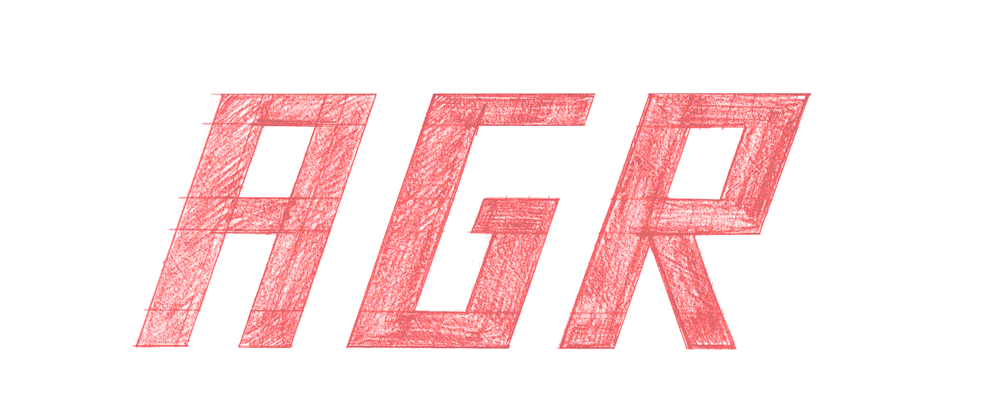
Bigger Smaller Funnier typeface is based on Scott's hand drawn letters in his illustration. Our goal was to study the various his letterforms and to come up with a system for a function typeface. The custom typeface is used on his website, promo material and branding.


