Visual Hinting & Glances: How computer vision modeling can help customers make timely, better informed decisions to help them find their way
After a long day of meetings, Joel retraces his steps to the subway station as he makes his way back to the hotel for a much needed rest. Walking into the subway station, he hears the screeching of brakes and rushes down the stairs only to see trains arriving on both sides of the platform. Momentarily confused, Joel tries to figure out which train to board. Suddenly, the ‘closing door’ buzzer goes off and Joel dashes towards the train. Barely squeezing through the doors, he collapses into his seat as the train rumbles out of the station. Breathing heavily, Joel begins to second guess himself… did he board the right train?
Everyday, visitors and other infrequent transit users like Joel get disoriented and lost. The heightened level of anxiety and distress associated with this kind of uncertainty reveals how our emotional states are closely linked to the quality of physical spaces in which we live (Lynch, 1960).
“What really frightens or dismays us is not external events themselves, but the way
in which we think about them” — Epictetus, The Manual for Living
in which we think about them” — Epictetus, The Manual for Living
This usability study explores the performance of sign and map designs within the context of a city-wide transit system. We are interested to find out how well our customers are able to find their way and whether visual elements such as easy to remember shapes, numbers, colours and simple language, presented consistently throughout their journey, can increase efficiency; a reduction in the amount of time and cognitive effort required, to navigate a transit system while still providing a sense of refuge and reassurance as they journey to their destinations (Dzebic, Perdue & Ellard, 2013).
In a typical transit journey, customers are usually in motion when they encounter our signs and maps; walking into or leaving the station, or transferring from one mode of transit to another. Their eyes are constantly scanning the visual field for cues on how to get to the next point in their journey. Therefore, we fully expect our signs and maps to be viewed from the periphery. Thus, while it is crucial to test what we can see in a glance, it is also hugely important to test what we might not see (Rosenholtz, 2011) as our peripheral vision helps us identify where we are in a physical space (Larson & Loschky, 2009).

Prior to implementation, we selected a specific image of a subway line map customers might see in a subway station for processing to find out if the proposed changes could be validated. The processed images (mongrels) reveal elements in an image that can be identified in a short glance. Even though one might not be able to gather sufficient information within a single glance, they provide hints so that the customer has sufficient information to know where to look next (Rosenholtz, 2011).

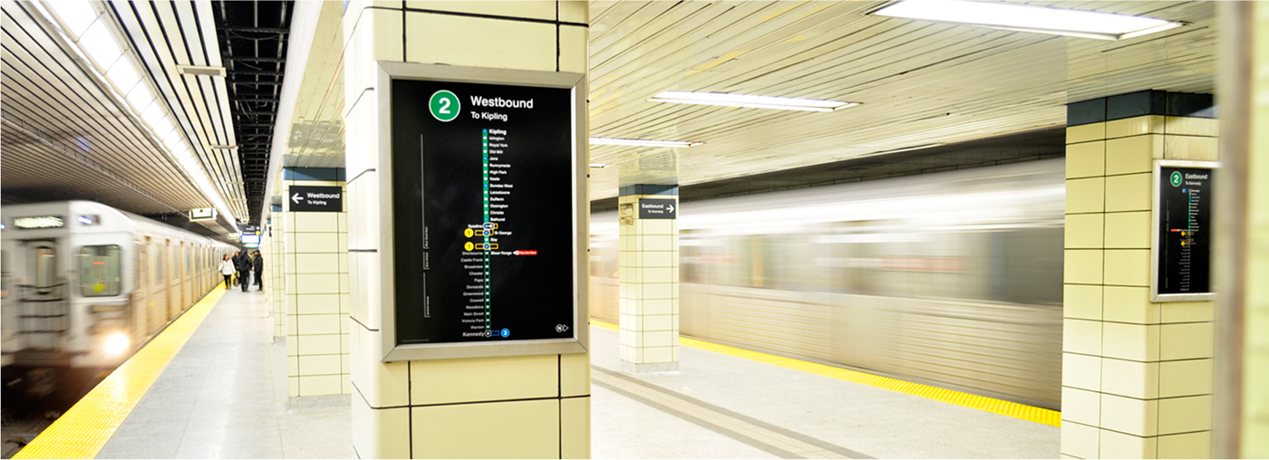
Prior to the redesign, we performed a needs analysis to understand what information the customer would be searching for when viewing these maps. As these maps are located at prominent locations on the path towards the subway platform, we learned that at this point, customers were most interested in identifying at a glance: the train’s direction of travel, the stations ahead of them and their current location.
After receiving the results, we compared them against the existing designs. We analyzed the mongrels to confirm whether elements of the new designs were more identifiable. Next we reviewed them to determine if additional layers of information could be recognized so that customers like Joel could use them to make timely decisions in the scenario presented above and be reasonably assured that the choice made was correct (Rosenholtz, 2011).

The map was divided into 6 sections:
A. Subway line colour & direction of travel
B. Connecting subway lines
C. Subway stations along the line
D. Legend
E. Cardinal directions (Compass)
F. Subway system map
Observation & Findings
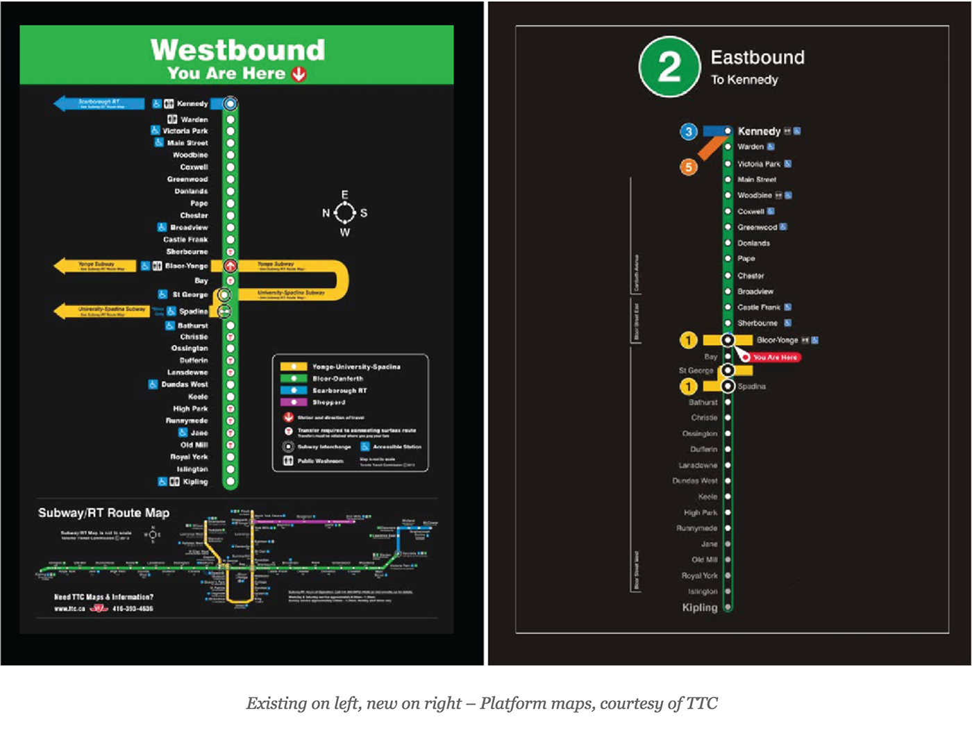
Based on the learnings from the needs analysis, we observed that the primary focus on the subway stations along the line (Section B) were diminished in the existing due to the reduced scale caused by the inclusion of the system map (Section F). We also noticed the connecting subway lines (Section D) visually distracted from the primary focus and caused the green line to recede into the background (Section B). It was also significantly more challenging to locate one’s current location (B1) as the arrow indicating “You are here” and direction of travel along the line was undersized.
In providing reassurance, the subway line colour and direction of travel (Section A) in the existing helped confirm that customers were on the green line (Line 2), however it was not immediately apparent if the direction of travel and terminal station location – which were of higher importance – would be easily identified since the lines of text appear to be muddled within the large expanse of colour (A1, A2).
Further, at this location and more so at interchange stations, it can be assumed that customers would have already selected the subway line of choice based on previous signs encountered prior to viewing this map, thus the salience of colour at this point is at best, secondary.
Comparatively, the redesigned map was observed to have performed better in the primary focus with less cognitive effort (Section B). Elements within the image were well separated based on the clustering of similar information.
The upscale of size in visual and informational hierarchy of the subway stations along the line (Section B) allowed for additional relevant information: subway stations along the line (B1) that are ahead, improved visibility of one’s current location (B2), interchange stations (B3), the stations behind the intended direction of travel (B4), and the inclusion of streets that the subway runs under were also identified as a simple point of reference (B5). We also observed a new layered system of information (Section A): a coloured and numbered shape (A1) representing the subway line colour and lines of text identifying the direction of travel and terminal station (A2, A3).
As the majority of stations are underground and also due to the orientation of stairs and escalators, it was determined that the cardinal directions on the map would cause confusion and were removed (Section C). The connecting subway lines (Section D) were also shortened to still retain awareness of the interchange locations while amplifying the conspicuity of the primary focus (Section B).
Recommendations & Future Application
While the scope of this study explores the visual cues on a subway map design, it is still preliminary and further study is required in order to determine more conclusive outcomes. Future studies could explore simulated glances and heat maps testing on research subjects. It would also intriguing to apply selected test scenarios at the intersection where the physical and digital worlds collide (e.g. quick glances at smart device screens while in motion). Additionally, tests for other relevant variables (high-contrast, legibility, auditory or haptic feedback and others), for accessibility requirements could be included to provide a better universal experience.
Special Thanks
Perceptual Science Group, Department of Brain & Cognitive Sciences, CSAIL, MIT
Perceptual Science Group, Department of Brain & Cognitive Sciences, CSAIL, MIT
Ruth Rosenholtz, Principal Research Scientist
Lavanya Sharan, Research Scientist
Lavanya Sharan, Research Scientist
References
Lynch, Kevin, 1960. ‘The Image of the City.” Cambridge MA: MIT Press. OL 5795447M
Vedran Dzebic , Justin S. Perdue & Colin G. Ellard (2013) The influence of visual perception on responses towards real-world environments and application towards design, Intelligent Buildings International, 5:sup1, 29-47, DOI: 10.1080/17508975.2013.807766
Larson AM, Loschky LC, 2009. “The contributions of central versus peripheral vision to scene gist recognition.” J Vis. 2009 Sep 9;9(10):6.1-16. doi: 10.1167/9.10.6.
Rosenholtz, R., 2011. “What your visual system sees where you are not looking”, Proc. SPIE 7865, Human Vision and Electronic Imaging XVI, 786510 (February 02, 2011); doi:10.1117/12.876659; http://dx.doi.org/10.1117/12.876659
Further reading (in order of relevance)
The Science Of A Great Subway Map, Fast Company, October 29, 2013.
Recognizing the Gist of a Scene, Kansas State University, Visual Cognition Laboratory, undated.
Rethinking the role of top-down attention in vision: Effects attributable to a lossy representation in peripheral vision, Frontiers Journal, Psychology, February 6, 2012.
Why We Can Find Our Way to the Moon but Get Lost at the Mall, Collin Ellard Website, 2009
Has the TTC finally found their wayfinding way?, Spacing Toronto, March 20, 2014
Confused by the subway system? The TTC has your number, Toronto Star, October 3, 2014
TTC unveils new system map and wayfinding signage, BlogTO, October 23, 2013
TTC says the days of subway names are numbered, Toronto Star, October 5, 2013


