O Redesign da equipe de Futebol Americano Arcoverde Templários surge com a necessidade de uma identidade que transmitisse toda a garra e comprometimento dos templários, algo que se comunicasse melhor com a torcida e que representasse o crescimento que o time vem passando junto com o FABR.
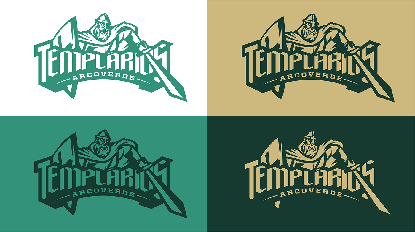
A nova identidade visual ganha um logo mais emblemático e real a história desses guerreiros medievais.
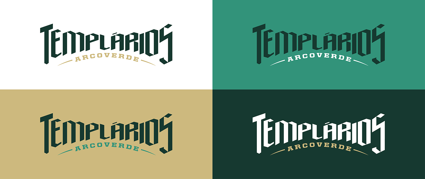
O lettering gótico foi desenvolvido com referência a época medieval em que esses cavaleiros atuavam.
O nome da cidade está presente em sua base em forma de arco, fazendo alusão ao próprio nome da cidade, Arcoverde.
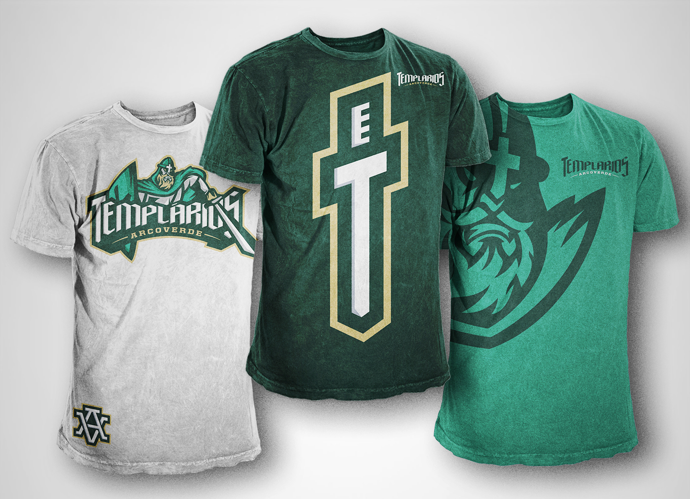
O verde permanece e o vermelho da lugar ao dourado criando harmonia, contraste e beleza aos novos uniformes.
Não poderia faltar a logo secundária (Sigla) “T” de templários, fechando assim junto com o ambigrama “AV” a nova identidade dos Templários.
A nova identidade visual ganha um logo mais emblemático e real a história desses guerreiros medievais.
O lettering gótico foi desenvolvido com referência a época medieval em que esses cavaleiros atuavam.
O nome da cidade está presente em sua base em forma de arco, fazendo alusão ao próprio nome da cidade, Arcoverde.
O verde permanece e o vermelho da lugar ao dourado criando harmonia, contraste e beleza aos novos uniformes.
Não poderia faltar a logo secundária (Sigla) “T” de templários, fechando assim junto com o ambigrama “AV” a nova identidade dos Templários.
The Redesign of the Arcoverde Templários American Football Team arises with the need for an identity to convey all the will and commitment of the Templars, communicating better with the fans and representing the growth that the team currently has with the FABR (American football from Brazil).
The new visual identity has a more emblematic and real logo the history of these medieval warriors.
The Gothic lettering was developed with reference to the medieval time that these knights acted.
The name of the city is present in the base in the form of arch, in allusion to the own name of the city, Arcoverde.
The green remains and the red is replaced by the golden to convey contrast and beauty to the new uniforms.
It could not miss the secondary logo (initials) "T" of Templars next to the ambigram "AV" the new identity of the Templars.

REFERÊNCIAS

PESQUISAS

RASCUNHOS

LOGO PRIMÁRIA

LOGOTIPO

SÍMBOLO